You should have tagged @danny with that comment ![]()
1 Like
Or just create another theme to stick somewhere between light and dark. Who said there can only be 2 themes to choose from?
1 Like
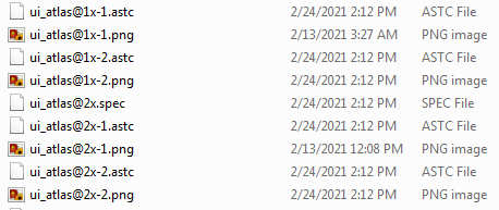
I think the 1x and 2x files are used for different screen resolutions/dpi. For example the circle80 is 80x80 in the 1x file and 160x160 in the 2x. I suspect that one of your machines is retina and the other is not.
1 Like
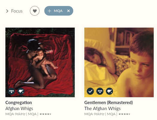
I think that will be because you’ve replaced the .spec files as well as the .png. In the newer builds they have added 2 new icons (for MQA) - while your way works, be aware that somewhere in the UI there could be a blank somewhere there should be an MQA logo.
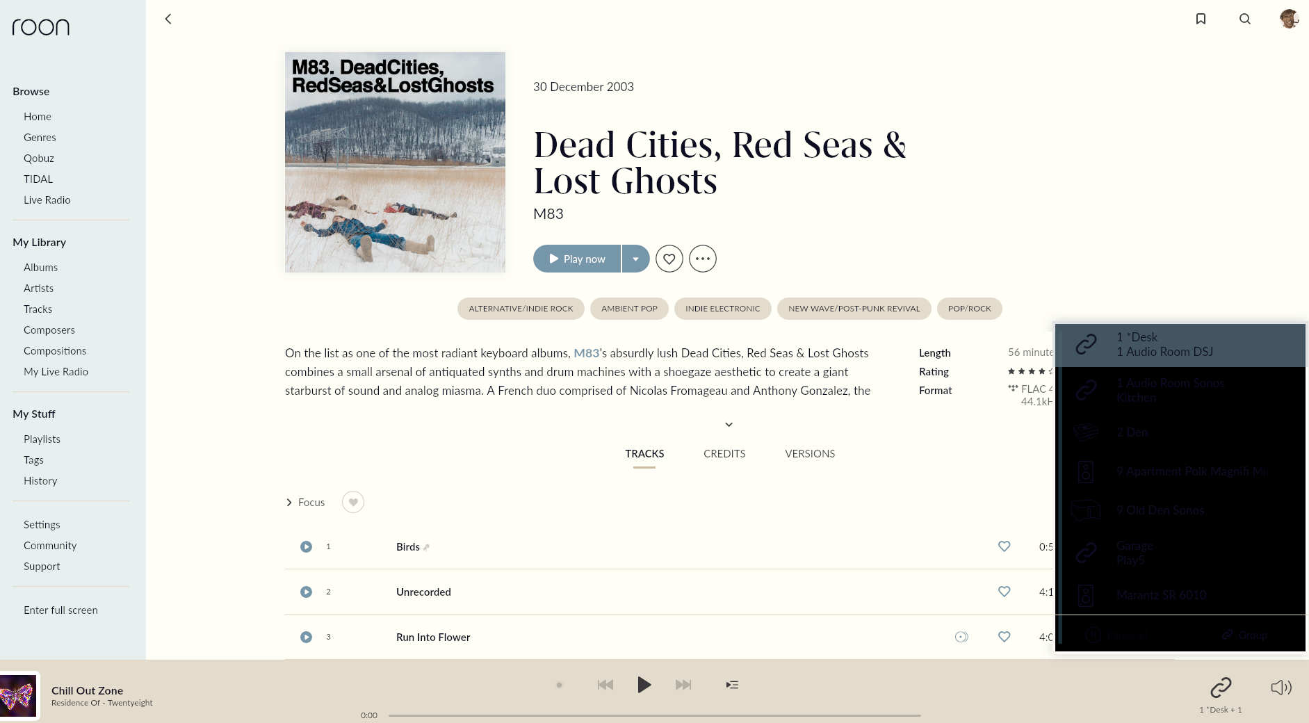
Does anyone know the name of the popup background color field?
I am using @DaveN’s excellent “Roon’s a Beach v2” theme and I’m getting a (problematic) black background on popups like volume, device, and search box (see pic). I figured it was atom-popup, but, in the color file, it’s showing correctly as fffef7 (warm off-white). So I’m thinking that the issue is with a different field. Any ideas?
Thanks for any help.
Hmm, afaik I only replaced the png files (the spec files have the same timestamp as all the other 764 files).
But, now that you mention it, my MQA badge is a mess! Not sure what to do now, hehe. Pour a bourbon and play some music, I guess. Thanks, mpd!
Better: let us create custom themes (inside Roon) so we can use them on mobile devices too.
2 Likes
I can’t replicate the problem using the same theme so I’m not sure what’s causing the problem. I would suggest updating the theme using the theme generator I posted recently but I’m not sure it’s going to make any difference. I’d also suggest restarting your core and clients as this could be a caching issue. Let me know how you get on and if the above doesn’t help I’ll do some more digging.
Thanks David! I tried changing to a few different themes and got the same result; so it’s apparently some other issue. I’ll revert to the original files, including the artist shape, and go from there.
Okay, after reversion, things got weird. It’s almost certainly a result of the shape file changes that @aKnyght and @mpd have talked about.
I’ll start with a fresh install, edit the new ui_atlas@1x-1 file manually, and bring in the beach theme.
Thanks for the help, guys!
If you do a clean install, you can try these sprite atlas files (1x and 2x). :-
https://drive.google.com/file/d/186vNU4n2kzh7Wnyh8M0VLTGFgjEiIlqo/view?usp=sharing, https://drive.google.com/file/d/1pOXezBtN_ixpAho0SoYY-2QR_V7W7rG4/view?usp=sharing
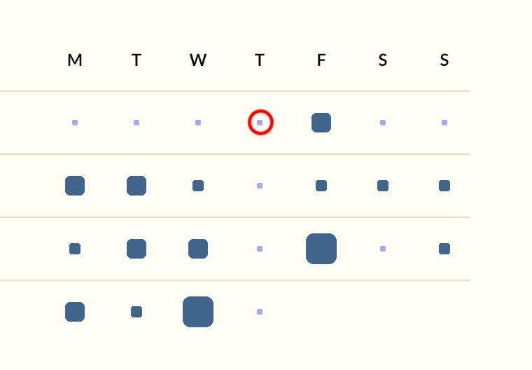
They are for the “squircles” - one small thing to note is that I’ve changed 2 circles in the atlas, but this does change the history chart of your listening.
Changing the large circle (208) in the atlas will change the artists like this:-

But leaves the artists in your “most listened to” section as circles. Changing the smaller circle corrects this like so:-

But changing this smaller circle also changes the chart:-
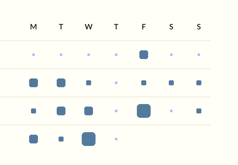
Side effect of the granularity. But one I am ok with.
1 Like
Got 'em. Thanks @mpd!
Great! Hope that works for you. Slight concern is the colour of the dots where I’ve not had any time listening… it is the “purple” but doesn’t seem to be coming from the theme file.
Hopefully roon isn’t hard coding things - there seem to be some icons that aren’t in the atlas files - most make sense. The rest hopefully make sense to them! But I do hope that it isn’t a sign of more things getting embedded in the code.
Maybe someone in marketing decided they should hire a brand consultant who decided that they could make the purple part of the brand… own it. 
1 Like
I haven’t seen that, but then I haven’t had any recent periods of not listening so can’t check. I’ll make sure I do listen each week as it would bug the hell out of me if I up with any tiny ‘purple’ dots ![]()
2 Likes

Hmmm. At least the shapes aren’t. Pity about the colour.
Hopefully the hard coding is tech debt as opposed to a decision.
If Roon does decide to offer alternative themes they’ll have to do something about tidying up the way it’s implemented now. My impression, having worked with the theme files, is that the whole thing was cobbled together without a great deal of though beyond its immediate utility. It works, just about, but there’s too much overlap between elements (e.g. the played section of the waveform is the same colour as the main play button. Why?), some of the hex codes seem to have no effect, and we’ve now discovered that at least one of the elements is hard coded. I have no idea how hard it would be to code an alternative, but it would certainly be easy enough to come up with a specification that’s aesthetically and functionally superior to the current one.
Yeah - the simple route is to carry on as per now and say “edit the files at your peril…” and let it get more opaque.
1 Like
I don’t even get what these graphs are for? Show the significant other we aren’t shirking off and listening to the hifi? Or that we are? or that I’d better step it up on Tuesdays vs Fridays? Don’t we just listen to music when we can, and listen to what grabs us or our mood needs? If I could make the whole thing go away I would.
1 Like
