They changed it to round a couple of years ago. There was so much comment on it that they changed it back. Hopefully this time as well. The fact that some years have past and every other app seams to do it nowadays doesn’t mean it is less childish all of a sudden.
1 Like
I really don’t understand why anyone thinks it’s a good idea. It looks childishly clumsy, and it wastes about 21% of each image that’s cropped from a square to a circle. Ugly, pointless and wasteful.
3 Likes
That looks a whole lot better ![]()
It’s just a crop from a larger view. Actually, just realised I’m not sure I understand your question. Are you asking about the edit to the ui_atlas file?
I thought, maybe accidentally we found some solution to remove extra space 
Lol it looks like have the first symptom of Antiroonlargespacesozis 
1 Like
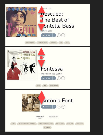
Ah, I see what you mean. I don’t know why the image for Antònia Font is smaller.
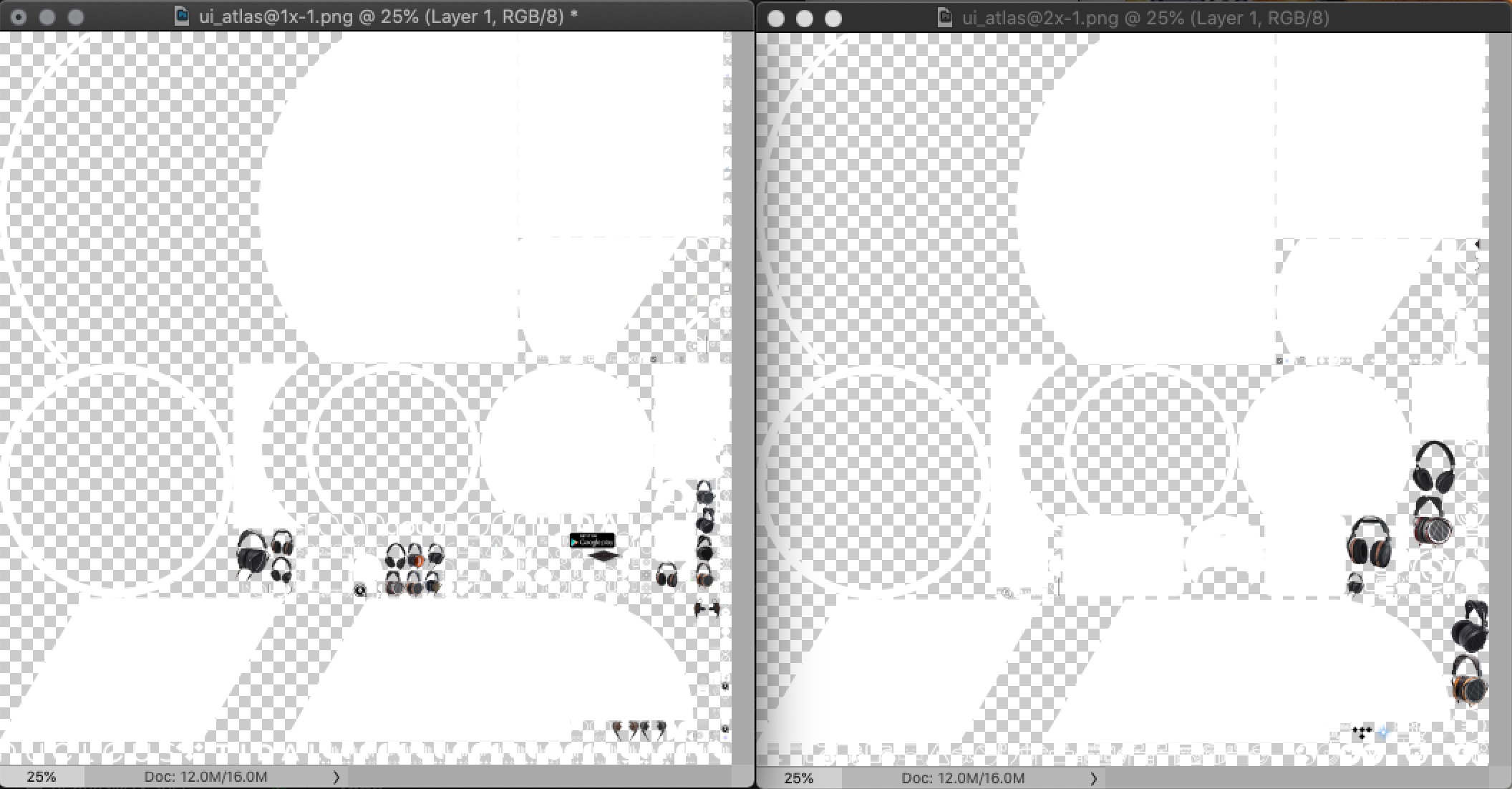
@Craig_Watkins, I’ve just discovered that you need to edit ui_atlas@1x-1.png AND ui_atlas@2x-1.png in order to make sure that all the artist images end up as squares. It looks like ui_atlas@2x controls the appearance on larger screens, while ui_atlas@1x is for smaller resolutions. Here’s how both my files look like after the edit:
1 Like
Gotcha. I tried one to no effect (on 32"). Worked after also changing the second.
Thanks!
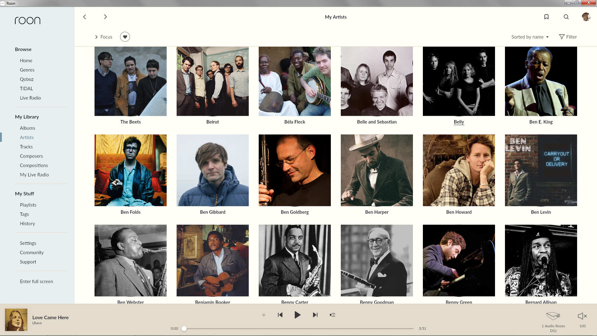
If you squeeze it all together in a window to phone size it makes more sense. I hope they can find a way towards a desktop version that utilizes space better.
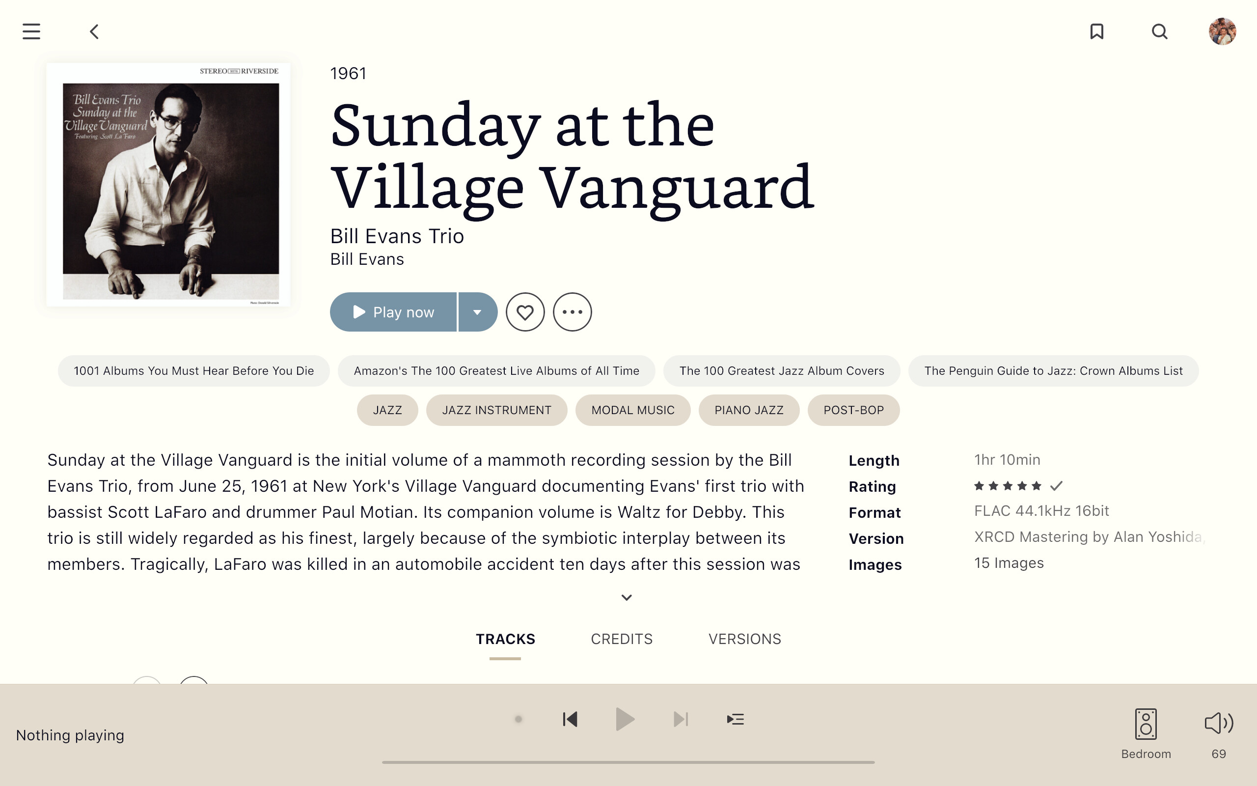
One thing I hate is clicking open a review no matter how long or short it opens to the same point, and to close it again one has to scroll to access the hidden close arrow, even if the review ends short of the play bar at a the bottom.
2 Likes
You can click anywhere within a review (except on a link) to open or close it. Unless you can’t on a Mac?
1 Like
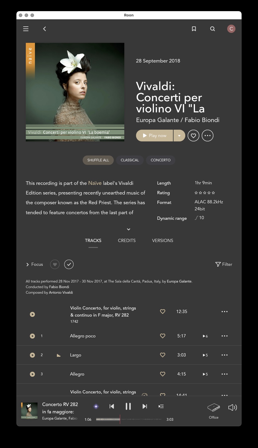
themes look great. the recording of the Bach Concertos- is that your own library? i can’t find it in Qobuz or Tidal.
Great and thank you. There are some non-intuitive things sprinkled about Roon like that.
1 Like
Alina Abragimova? Yes, my own. She’s on Hyperion which doesn’t stream. Amazing album with some of the best recording sound out there. You can get a taste of her with the Chiaroscuro Quartet, which is on both Tidal and the 'Buz.
Exactly. I was trying with turned monitor to vertical and seems the 1.8 is mainly dedicated for mobile devices or the solution which was used to 1.8 is specified for it.
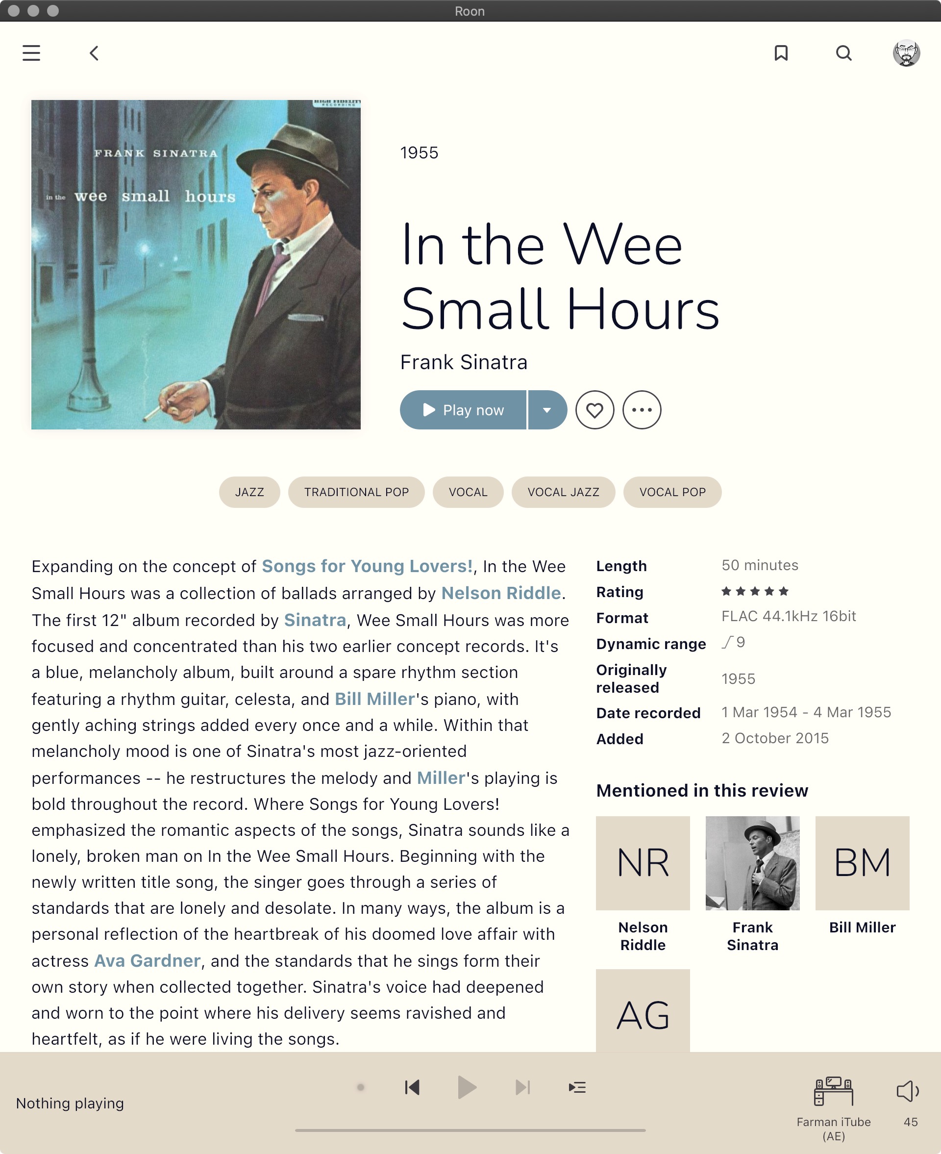
This, in opposite to the “original White purple thing” is kind to the eye! Well done. 
I came across a great font suggestion from @Candombe in the Customising the Roon theme thread for another font to use as a Lato replacement - SF Pro Text Regular. The line spacing is better, and it seems slightly larger than some of the others I’ve tried.
5 Likes
I see a lot of folks (myself included) posting screen shots of that ‘beach’ theme. Well done and thanks.
1 Like
I’m glad people like it. I might even consider letting Roon use it if they ask nicely ![]()
2 Likes