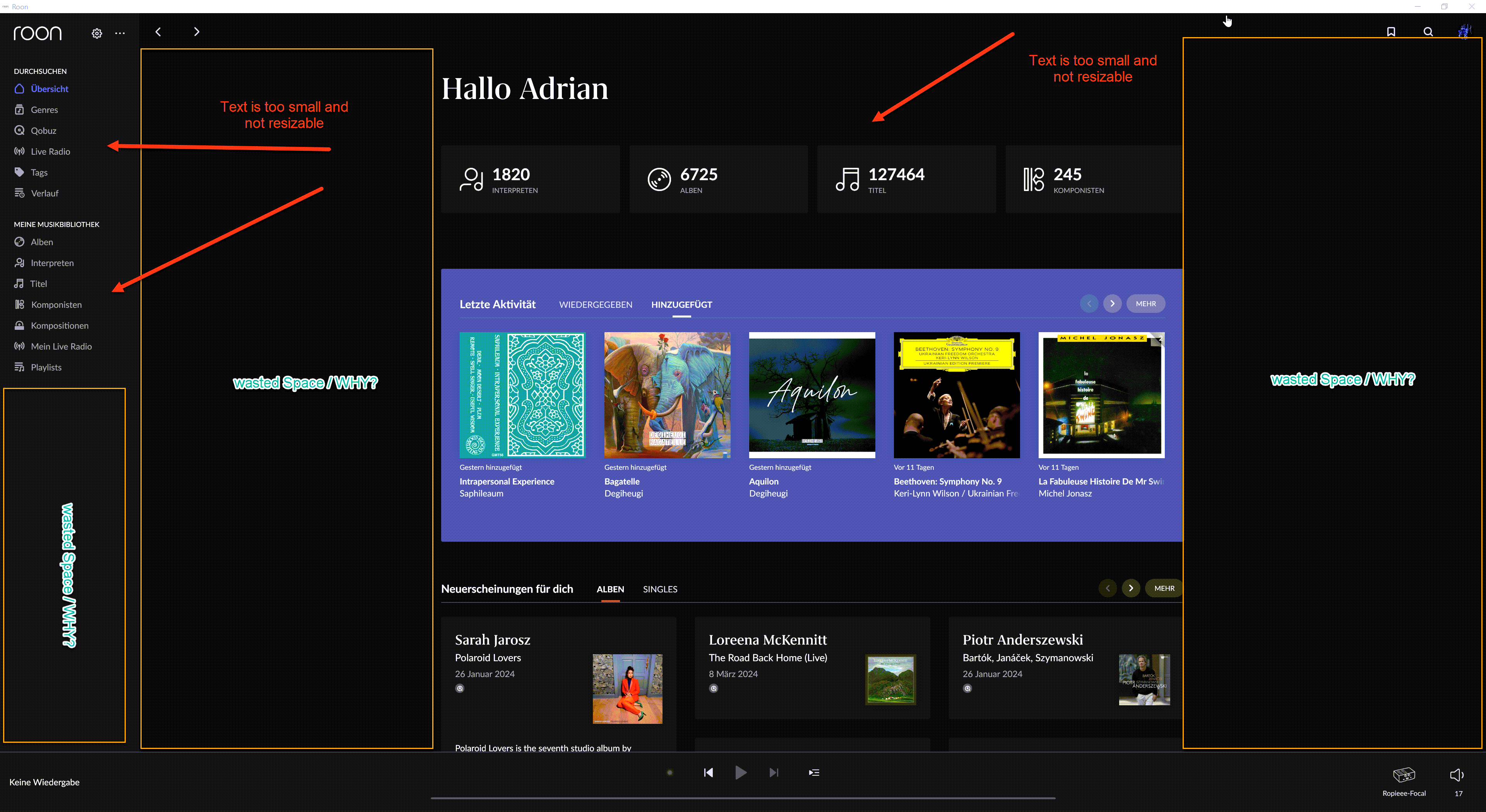
Dear all
Am I the only one, who uses a 4K screen?
There is half of the screen empty.
You can’t resize in leftwards from the bottom right of your window?
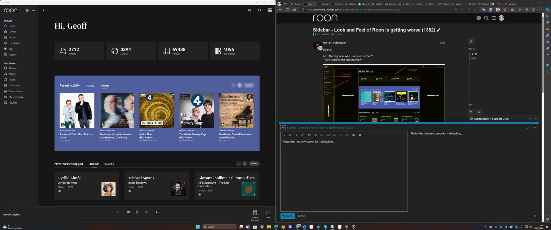
That’s why I use my screen for multitasking…
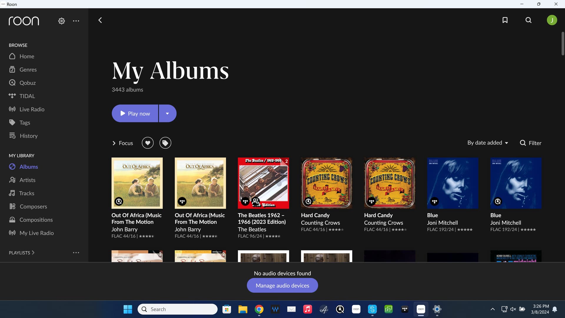
Of course, that “wasted” space is just on the Home screen. In the browsers, all the real estate is used…
This is for sure one way to go, but the rest of the Software is then looking too Big.
I just don’t understand, why the main screen is not autoscale, like album.
This is what I mean - why is the main screen not autoscale.
There is still some work to do.
And the new version lacks also from sound quality. buth that’s another thread.
Thanks
Do people spend hours gazing at Roon? I open it up, queue up a load of music at my chosen end point and hit play, I’m in there for less than a minute.
I only use it in Android, on my phone or Chromebook.
I see lots of complaints about minutiae.
I think you have many use cases. There are power users (e.g. using it and thinking it’s ike SQL) and others that push play. Neither is better, right / wrong.
It goes both ways WRT to usage / use case - trying to define one’s indiv workflow is really difficult. Similarly to the sound quality debacle, its impossible capsulize the indiv experience.
I haven’t pushed an update since I think Sept for fear of the typical cautionary update’ites / I’m never on latest and greatest.
I’m of course on a tangent as usual ![]() but it would be nice if there was a roon revision feedback thread - to vet out bugs etc,
but it would be nice if there was a roon revision feedback thread - to vet out bugs etc,
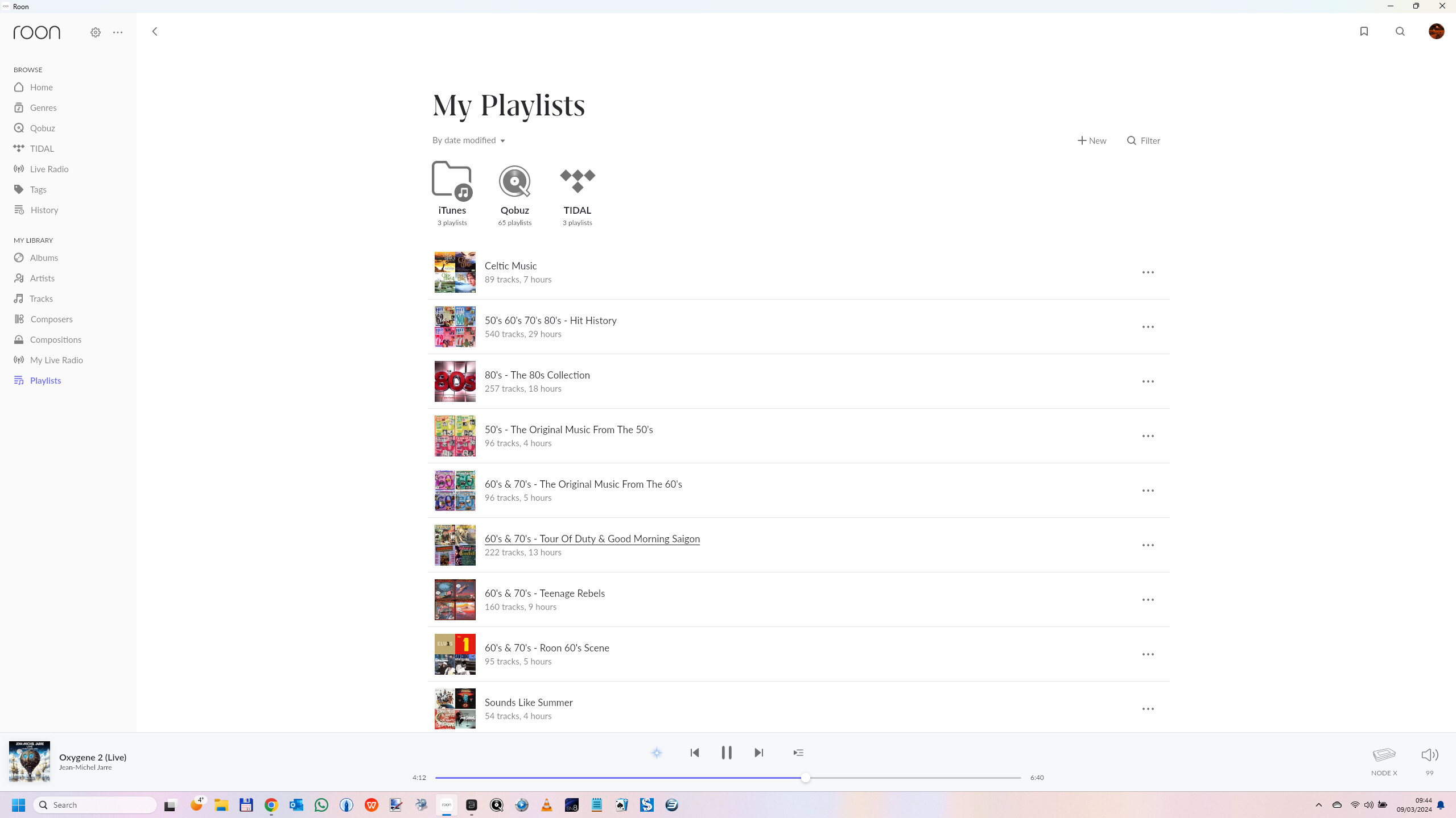
I use Roon on my Android and do not like the new Playlist layout. It used to look nice with album icons which made it easy to spot visually, now it’s just a text list. And the Settings wheel is next to Bookmark and Profile, it’s no longer in the sidebar list. I wonder why it was changed? I liked the previous layout much better.
As I find 3840x2160 far too small to read on my 27 inch 4k monitor, I’ve set its resolution to 2560x1440.
And I don’t have wasted space on the left. My playlists won’t even fit.
It reminds me of Apple Music’s interface, or that of macOS/iOS in general.
And I can’t find a way to collapse the Playlist either. Not liking this change at all.
Oh, thank you! I like that better. ![]()
Hi, I agree with you. Audiophiles, like myself, will always have an oppinion. We use Roon for more than a minute and even automatic scaling is important. The Roon developers need this information (and oppinions) to make the software better.
Thx.
Yes, there is in the settings.
Thank you. Fixed, all fine again.
In addition, many playlists are now missing. Only the ones visible on the left in the image are still available. That’s not good at all. The previous layout was really better. And I’m not saying that because I can’t get used to a new layout.
I’m really happy with the new layout. To my personal taste it’s far more user-friendly, I can easily swap between my Qobuz/Tidal playlists.
Good work Roon!
All my Playlist are there, none are missing so not sure why you can’t see them all. Although one time I was missing some but it turned out they were my Qobuz Playlist and I wasn’t logged into Qobuz so rhey disppeared…just a thought in case you may have a similar situation.