Sometimes I can see them and sometimes not. Then I only see 11 lists. But I have about 20. All songs are on my hard drive. No Tidal or anything else. I do not get it. Maybe a future update will help.
You might want to open a Support Request in the Support category and illustrate it with screenshots so that your issue can be investigated.
I found it. If you open the sidebar at the top left, the playlist is under “Browse”. If you click on it, all playlists will be shown. In the new view, if you click on Playlist in the sidebar on the left, only a small part of the lists are displayed. Sometimes you don’t immediately realize what programmers have come up with. Then all you need to do is search and try it out.
Interesting. I just noticed that the sort function on the Playlist will not save how you sort. It seems to always return to “date modified”.
Am I missing how to keep save the sort or is it not possible? I am referring to the Plalust that the list is set to not appear in the left sidebar but after you click on Playlist
This change to the sidebar makes me nervous. It feels like a change no one really asked for and it doesn’t really make any sense to me.
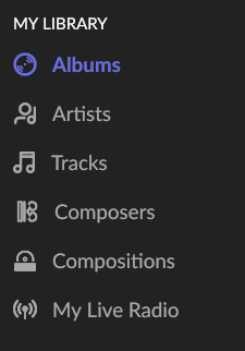
A part of what feels wrong is that the font in the sidebar is the size and style of the secondary elements in the rest of the interface. In the album view for example, the album name is primary (in bold, slightly larger) and the artist is secondary. The content in the sidebar is the same size as the artist name rather than the album title.
The content in the sidebar should at least be the same size and style as the primary information in the albums page if not larger.
Another thing that feels off about the sidebar is that the section headers (Browse, My Library, and Playlists) are smaller than the text below them. This is a very odd design choice since conceptually these section headers represent larger concepts.
You can see that these section headers are displayed in only capital letters - I think this proves my point. These really shouldn’t need to be capitalized like this, but they were probably capitalized to compensate for the small size.
Someone else mentioned these details are minute. Maybe they are, but Roon is a premium service. I expect attention to detail from Roon and I think it is justified to argue these points. They all contribute to and coalesce into the best music listening experience on the market. With a lack of competitors, the preservation of what makes Roon stand above the rest of it’s competitors is critical.

2 Likes
Now the Playlist seems to be staying sorted the way I set it; I’ll continue to work with it to be certain.
One more thing. The icons have a strange aliasing issue. This is most obvious in the Live Radio icon.
On the middle-inside of the outer-most signal line coming from the antenna you can see a really weird indentation. It’s like a pixel is missing.
The Composers icon is also really weird. First off, what is that? Secondly - the top and bottom tips of the diamond bleed into the circular elements on the right. It’s like there is a random pixel that can’t tell if it’s supposed to connect the diamond to the circle or not.
These icons for whatever reason just feel very low-fidelity. All of the circualr elements just feel rough around the edges - except for the Tags and Home Icon, for whatever reason.
I know these comments might sound bitchy or nit-picky, but hopefully they put words to some of the underlying reasons for why some of us are having a negative reaction to this change.
How many software manufacturers, Apple, Google or MS ask their user base for feedback on every UI change before it’s made?
Some people like the update, some don’t. They cannot please everyone, if they undo the changes there are people who will not like it.
How many software manufacturers, Apple, Google or MS ask their user base for feedback on every UI change before it’s made?
I think this is the wrong question. A better question is, “How many software manufacturers are receptive to feedback from their users.” This forum is evidence that Roon is receptive to feedback.
Some people like the update, some don’t. They cannot please everyone, if they undo the changes there are people who will not like it.
This might be true, but I haven’t seen anyone explain why these changes were a good design decision. I’m open to that explanation, but I can’t come up with it myself.
Maybe they were trying to fit more information on the screen? That would be an odd design decision considering Roon’s design is intended to be “light and airy, like a museum” in Roon’s words.
1 Like
If you read the thread, there are many who like it.
3 Likes
I read it, and I see only one who gives some comments on why they like it? And they seem to be talking about the playlist page specifically. Not the sidebar
To be fair, I’m neutral on the changes to the Playlists page. My comments are only about the sidebar.
Oh come on
Edit: By the way, there’s an official feedback thread for this where Roon asked for feedback. Not sure if you read that one. In any case, better to post there if you want it noticed
2 Likes
there’s an official feedback thread for this where Roon asked for feedback.
I was not aware of this. Do you have a link? I don’t see it under the feedback section.
Thanks, although that thread is really for the playlist page rather than the sidebar. My concerns are with the design of the sidebar.
If you read the thread you would see that half of it is about the sidebar design because it goes hand in hand with the new playlist features
I don’t even use playlists ![]()
I suppose you could consider the early access program, that way you’d be able to give feedback during development?
The caveat I suppose is the software is buggy, or buggier as some may say.
I don’t know if you can have a beta version on an old phone or tablet to test and the release version on your usual equipment?
I don’t know if that’s possible.
Sometimes, but if the changes are larger then it needs an EA server together with an EA remote, and then the remote from the release version won’t work with the EA server.
People continually get themselves into trouble by mixing EA and production branches, NOT recommended.
I don’t dislike the new sidebar… but for me to have my Tag visible rather than playlists would be more useful.
1 Like
They’de better created something like Favorites. Where you can place Tags, a simple playlist or something else out of Roon.
I disabled the playlists in the sidebar (its in the Settings first page).
Now I have to click for it, when I want to enter them.
On a 77inch TV - there is so much empty grey (not black) space.
Each of us users have different ways to use Roon - so I prefer the ability to define what to show in the sidebar and what not.
I never use Live Radio in Roon - so a useless menu tag for me.
1 Like