That is exactly what I used to do - but found the alpha search was actually quicker to get to an individual album. (I suppose this does depend somewhat on the size of your library - I have about 3,000 albums thus I did require quite a bit of scrolling using 1.7 once I got to the general location
I can see that the alpha method works, some what differently of course. I’ll realign my self to the new method 
Bring back the Favorite heart asap. I use this to filter on tracks
There are good reasons for putting EPs and Singles here.
- For some new artists, EPs and Singles may be all they have. Often, they’ll put out several Singles over years in between new albums. That music is interesting to know about.
- If you have most of an artist’s work, sometimes the EPs and LPs are all that’s left to be explored.
Perhaps “Recommended Albums” is just poor wording. There is a similar situation on the Artist’s page too.
Frank.
It should be there. You may need to search a little.
If you want to be more precise about which heart you are looking for, one of us can direct you.
I posted this elsewhere, but this is a better place for it:
Here is a partial list of things I liked about 1.7 that are broken in, missing from or made harder to use in 1.8. I’m referring to the desktop experience, as it appears that the app has now been optimized for phones and tablets.
- The waveform is too small to be used as waveform. It’s just a progress bar now.
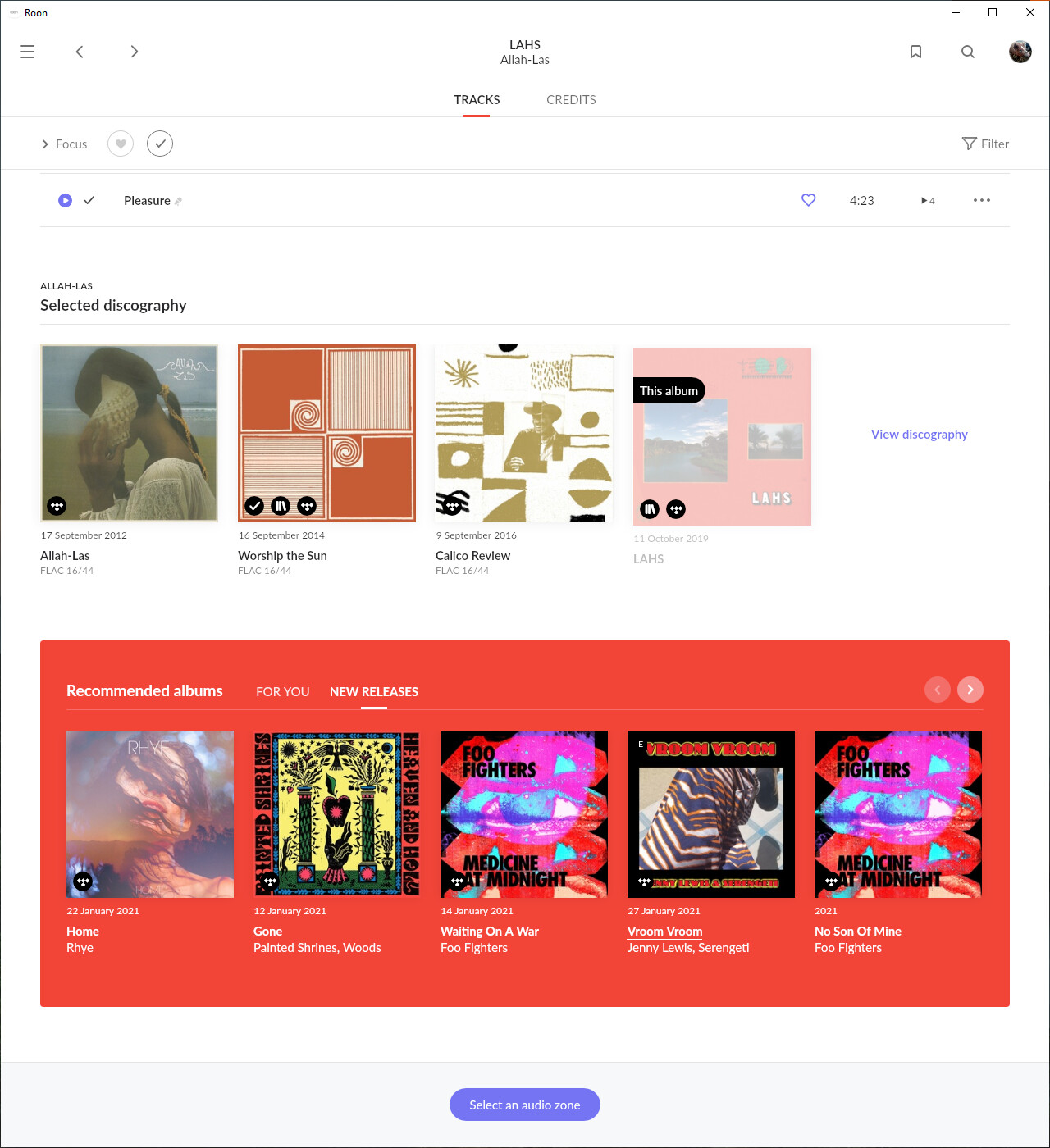
- The sidebar with album recommendations and the artist discography is gone. You have to scroll or go to a different page to find that information.
- The album title font is both strange and needlessly gigantic. The first song on the album is at the bottom of the page. This focus on massive headers is literal form over function.
- The song titles, which you actually need to read, are too small. In fact, most of the buttons and text are smaller, but there’s a huge amount of empty space everywhere.
- The current song title and artist information on the bottom left of the playback bar often has to be truncated because it shares space with the too small waveform.
- Album covers are too big, showing too few albums on the screen, once you scroll past the huge headers.
- Tagging is much more difficult to use.
- Shuffle is limited to 5,000 tracks, which means it’s broken.
- Focus uses “AND” for criteria instead of “OR”, which it should not do and did not do before, so bookmarks are broken. Focusing on “Jazz” and “Blues” eliminates all albums that are not marked as both.
- Album star ratings have been removed from where they were most helpful.
- The indication of whether a song has been added to a playlist has been removed.
- Albums are shown based on “popularity” criteria, which has rarely has anything to do with the quality of their content.
- The dark mode is too dark and the light mode is too light. Small white text on a fully black background is headache inducing. Especially when it’s interrupted by flashes of Electric Purple.
- The “queue” button has been moved too close to the transport controls.
- The album title (and other text) exhibits weird line breaks. Pat Metheny’s album called “Day Trip” puts “Day” on one line and “Trip” on another. For what reason, I’ll never know.
- The distinction between albums you own and albums from streaming services has been made less clear.
- Half of the home screen says “Hi Keith” and prominently features a huge graphical display of time usage stats. I don’t know who that’s important to.
- Dates for albums: We used to get date recorded, date released and date added. That was great, given how many reissues and remasters there are. Now we just get one ambiguous date.
- On multi-disc albums, you used to have individual links for each disc. Now they’re in a menu. So more clicks.
- There’s a startling lack of symmetry and congruence to the visual design. It’s nice to have a mostly fixed place for things to be. A good analogy would a dashboard in a car. Roon 1.8 it’s just messy. Depending on the metadata received, the arrangement of items on the album screen changes radically. There are square images, big round images, small round images, huge round circles with artists initials in them. Orange backgrounds. Blue backgrounds. And did I mention the purple?
15 Likes
You mention a waveform, as others have, I don’t see this, do I need to toggle it on somewhere?
Thanks.
It only shows with local music, not streamed services.
OK, that explains it, many thanks.
Wow, that is a pretty pointless display !
@Howard_Seward - No the waveform is not pointless, hence the huge number of people who have mentioned it being a problem for them
2 Likes
Hello - I used to be able to Favorite a track. I don;'t see it anywhere. For one it must be in the Queue screen. Do you see it?
This is a key for me because I filter on favorites
Frank
I think that the easiest way is to add the relevant album to your library. Then you can favourite individual tracks. Someone else may have a simpler shortcut?
@Paul_Williams would you care to elaborate on what has improved for you? I have a local library, exclusively classical and did not experience any difference. But maybe my ways of searching are different. Would be interested to learn what makes it better for you.
1 Like
I’m talking about the “Recommended albums” box, so these are albums related in some way to the album being viewed, but not by the same artist.
I think on the “For You” tab, it shows just albums, as expected. It’s on the “New Releases” tab that it mixes Singles/EPs with albums.
I actually don’t get the point of the “New releases” tab here anyway, it doesn’t seem to show content with any relevance to the album being viewed. Just a rehash of the New Releases section from the home page, but without sorting the singles from the full albums. Maybe it will get better with time?
1 Like
You are correct . My mistake. It is there if in your library like in 1.7. Thank you
Apologies, I meant as it is
1 Like
@Duckworp @support Could someone link this and maybe even some other very nice summaries to the original post?
Would be great to let @danny @enno @mike and others from the Roon team know about all this, so that they have a chance to take at least some of the points into consideration.
2 Likes
Problem with Tags using iPhone
I had a critical problem using some tags this morning on an iPhone 12. I selected Academy of St Martin in the Fields, and tried to turn on Radio. Screen froze. Quitting the app, and then even restarting the phone did not fix it - Roon Remote kept coming up to the same screen (frozen). Had to uninstall/re-install Roon Remote. It then worked fine for other tags, but when I selected Academy of St Martin n the Fields again the same thing happened, and I had to reinstall. Haven’t had a chance to try every tag, but most other ones seem to be working fine.
Roon 1.8 on a Nucleus
iPhone with iOS 14.4
To me, it doesn’t give as much information at a glance.
Maybe I am missing it but it doesn’t show what playlist a track has been added to as it did before. Before it would list every playlist that a track belonged to right next tot he track, i thought it was very handy.
Appears to have a lot of wasted space.