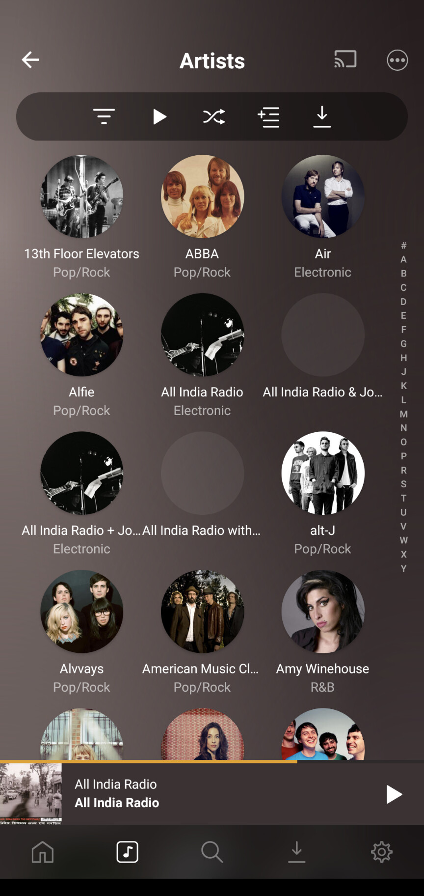
Well I appears Roons not the only app to adopt the circles for artists. PlexAmp is the same but it crops them better to keep the face in.
1 Like
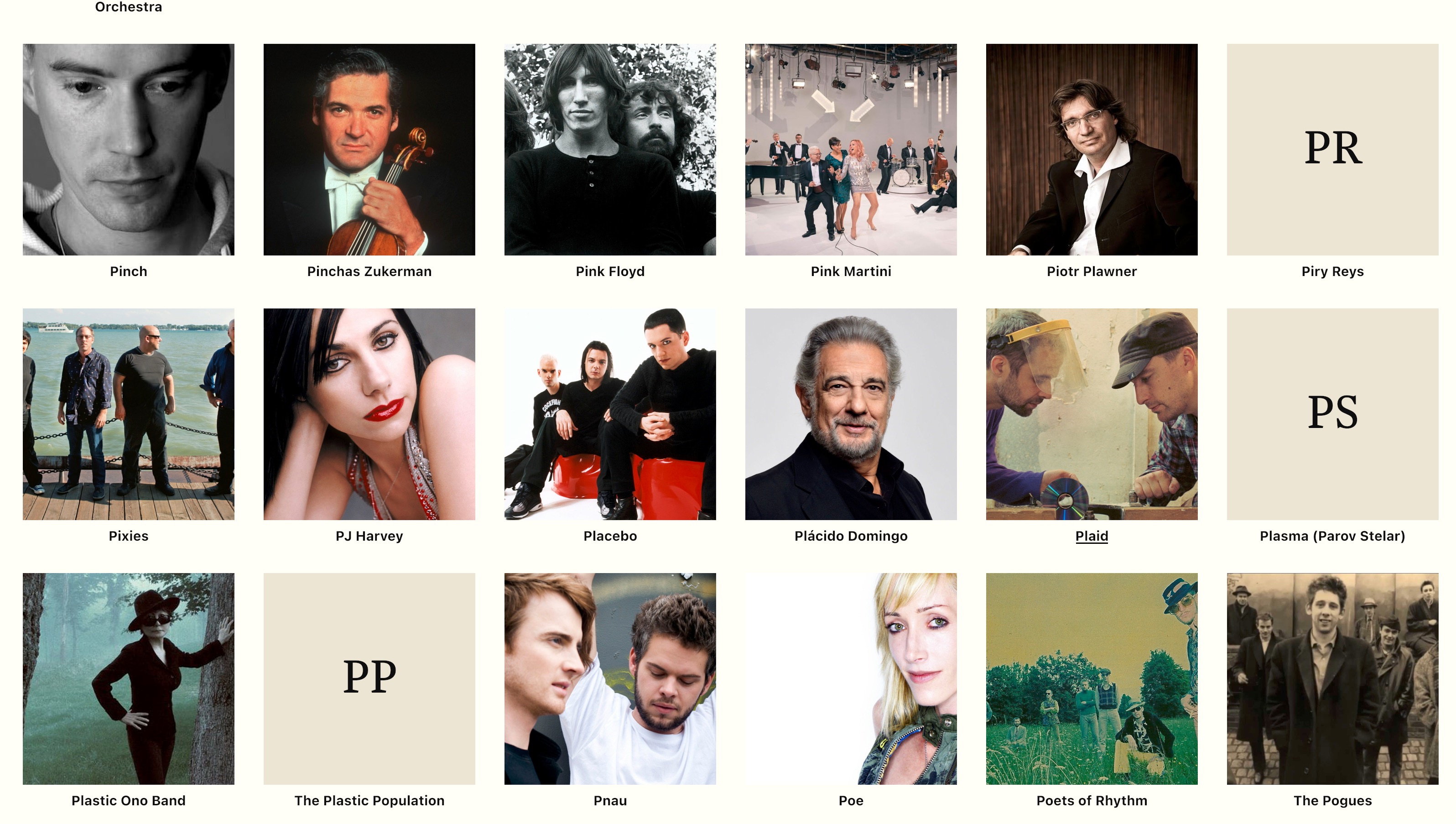
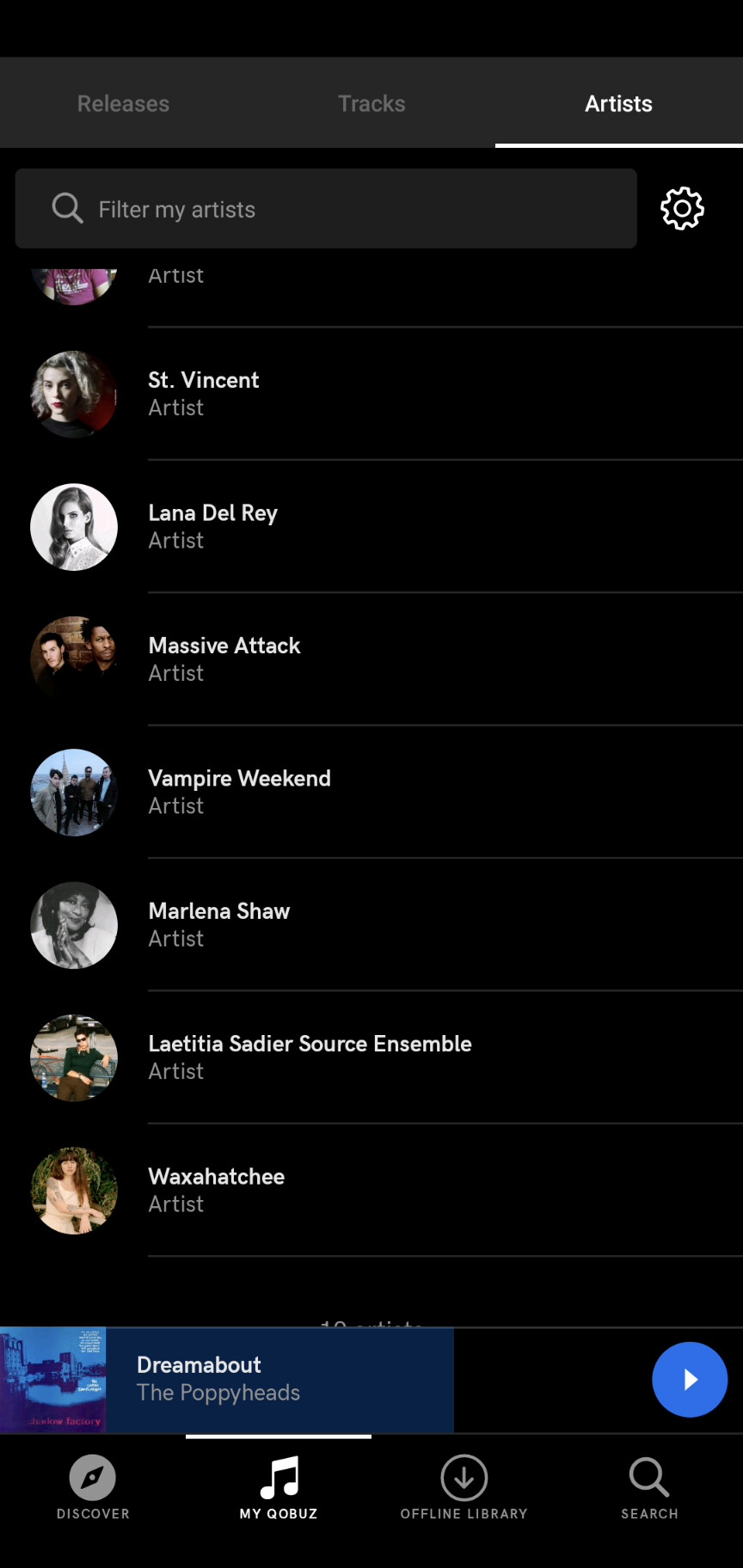
I would guess that roon employed someome who had eccentric views on graphic design or no experience at graphic design. I can’t imagine how someone with a basic understanding of graphic display would think that the same photo would be appropriate both in the circle used in the credits and in the rectangle used at the top of the artist page. For example, the photo of Joe Henderson that roon uses has Joe at the very right side of the photo in the artist page graphic, which means Joe is almost invisible at the very right of the circle, which is mostly black. I for one, would welcome the abandonment of the circle photos in credits (what a waste of space) and a return to the simple and easily understood list that was used in 1.7 and is still used for the track credits.
5 Likes
It’s not excentric my post shows another app using the same design. It’s likely the face recognition needs tweaking to position them better.
It’s not the circle photos per se that is the problem, it’s the assumption that using the same photo for a large rectangle and a medium circle without any adjustment would be great. But the circles are a problem because they are unnecessary and take up space that could be used for the essential information, to wit the name and instruments which appear in such a small font that it is not easy to read. And the layout makes it more difficult to answer the question “who plays tenor on this album”? Note that the nice list one gets with the track credits allows this as well as “who plays on this album?” because it offers users the choice. One of the problems I have with some elements of 1.8 design is that it seems to be design for design’s sake rather than design for information’s sake.
2 Likes
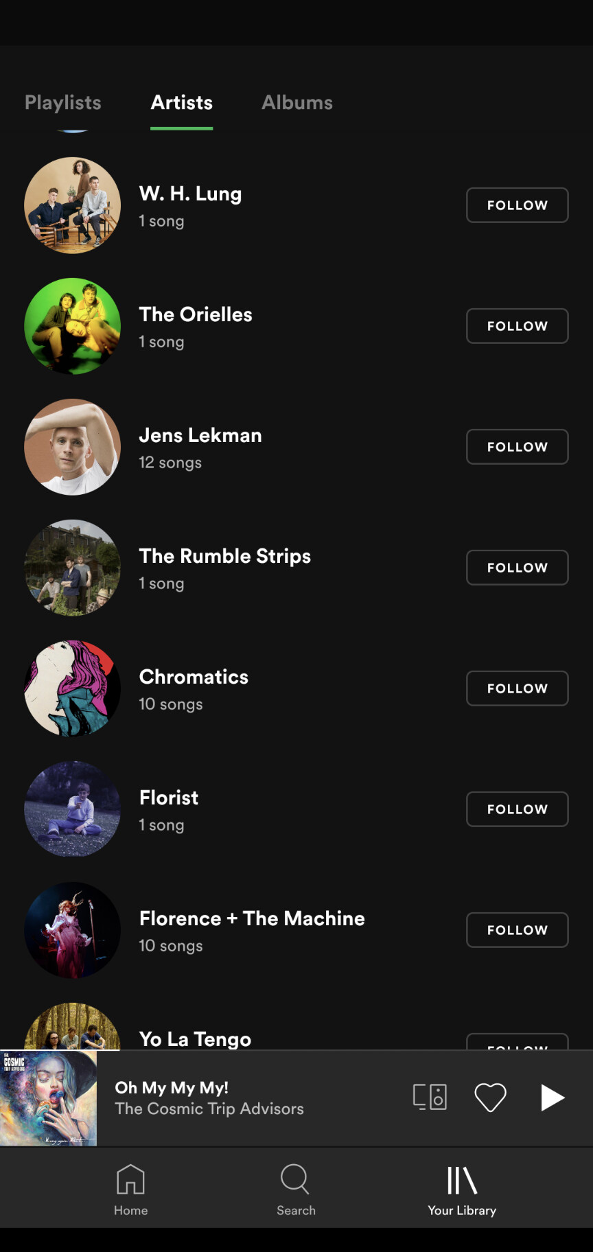
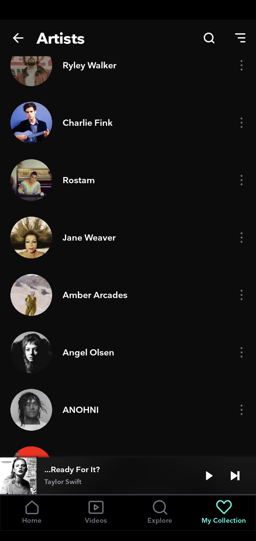
And so I love all the negative feedback Roons been given about the circles. I just checked 3 more music apps they all use them.
Probably because Roon has moved to the same design platform as these other apps are on, and it gives the same out of the box options and stats gimmicks.
Maybe also one of the reasons why a lot of us chose Roon over these other systems many years ago?
I’ve actually been very impressed by some of the skins - colours, font changes and sizes and replacement of the said artist circles by rectangles that have been created by users to 1.8 since the ‘upgrade’. The process to change these things is so apparently straightforward that I’m amazed Roon didn’t offer a wider range of themes themselves in the first place.
This might well have allowed them to avoid quite a bit of the criticism about the look of the new 1.8. It certainly would have resulted in less criticism from me!
2 Likes
Yes, they all use them, it’s just a trend but that doesn’t mean it is automatically the best choice. The amount of chopped off heads says enough I guess. The most popular music isn’t automatically the best music is it? The round circles are just the design equivalent of Rhianna.
3 Likes
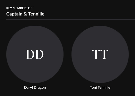
Captain AND Tennille pics are missing. Total Failure!
Of course they use circles for artists, in order to differentiate them from albums which have been traditionally square (cd and lp covers). But they (the other apps) also fill them or just leave gray. The initials on the other hand - since when has anyone thought about artists by their initials??!! Oh yeah, M.D., he’s the man, but I really prefer the playing of J.C. They just have no meaning and do nothing but add visual clutter that makes it more difficult to see the undersized actual names.
Me: Well, Rod and David did it …
My Mum: And If Rod and David jumped into the lake with their clothes on would you do that too ?
3 Likes
I think most people’s problem is with the artist circles in the credits and none of these examples have them. In the artist view, a better face recognition would indeed go a long way, but this would not solve the credits problem
Yep, that would be the logical conclusion, and would be appropriate if the majority or Roon users had problems telling the difference between them. But that’s the sort of level I think would be appropriate for the average Tik Tok user, but I suspect even they would be offended ![]() Personally, I say give us back the 21% that got cropped out in Roon’s quest to be ‘on fleek’
Personally, I say give us back the 21% that got cropped out in Roon’s quest to be ‘on fleek’ ![]()
1 Like
They copy-cated from Plex, Apple, Primephonic, Audirvana. They‘ve all been there before. But better than those ugly grey boxes they had before.
Apparently, having chatted to @Rugby about this, it’s been possible to edit Roon’s themes since at least version 1.3, but clearly nobody was that bothered until 1.8 provided the motivation. Maybe, given that it does seem to be gathering a bit of traction, this is something they’ll bear in mind for the future.
1 Like
How is an ugly grey circle better than an ugly grey box?
1 Like
My feeling as well @andy but I guess you can’t blame Roon for for wanting to be current (ahem) and on fashion, after all Roon’s GUI has not really changed much since its inception.
It was in danger of becoming like Victor Harbour in South Australia; an ageing population and no young person wants to go there, heavens waiting room, as it were.
I used to be proud of how adaptable I was but over the last year or so I truly realised I am becoming a grumpy middle aged man who doesn’t enjoy change too much.
Hopefully the algorithm will get better at its job.
1 Like
Or maybe Roon could just ditch the whole circle thing. I’m really struggling to see why it’s even vaguely popular.
2 Likes