Just put the name inside the ugly gray box and be done with it! 
I’m not fiddling in the code. Enough bugs without me creating even more 
I hate to say it, but I don’t like the circles at all. Although minor, the squares were one feature that brought me to Roon. I liked the look and I liked that it was different than most of the other music players. I would not mind them so much in the credits area if they had pictures of everyone. Why even add images to the album credits if you know they are mostly going to be blank? Makes no sense to me
1 Like
Actually, of all the recent hacks (themes, fonts and squares) changing to squares is the one that’s least likely to cause any problems beyond messing up the appearance if you get it wrong. It’s just a quick edit to a couple of .png files.
I‘m perfectly fine with the bubbles. @AnimalOnDrums needs your help, maybe 
1 Like
If nothing else I hope they lose the initials. I think the problem is, the brain is searching for a name first, a picture secondarily, and then the brain is totally thrown off by the initials as that is rarely how someone is searched for (unless it’s JJ Fad perhaps). That said I don’t like totally blank squares either. Perhaps the full name faded back or something. A subtle classy X? 
I have disliked the circles since Apple introduced them a long time ago on iTunes but looking at yours and @bbrip screenshots I am actually struggling with which I now prefer, the squares could do with a radius on each corner (I’m an ex Mechanical Design Engineer) ![]()
1 Like
Squircles, … with a configurable corner radius. That gets my vote ![]()
1 Like
I think I know what the developers were eating during lockdown:
Rough edged squares look rough. Just ask Jony! Give them gently rounded edges with a 3D-Aluminum-Shade and I might drop the bubbles 
Its just too few bubbles per page. We need that option „Allow for more covers“ back to see more content again per page on our iPads!
1 Like
I wonder what Andris Nelsons actually looks like?
 Many artists jumped out of the picture. Either being afraid of Roon or Roon failing to focus on faces.
The latter has been recognized as an issue - so hopefully Andris will soon show in full beauty.
NB: I‘ve also got some stunning forehead-shots. Not now, getting late.
It’s equally bad on my Macbook Pro. If I have Roon full screen I can get 24 full artists and about 2/3 of another 8, but if I reduce it to half the screen (split vertically) I get 20. The size is fine at half screen, so double that up and I’d get 40. So yes, bring back ‘allow more album covers’.
Well I guess it could have been worse then. Round is better than Calzone shaped ![]()
Be patient. That’s 1.9 ![]()
1 Like
I was thinking jump off a bridge but same idea
It’s another personal preference nit on a nat, just like the purple color. It doesn’t matter. People here are going to complain regardless.
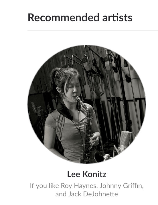
In 1.8 we have many more screens that have a mix of albums and artists. The artist circles help differentiate between the two more easily.
We know that some of our artist images have poor face recognition or are not well suited for the tighter cropping. It’s an area we are working on some solutions to improve.
2 Likes
Everything that was taken away in 1.7 needs to be brought back. Deleting a whole bunch of stuff from 1.7 to replace it with things we don’t want and long workaround made no sense at all. I am serious when I say pretty much all of the functioning needs to be brought back from 1.7. Until it is, people are just going to complain and request those features be brought back. Then Roon can move onto to fixing long lasting bugs and implementing 5 years old feature requests. Once that is done, then Roon can create a better product
2 Likes