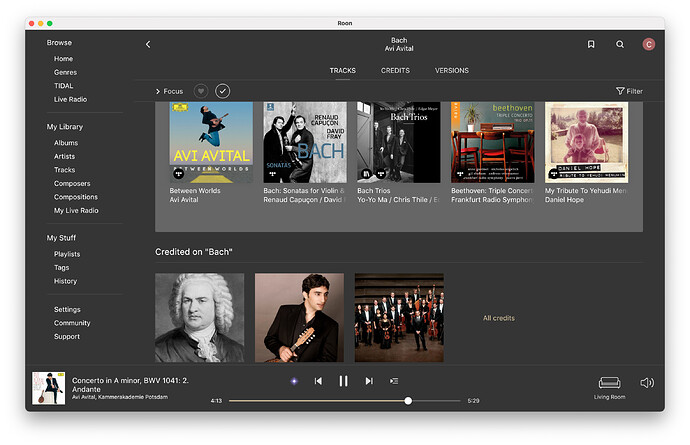
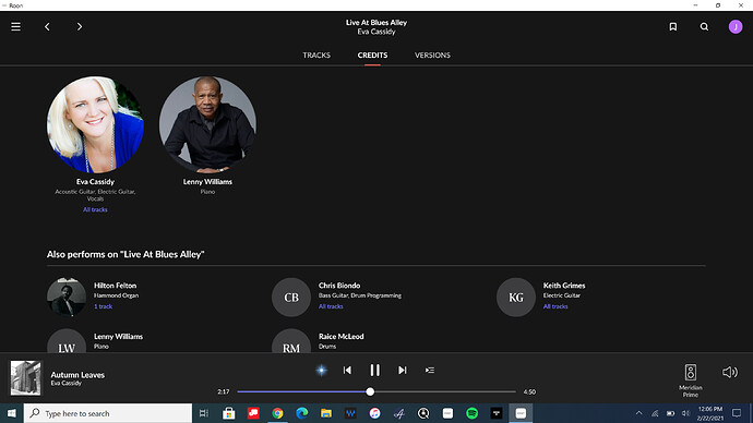
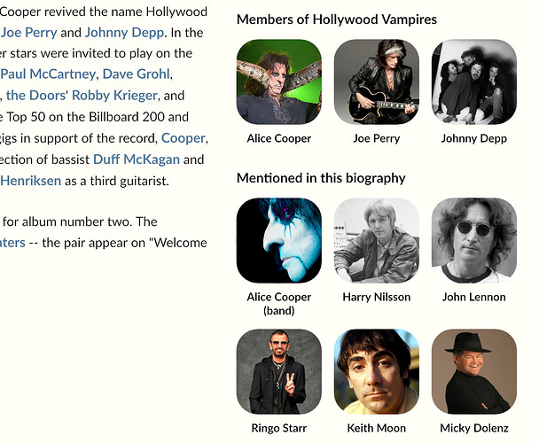
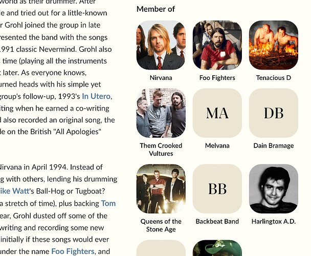
Seriously? Do you really think anybody is going to do/need that? Maybe first make it so that at least more than one line of complete images can be shown on a screen at once (13" MacBook Air). Plus artists have one name line below their pic, not an album title and name. And I’m not seeing where they would mix on the screen so much - maybe if one plays a mix of albums and artists on the recently played screen but that’s about it.
There a thread on how to turn them into squares and change colors to your liking. They‘re fine for me, once Roon gets the center-on-face right.
I’m with you on this one. Maybe - and it’s a small maybe - maybe someone who opens Roon for the very first time might benefit from such an obvious visual pointer, but going beyond that use case I can’t really see anyone getting even vaguely confused because both are square ![]()
I think it’s super useful to have that kind of visual differentiation. Is it too much? I don’t know. You can use color, or just rounded corners, or all kinds of things. And I bet some of the same people would dislike those too, and some people who dislike this would like that etc etc.
But yes, I do definitely think that a clear differentiation between entities of different types (in this case: people = round, recording = square) is super useful for navigation, and not just on the first time. They’ve chosen this convention; maybe they will choose a different one, but having none seems retrograde at this point. That kind of training on how to read “what am I looking at” at a glance, is what allows folks to become fast happy repeat users, not just the first time but more and more over time. I get that many folks don’t like it, for a variety of reasons, but casting aspersions about “only novices” feels kind of unpleasant.
OK, that’s an interesting way of thinking about it, and you do have a point. I suppose I’m coming from the perspective of a long time user (December 17) who a) knows his way around Roon, and b) finds the circles both unnecessary and visually unappealing. I find them detrimental to my enjoyment of Roon, but it’s not a huge issue, and I certainly didn’t mean to imply that other established users were akin to newbies if they like them. So my apologies for any confusion.
I’ll get back to trying to find out where the ‘released year’ info on an album has gone. The original release date is still there, as are the recording dates, but the ‘released year’ seems to have been removed.
Thanks David, I totally agree with many of the “stuff got buried” sentiments… so appreciate the flexibility of perspective on this one (Not to mention the apology; not needed but always appreciated!)
BTW, much respect on all you (& others) have done on themes. I kind of love that this is all possible, and not discouraged, but not actively encouraged/enabled. I’m a “leave it and get used to it” type for software, but there are plenty of other domains in which I’m not (eg, cars).
And that’s the main problem here: all of these are not huge issues when you take them separately, but as a whole the entire user experience is getting worse.
People will always like one way or another, the main joy killer here is the roon stubbornness of not offering a decent level of customization.
A different sized square could also work. Anyway squares look better even if they are the same size with albums. A group of artists in squares on another line would probably cause less confusion than the ugly distraction they create.
But it is the developers’ choice and we have to get used to it.
An album cover is generally not easy to confuse with an artist picture I guess.
Well, you have options.
I think there are 3 interrelated sets of problems with 1.8 at the moment: Stuff that is genuinely broken (crashes etc); the removal of preexisting functionality, and a whole bunch of aesthetic issues (themes, artist circles etc). I’m sure that Roon will fix the first set - these are genuine bugs - and we’ve been playing around with themes and .png files, so that takes care of the third (albeit in a not entirely satisfactory way), but it’s the second set that worries me the most, i.e. previous functionality, information, and so on, that seems to have been stripped out for no apparent reason (playlist info on tracks, release year, etc). So yes, customisation - both functional and aesthetic - would definitely be a huge bonus at this point.
You mean themes editing?
I mean you can always vote with your money…
The mids sound fine, but there’s no bass extension and the highs are now overly compressed ![]()
Maybe it falls off a little around the edges.
I already paid lifetime.
And I love Roon. This alone is not a reason for me to switch. I just express my opinion in case they listen and do something about it.
Which brings us to the reality of the lifetime situation: once you paid you get to eat whatever ■■■■ is on the table, as opposite to the monthly fee for example when you can actually have at least the idea of an impact you can make for the future of a product that you love.
I see no signs that roon loves you back! ![]()
I don’t love roon, for me it’s just another tool in my very complex and old musical enjoyment journey. I started this journey probably long before some of roon team were born, so I really do not expect them to understand or accommodate my habits. I was whatever expecting from them to understand software development, that was until 1.8 punched me directly in any good technical sense I may have, from the design up to the deployment. For some time the tool was good enough for what I needed, now is not, tomorrow it may be again. No big deal, I have a lot of spinning gear that I listen with on daily bases, none of which are spinning around roon.
You say squircle, I say …
… moderately better than circles ![]()
