I know many of you wont agree as change is often met with criticism though I would like to see a UI refresh in Roon. Its looked the same for some time now and I like change to keep things feeling fresh.
Maybe a full dark mode given OLED screens are very popular these days.
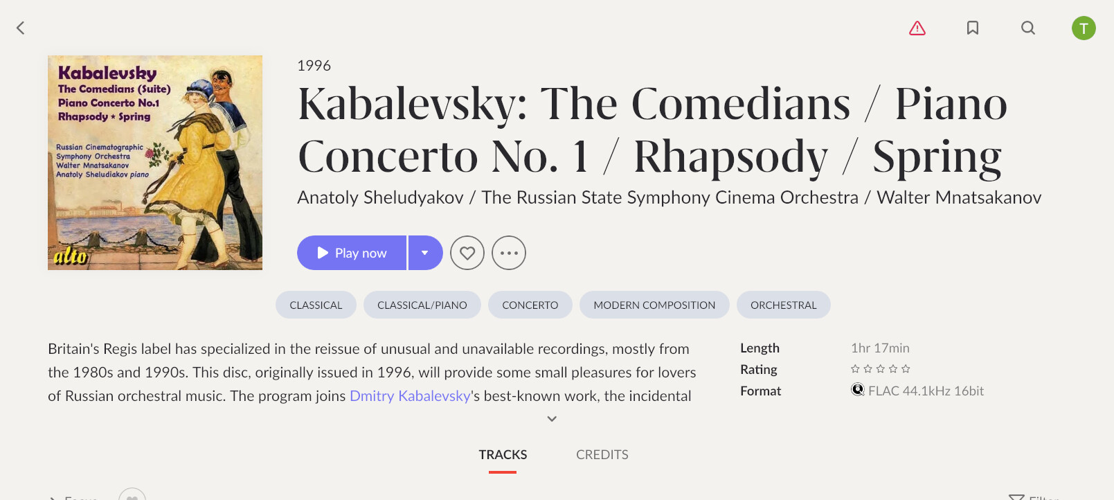
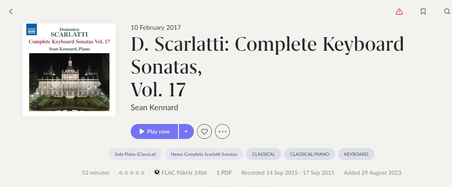
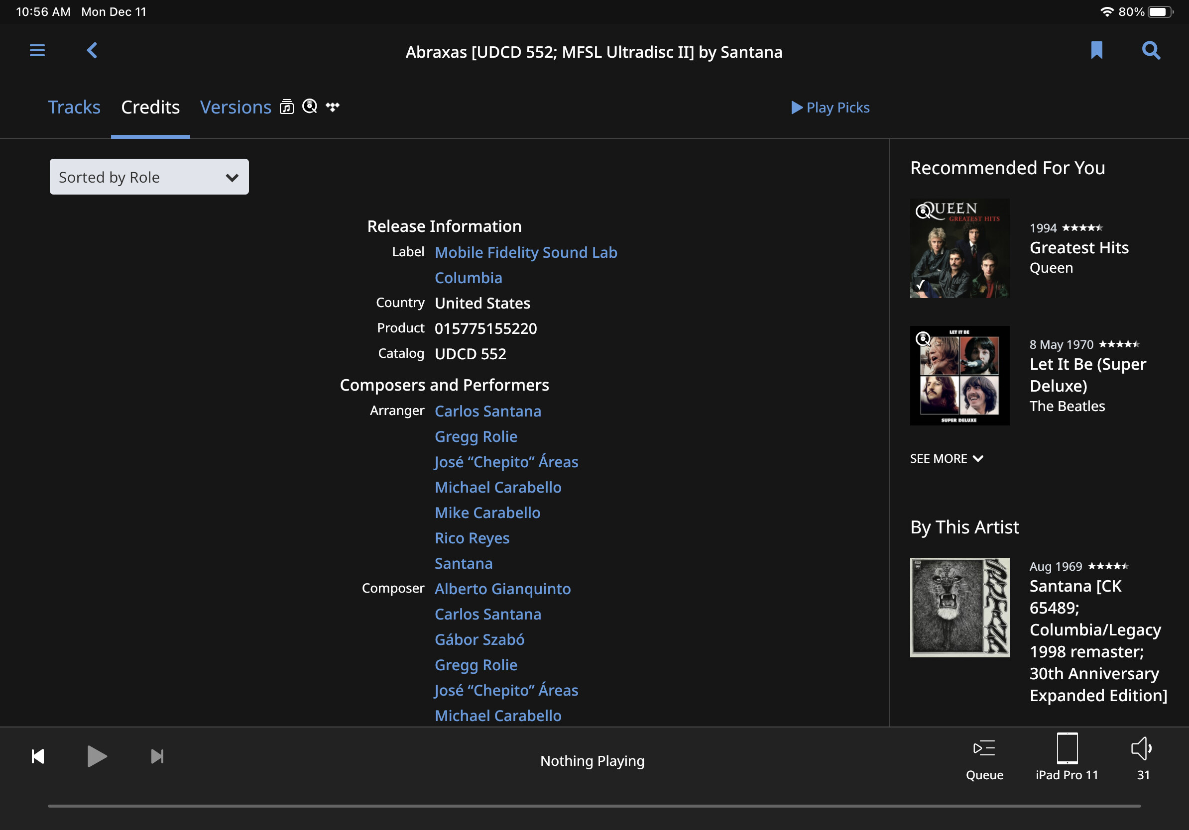
Yes, scroll bars. Also the giganticism of the fonts suits only some genres. Classical albums, for example, rarely have a real title. Usually it is a list of the recordings and that leads to cluttered and difficult to read screens:
Yes it does. Esp the fonts and use of screen space. Andstill how many clicks it can take to do some things. Personally, I’ve always wanted to see more of a tab style layout with user adjustable menus, but I guess the platform it’s built on won’t allow that.
I would love to see more items being made user customizable, such as fonts and font size. Plus the ability copy text from the UI - this would be very useful for when Roon fails to have any worthwhile information on an artist or recording and one needs to do a web search oneself. By the way, this is happening more and more now since the streaming services often have almost no information about new recordings from lesser known artists.
I don’t like change for the sake of change. I prefer Roon spend their resources solving problems. It wasn’t that long ago we had a total remake of the UI IIRC.
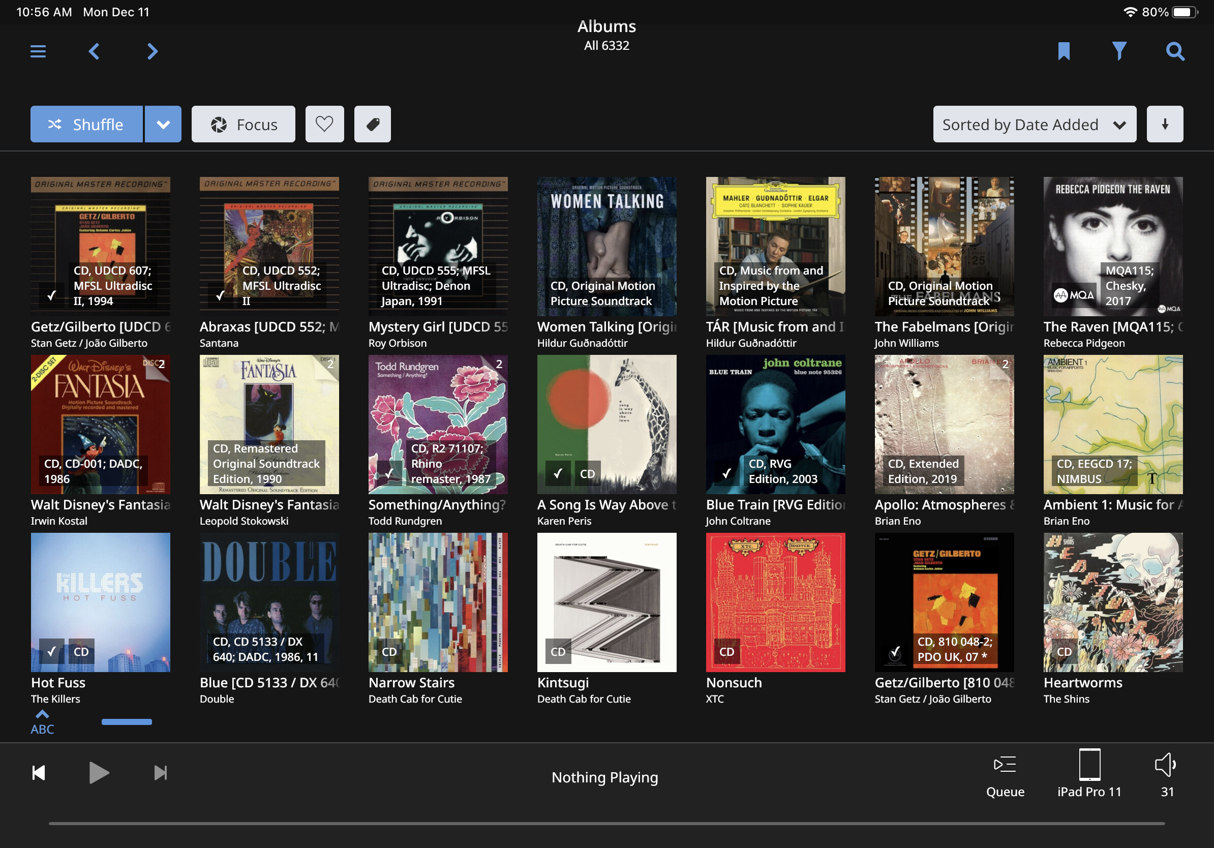
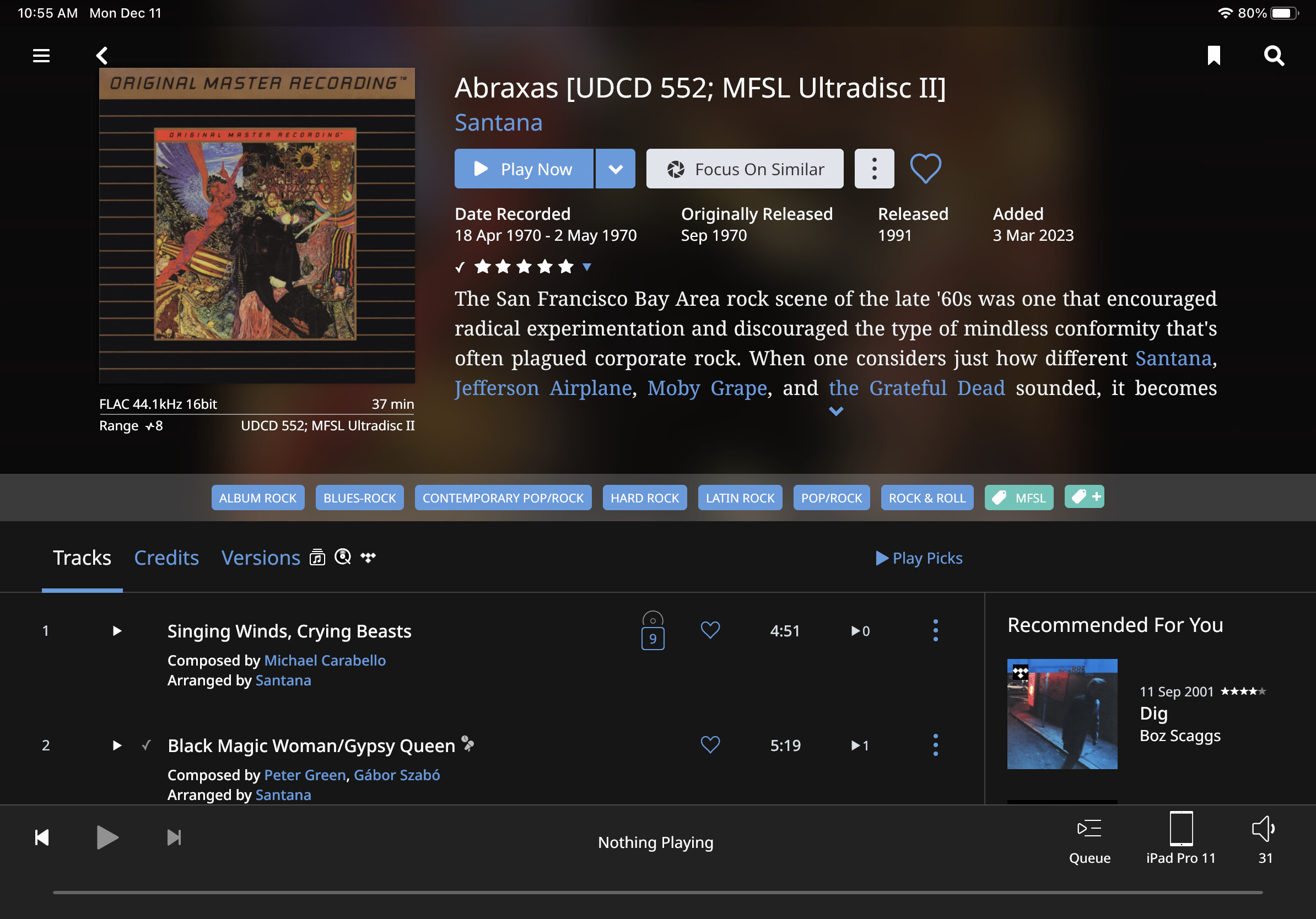
My Mac Mini Roon server as viewed from my Dell 15" laptop using Splashtop.
Agreed, but the UI changes they made were not particular great imo or others. It’s just got so much wasted space. But we will get new features over fixing broken features and even more broken features. Seems to be part of the course for last two years.
Oh if it’s grumpy old men you want…happy to oblige.
Harrumph, young whippersnappers don’t know they’re born.
I welcome change as long as nothing is altered or different.
Quite the opposite. I think you’ll find the moaning is about the lack of change regarding requests to fix stuff (font size/spacing etc). Requests for flexibility and customisation have fallen on deaf ears.
If you are on a tablet, can you show these two screenshot in portrait orientation? And how does Roon decide album title should be on 2 or 3 lines, why did it split your second screenshot album on a third line?
Edit: and also the incosintency - look at the position of Play button… should the Pay button “float” so to say? I thought it should be otherwise, like the title and credits should “shrink” by font size to adjust…
If there was a UI change, I would like to see the following changed:
Artist view. On a big 12.9" iPad Pro, when I go to an artist, I see: a) a huge picture of the artist; b) two tabs - overview and discography; c) a line with janre bubbles; d) one-and-a-half lines of the artist bio. I would prefer, instead of being forced immediately to scroll down, to see at least some of the albums that are in my library. Not popular tracks, but albums.
Album view. On a big 12.9" iPad Pro, when I go to an album, I see, just like in artists view, not the album songs but other info. I would prefer to see the album songs, first and foremost, and not be forced to scroll.
Andrew, how is this different from the way Roon looks NOW? I fail to see any difference in your shots vs. current UI.
I guess I’m just insensitive to “look and feel” - I have the same observation going from one version of Windows or macOS to the next - I seldom notice any difference whatsoever