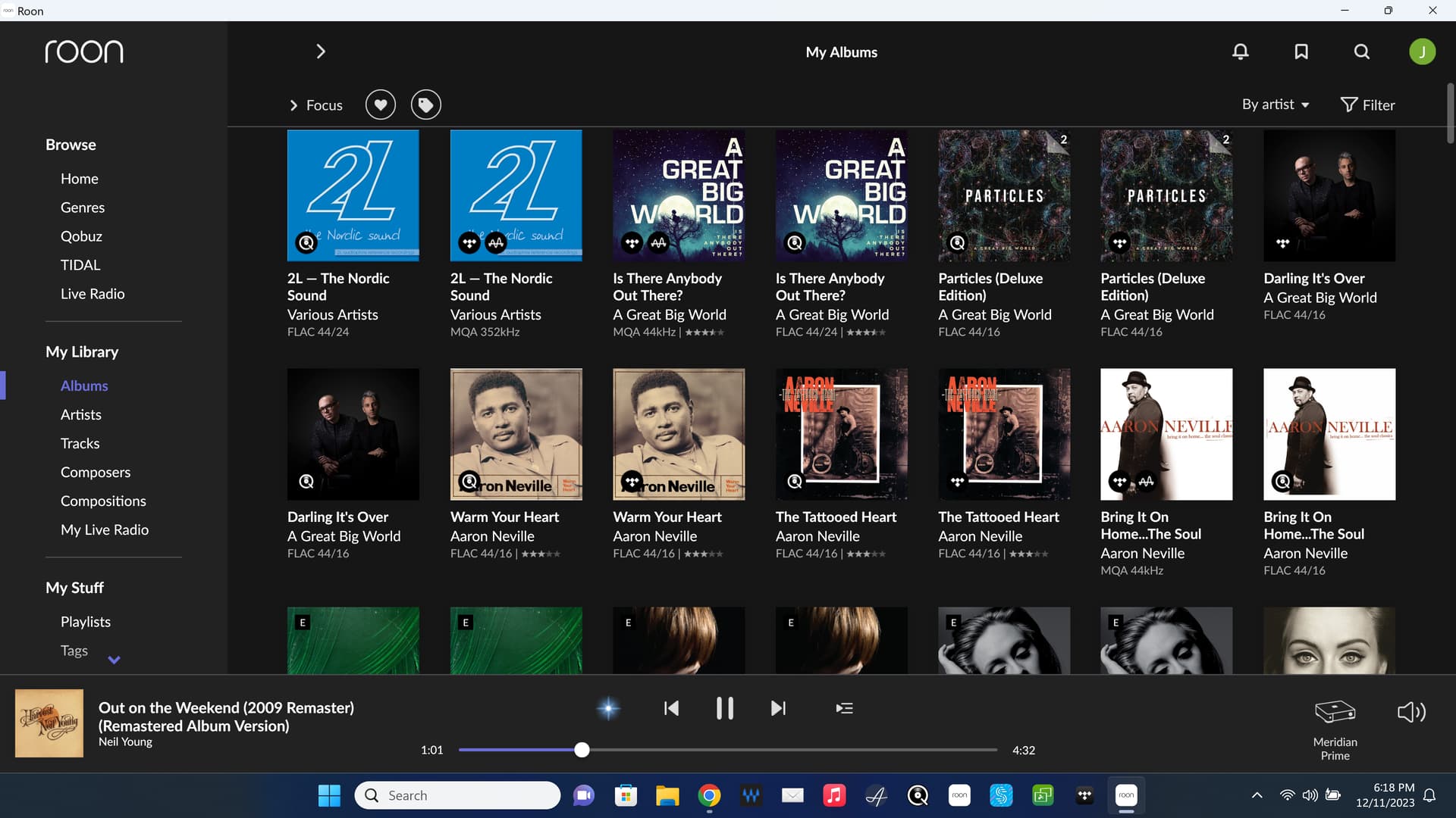
That is Roon 1.7, which remains probably peak Roon for interface design and local music library playback.
AJ
That is Roon 1.7, which remains probably peak Roon for interface design and local music library playback.
AJ
I don’t have a tablet and I don’t use a phone. The screenshots are landscape on a laptop. I would imagine in portrait mode the examples I posted would take up most of the screen.
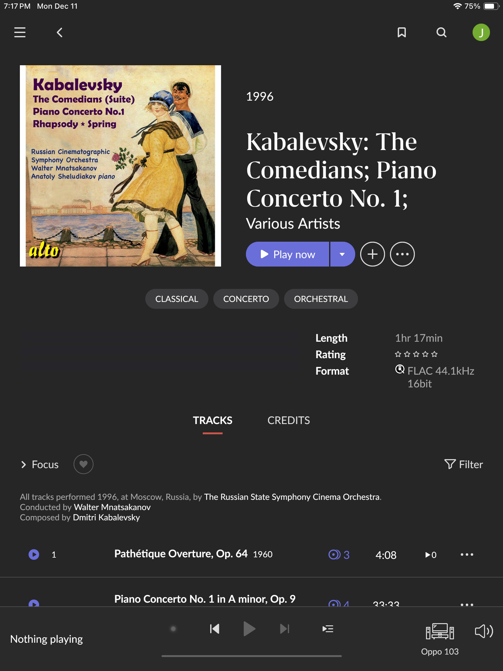
The two I posted were just chosen at random. They are common. I find my self editing the autogenerated clutter all the time but it still ends up looking pretty bad. Here is another one:
Fair enough ![]() I’ve been a Roon user since (before) Day One, so any changes they’ve made have just faded into the background for me.
I’ve been a Roon user since (before) Day One, so any changes they’ve made have just faded into the background for me.
All I use it for is to collect and play music, so unless they choose some wild color scheme you cannot change or change the interface fonts to emojis or some such, I probably won’t notice LOL
For the main Roon screen I use the “My Library->Albums” view and I would like there to be the ability to see the entire album name, perhaps in a text popup when one hoovers the mouse above the album. currently one has to actually select the album and go to that album’s screen to see the full title. Not a big ask but I’ve been requesting the ability to view *.txt files in Roon, similar to the way one can view image and PDF files, which is also not a big ask, and it has fallen on deaf ears.
They’re not deaf. It’s just an incompatible endpoint…
Happy memories, search actually worked reasonably well back then as well.
More than just memories. Check the clock in the screenshots. They are dated today.
AJ
How are you able to run 1.7?
I have active at least three different ROCK machines, dating back as far as 2018.
AJ
It’s really weird to still have no scrollbars displayed and I get regularly completely lost in playlists.
There another bug comes up: the current playing song is not highlighted with the playing icon!
Why would you want the dock obscuring the screen?
If you mean the thing on the left, I want that always visible. That’s how I like it.
This is my Nucleus.
Ah, the good old days ![]()
It all worked so well back then. Less cloud a nicer interface, slower releases that has less glaring problems and you could get support to answer in under two/three weeks. Halcyon days.
As a new Roon user, I think the GUI interface is lovely. I just wish they could fix the choppy scrolling on the Mac. It sucks to go from buttery smooth ProMotion to Roon.
Well I don’t care for that at all. Call me a grumpy old man ![]()
I would just be happy if the release YEAR was able to be added to more screens.
One pet peeve of mine about the UI is how you have to click (or right click) an album and then click Play Now. It’s very cumbersome compared to other services like Apple Music where you can just hover over an album (or anything) and click Play.
I never did understand the circular artist images. Most pictures are rectangular. Why try to fit that to a circle?