I would love support for smaller resolution size screen resolutions. Haha, I have my Roon core, which is a Microsoft Surface with a small external touch screen display thats on all the time.
What drives me most crazy is the need to constantly click through elsewhere to do some basic functions. For example, I often browse for other albums when one is playing (or if Radio has started). See example. But there’s no way to add a track that’s currently playing to a playlist when in album view if it’s not on the album in the view (and even then one would need to scroll down if it’s not the first couple of tracks) except to click through to the Now Playing screen, and then click through another two times to add that to a playlist.
With all of the real estate on the ‘playing bar’ under the album view, why can’t there be a simple add to playlist there? Even better would be an add to ‘last playlist used’ that needs one click only to add a track (and one click to remove). That would go a long way to making playlists less of a chore. This is but a small example, to me, of the cobbled together over time aspect/feeling of the current Roon UI. Too much unnecessary scrolling and clicking.
IMO (and I’ve got lots of them, lol) Roon hired a designer for 2.0 to make it more ‘hip,’ and who might be good at designing some things, but a data asset management program wasn’t one of them. They should have followed the K.I.S.S. philosophy.
I have some recent experience in something just like this. I hired my friend, a renowned album cover/poster designer, to design my new (music related) photo book. It was a rocky start, because he admitted he had no clue as to what he was doing having never art directed a book before. In the end we got a great design, but it took lots of re-inventing the wheel on his part, with direction from the publisher and I to not let the design take precedent over the photos, so the design treatment got simplified to just accent the book and the photos. Yes, at the start of the project he felt a bit deflated, but as he got more info as to what it should be, the better his designs got in relation to the overall intent and ‘function’ of the book.
FWIW, I don’t think this is what a meaningful portion of Roon subscribers use the service for, or think of it as. I think that’s one way in which Roon was originally sold. As its markets and use cases have expanded (to include many more who stream fundamentally or even exclusively) there are a lot more people who use it as the most capable software for music discovery / content / relationships. And in that context, having a visual signal / cue that different images are for different entity types makes more sense. And, in many of the more mass market streaming products from which those newer users are coming, this is more of an established convention (round means artist, and yes I know it’s not universal by any means but it is popular/well understood). So, if Roon were designing from the ground up without any ecosystem / competitors, they might do something different. I can personally get used to most things, so it doesn’t bother me. But I do feel like Roon is serving many users / use cases, and sometimes its hard for me or anyone to know what the user stories / user segmentation and prioritization are, and that’s ok - it’s my challenge to know if it’s still the best thing for me.
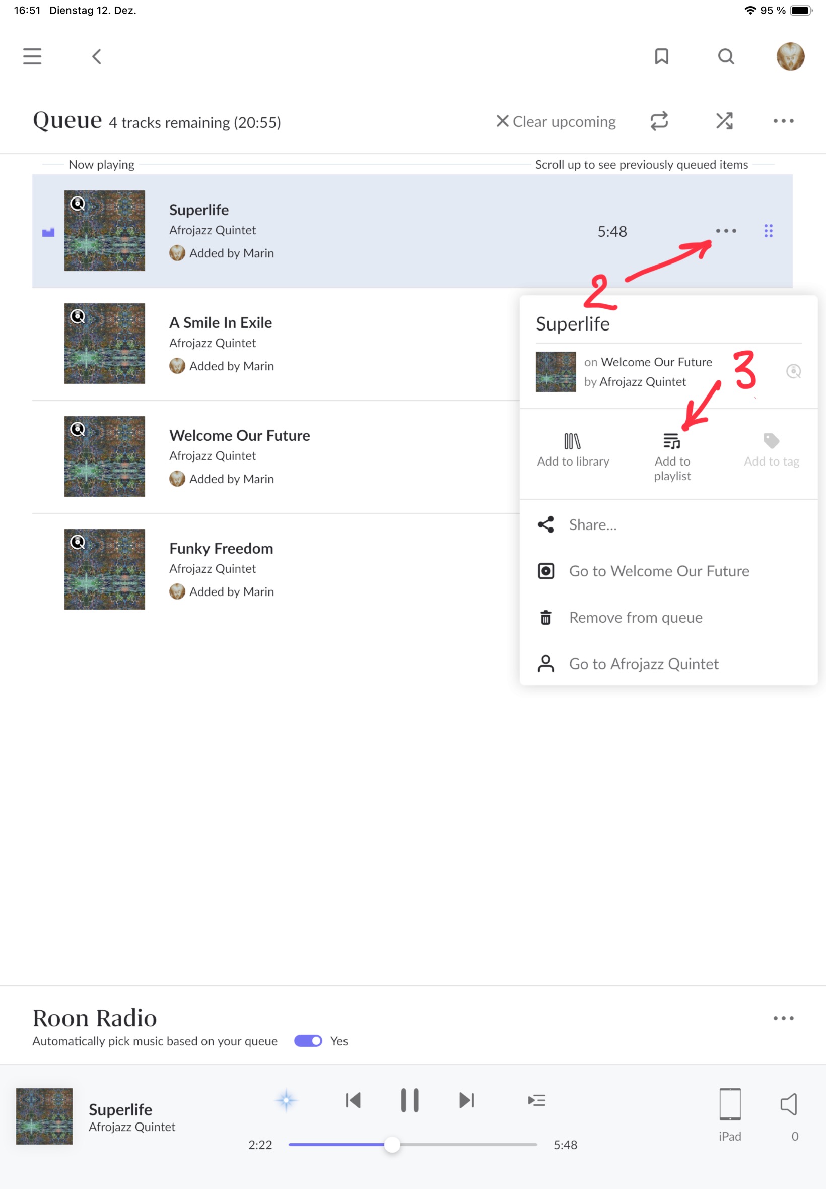
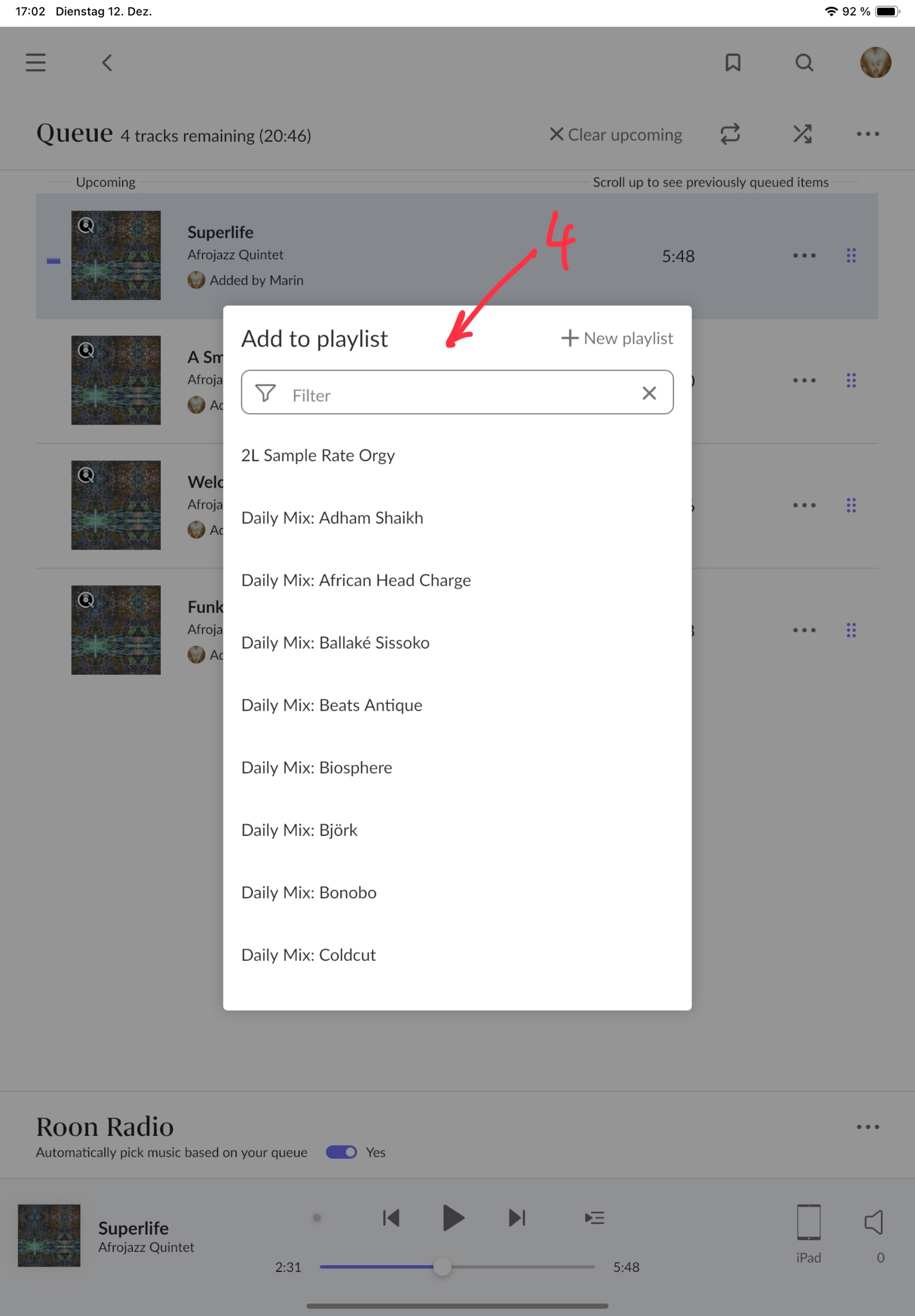
Off topic, actually, but in this use case I open the queue (1 in screenshot) with the top track being the one I’m looking for, where I’d click the three buttons (2 in screenshot) to open the pop up (3 in screenshot) and add it to any playlist in that pop up (4 in screenshot).
It’s not a one click action but more streamlined than your description.
Yeah, I just figured that one out on my own as I was writing my critique above. Still far too many clicks, as one has to still then go back to the album view. My point is that one should never have to leave a ‘view’ to go to another (and then back) to do basic functions like adding a track to a playlist. It’s just ridiculous topology imo. I should be able to build a playlist of 50 tracks with 50 clicks (ok, 51 if setting up a new playlist) and not 250 (by my count using the queue system above) while also browsing albums (it’s still 150 if remaining in queue view).
A good example of how it can be done is in Lightroom, where one can build ‘playlists’ called collections by either dragging and dropping images to it, or using the B key to add to the target collection. So I can set up a new collection/‘playlist’ and set it as the target, and then navigate to any folder in the 250k images I have in Lightroom, hit B, (or use the top menu dropdown) and it’s added to that collection. Hit B again, and it’s removed.
It wouldn‘t be for this one, but some people want rectangles and others want lists without pictures, and suddenly you have three versions of layout code. The bane of software development is piling options and explosion of code paths.
I hear you with having too much clicking to do, but to answer that sentence you’d just click on queue again to go back, or use the forward back arrows top left…
FTR I really don’t mind artists being in a circular frame. It’s the topology that does, and the waste of screen real estate (esp on desktop) that could be used for streaming navigation.
Which is still more clicking… sorry, I appreciate the insight and help, but going to the queue page to have to add to a playlist is no different than going to the Now Playing screen or wherever else. One still has to return to where one was at before. That shouldn’t have to be.
Sorry to keep drilling down, but I think focusing on what is probably the most used piece of Roon - the bottom play bar - is representative of a lot that could be changed with the ROON UI. Another thing about that play bar that drives me nut is the inability to separately click through to album, artist or track. Yes, I know, if I click through to queue or Now Playing I’ll get to those, but the functions should all be there in those big gray spaces on the play bar currently doing nothing.