I think that logos are great where appropriate but not all of them are created equal so they need special attention if they are to form a big part of Roon’s UI going forward. Enforcing a resolution floor would be a great first step.
Tool, mentioned above, were represented by their iconic logo which looked great in Roon until somebody flagged every permutation as ‘not the artist’. This isn’t VAD’s fault, this is the action of one user with a strong dislike for logos.
I have no issue with artist logos in Roon as long as they are technically good enough for the UI so I think they should remain as an option on which to vote. I think an artist logo is infinitely preferable to a ham-fisted avatar crop in situations where a photo of suitable composition cannot be sourced.
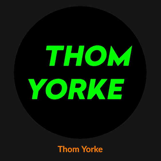
Logotypes like Thom Yorke’s do nothing for me but it clearly affects some users strongly enough for them rank it ahead of the multitude of neatly-cropped pictures of the man himself. Different strokes for different folks and all that.
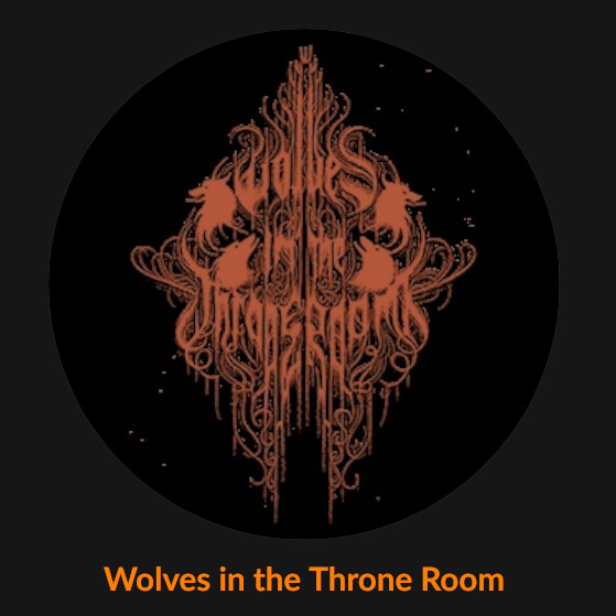
Wolves in the Throne Room’s current logo choice looks like a soup stain because it is a high complexity graphic, presented with low contrast at a low resolution – an unholy triumvirate.
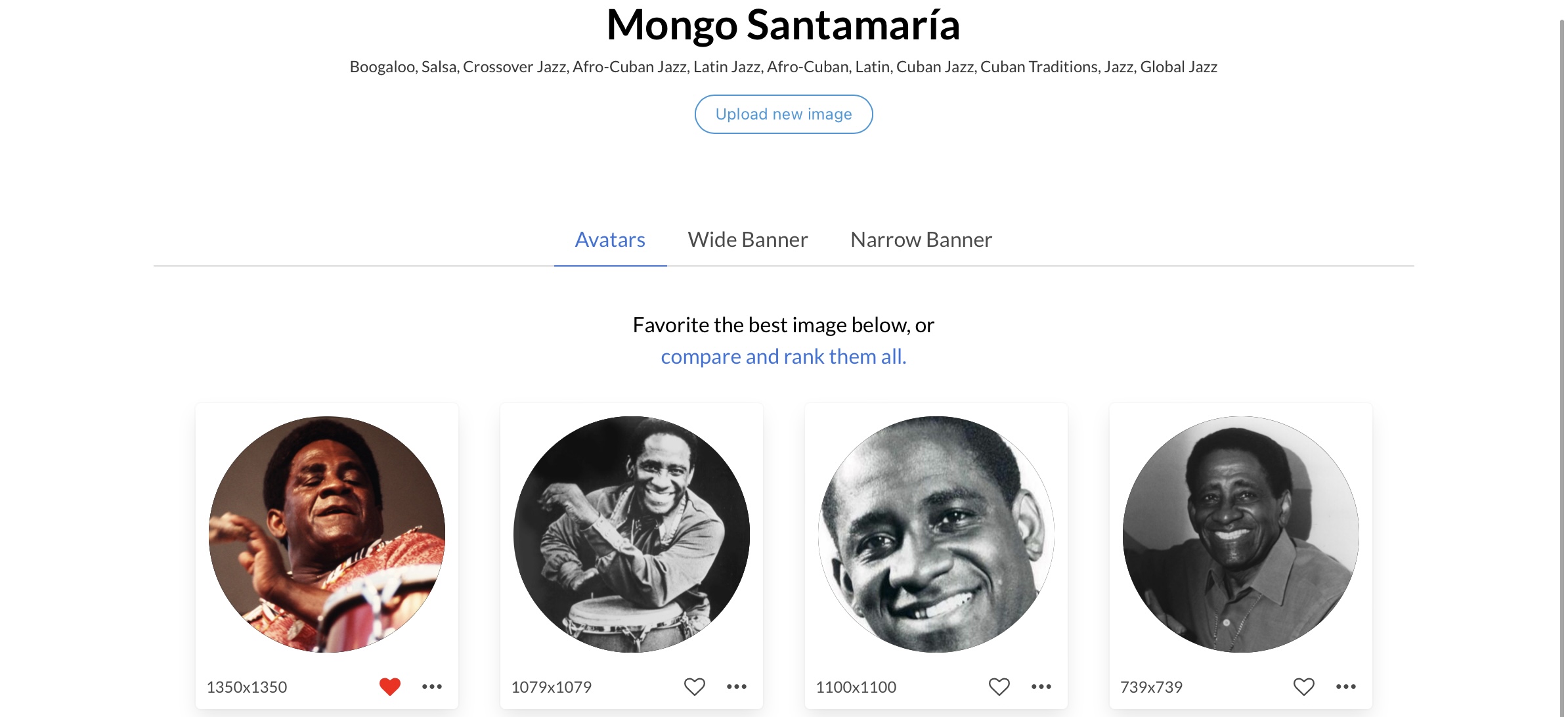
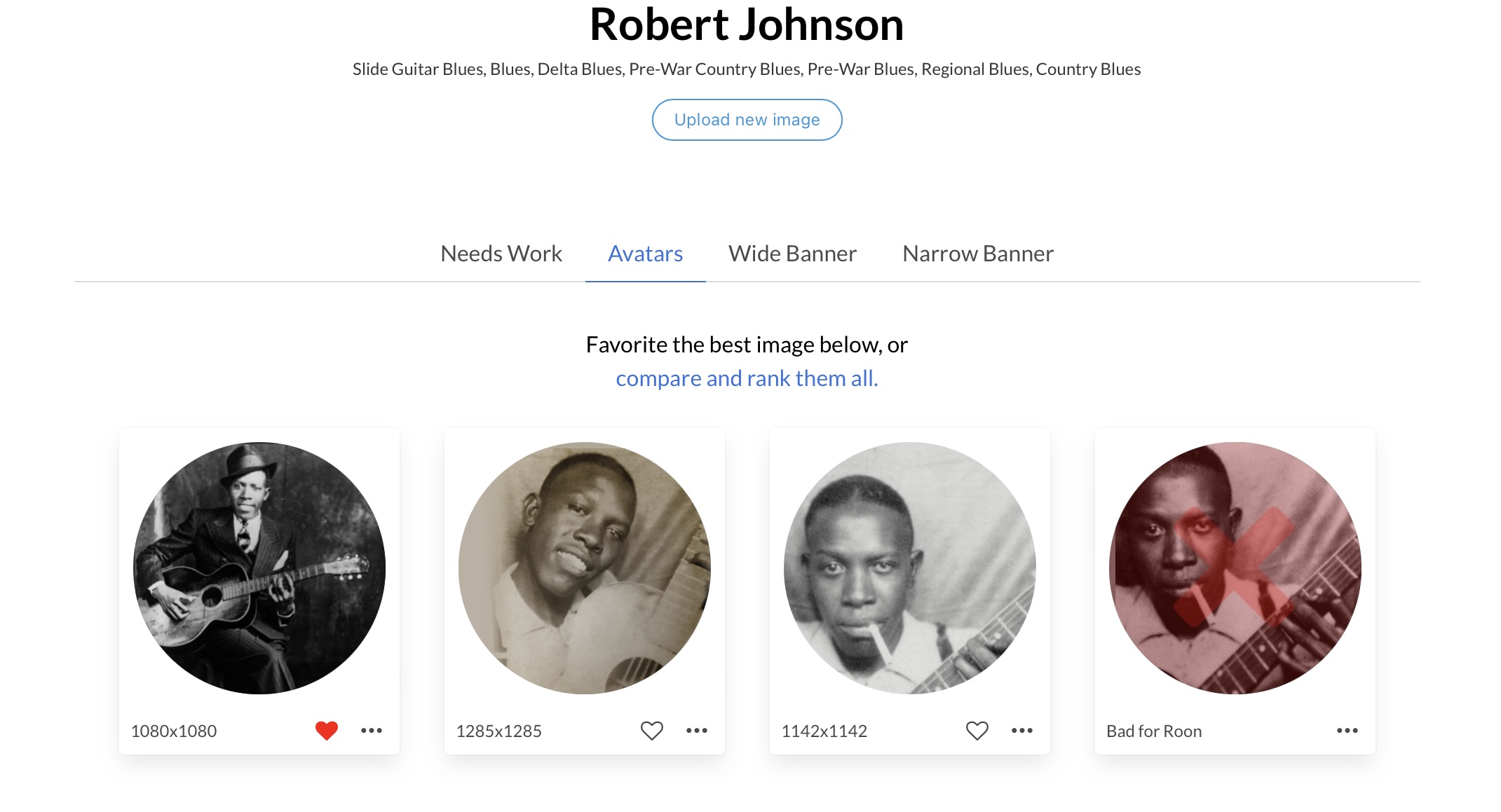
I don’t think the icon below works but the logo is correct for the artist (and looks great on a t-shirt) so it cannot be dropped from consideration.
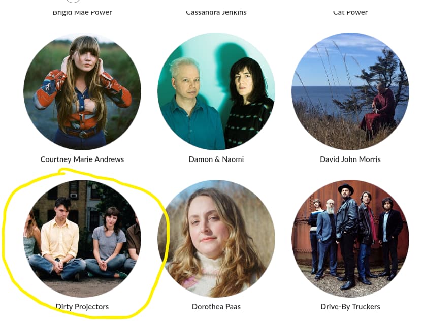
There’s something I don’t understand. In the case of the band The Dirty Projectors, I’m still seeing an avatar that has been rejected as unsuitable, rather than my choice which is suitable (see below).
What’s even stranger is that sometimes Roon shows the suitable one and sometimes it shows the unsuitable one. @danny - can you shed any light on this one?
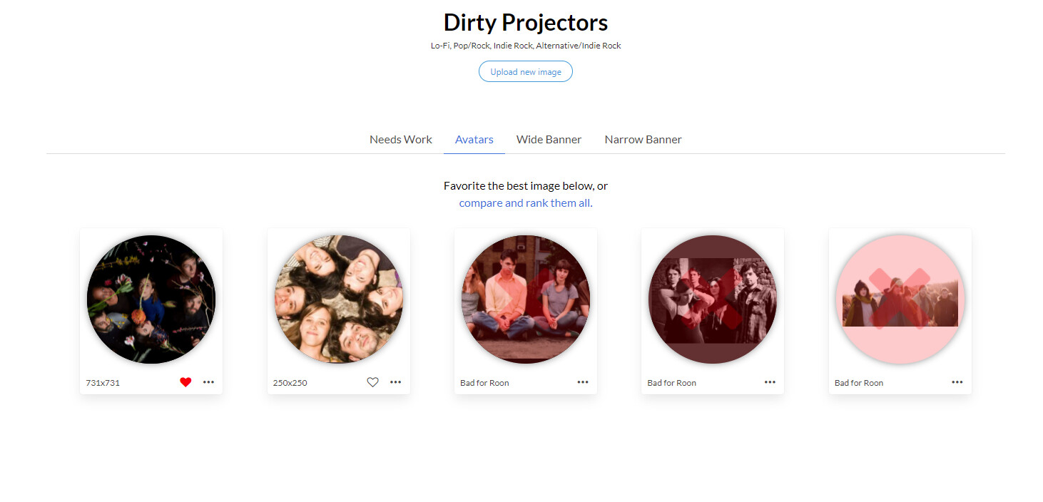
I’ve just favourited the same Dirty Projectors avatar and it is now showing alongside my search suggestions. I assume edits need a minimum number of likes before they show in Roon. I guess the main artist page will update in a similar fashion later on today.
Funny I hadn’t thought about it until I read this thread.
In my perfect world, a logo doesn’t make sense unless there is no better option. I have too many artists in my library to comb through and fix things - I’ve never done so manually and am not about to start. So what’s an example that’s puzzling? Andre Nikitina. The Animals. Good photos exist, I recognize the artist. I’m happy for Blink 183 or the Art of Noise to be a logo.
The problem is we are voting on specific individual images, but we see them in context. My context differs from yours, because I have more or less bands where it “makes sense” and make different judgements about when they individually “make sense”. For me a 10% mix may Mayer perfect sense, for you 2%, for some 0%.
My honest guess is that over time logos will get replaced and we will all get used to it and agree it’s better. But the “democracy can’t solve for my use case” is true. It can’t. So you have the option to override. For the moment I’m happy to be part of the experiment.
Logos, on the other hand, do not give any information and therefore they have no meaning, unfortunately.
That’s definitely not true, at least not in all cases. There are bands where I don’t know what the personnel look like. They might be more likely to be electronic music, collectives, large ensembles, etc. I might be looking on my phone, not on a computer and hence have less pixels.
I certainly don’t prefer a logo in most cases. But there are plenty of cases where I do prefer a logo to the next best alternative. And in those cases I don’t object to a mix of logos and photos. But my list of artists likely looks very different to yours.
Do I think “logo” is an easy to machine generate attribute of an avatar? Yes, incredibly simple machine vision exercise.
Do I think that it’s potentially possible for Roon to have a user setting “Show logos: never / sometimes / wherever available”? Probably, though it might be a real pain for caching, and given the amount of grief the support team already gets for things that are already user preferences, I’m not sure I would implement it if I was in charge.
I, for one, am going to let this play out for a few more months.
See above. While @Winter_Fleury loves the logos, his account only gets 1 vote per artist, so there is little he can do other than muster up support for his cause from his friends. If the majority dislike logos, then they should vote for non-logos by clicking the heart.
Remember, before Art Director, you got zero say in what image was shown by default. You either took what we gave or you overrode it in Roon. Now, you get a say. I’m betting that “wisdom of crowds” will end up producing a nice result in the end, which is just pretty much exactly what @Winter_Fleury said above.
I personally like logos when they are nice or recognizable, and it’s a band. But in general, I prefer photos. That makes me disagree with @Winter_Fleury’s logo mission, and probably counter his actions on images were I voted.
It’s not… individuals are not intended to have logos, and the upload process makes that clear.
We have some logos in there from prior, but they can be cleaned up.
In Trent’s case, the logo was both wrong but also was winning by having 2 votes. In the last few minutes, his photo has received 6 votes, so expect Trent to fix back to a photo soon as CDN caches fix themselves.
I doubt there are 4 more logo lovers, but we’ll see
This is a really good idea. I almost suggested guides and grids earlier in the thread but these would probably end up being ignored by a significant number of contributors. As stated earlier the tool isn’t the problem, it’s the action of users.
Roon isn’t run from a garden shed. They have a design team and I think that professionals need a greater degree of involvement with this feature because a lot of community contributors are making poor decisions and forcing changes that ruin the Roon experience.
Some say the designer traded his soul to the devil for a better grasp of Adobe Illustrator…
This is more than a little silly. Art Director needs an increased degree of manual intervention from Roon HQ. A lot of these logos are unofficial and are most commonly seen on unlicensed junk from Etsy. We pay for Roon and are right to expect better.
Agreed. Please remove band logos from avatars. I’m noticing these are being used more and more and personally I thing they look ugly placed in a circle.
At least allow users to have a preference to turn on/off whether if they want to see band/artists logos as avatars.