… but it catches your eye if you are browsing; and then you read the text; and then you add it to your library. Maybe. I think I like that someone has put some effort into the graphic design. It’s part of a series, and it does make them easy to spot!
I’ve always felt that ego comes into it with some classical performers. This cover always cracks me up.

1 Like
DGG have used it’s same emblem since the 50’s at least
It’s a badge of office of “best in Classical recordings”
I must admit Anne-Sophie’s smile does look a bit forced , she is normally more relaxed, no2 in your samples
I’m learning, but it may be time for a re brand, not easy if you feel stuck with it though…
Or maybe make it smaller
Frankly, no. I have all the releases in that series and none of the covers are, excuse me, eye-catching.
However, your comment is significant in that it you are using the cover to suggest something new to you and is in finding/choosing a recording from my own collection when searching. So, all the Haitink/Beethovens, including this one, have covers that are quite similar in color and mood and they are distinguishable mostly by the too-small text. Why would this be more or less attractive than:

Does either picture say anything useful?
Well… I like the design still…
But are you effectively asking what is the purpose of an album cover?
Why not just have a list of titles? Or a database?
That is a good question. Since all of my collection is on files and I can choose whatever “cover art” I wish, it is mainly a flag. I can scan through covers and, at low mag and without examining each one, can pick out the familiar ones that have become imprinted in my mind. Some may be albums I have not seen or heard in decades and, yet, are immediately identified.
It is not the picture, itself, but the gestalt. Text cannot do that.
1 Like
I’d imagine it’s directly proportional to marketing budget for the release.
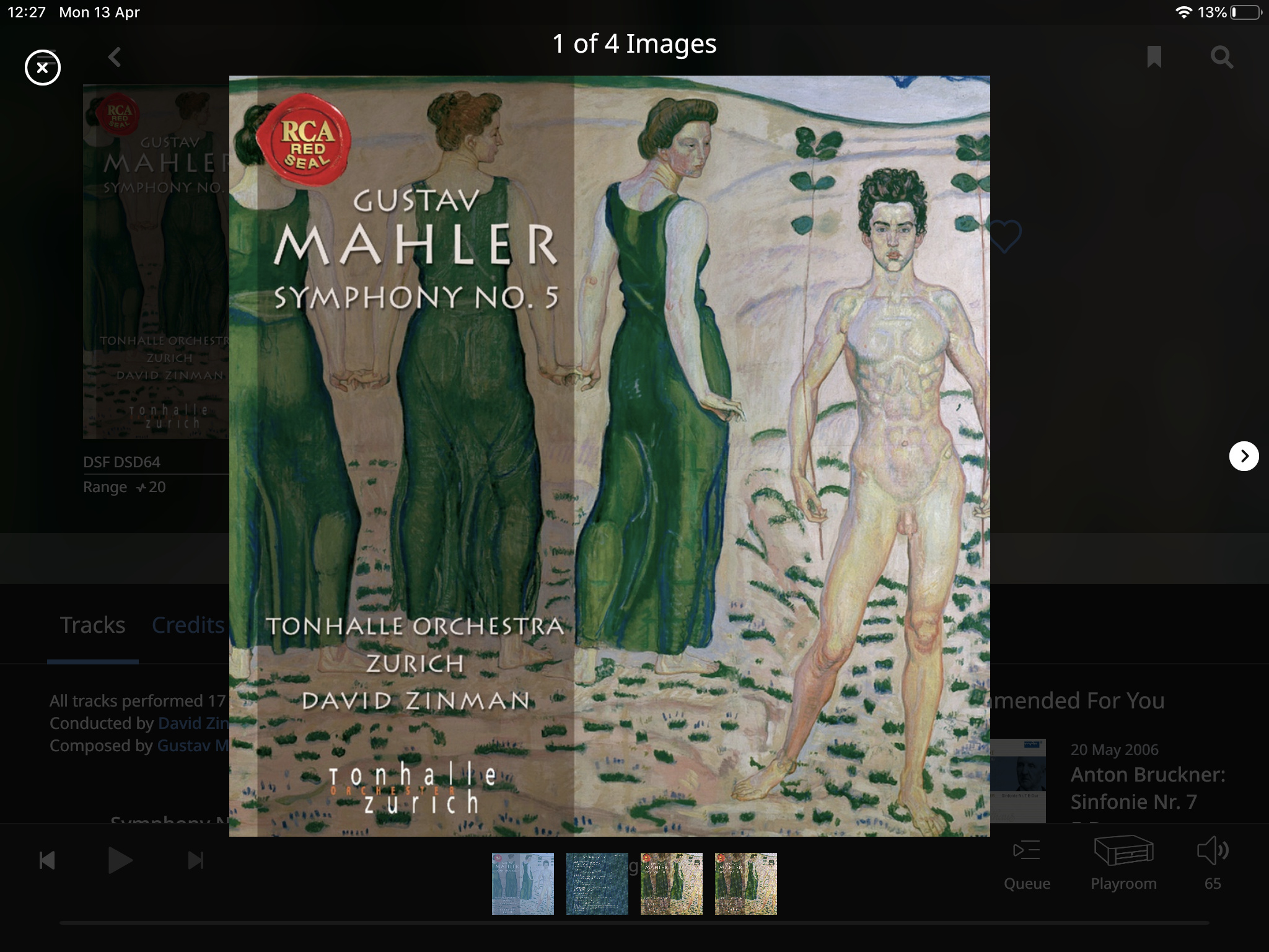
I was looking for another performance of Mahler’s 8th to add to my library, and came across a recommendation for the David Zinman recording. The cover art is, ah, striking…

Apparently it is L’Été - femmes se baignant dans piscine de briques, en plein air (1893) by Félix Vallotton
1 Like
The portrait head shots, so typical of very low selling Classical albums (pressings rarely exceed a 1,000), are probably also the most common album covers in most other genres. I don’t know what the numbers actually are. But there are several comments here about Deutsche Grammophon. This is a company now over 120 years old that has survived two world wars, was the original owner of the “His Masters Voice” logo, spun off HMV, Parlophone and RCA Victor amoungst other labels and has had estimated sales in excess of 10 billion units since 1898 (when their founder invented the record “disk”, replacing the wax and foil cylinders of the day). No doubt their marketing department would welcome comments on how to improve their album art work.
BTW, probably the single most important album cover in popular music history is a simple head shot. A lot of energy admittedly but it is Elvis.

Not a new idea BTW.

5 Likes
1 Like
I’m sure they know their target demographic… but I find the covers rather ‘stuffy’ and wonder how DG’s sales (streams?) would change if they used a different approach.
I suspect the specific shade of yellow would identify DG even if it wasn’t actually a logo!
1 Like
This is a 120 year old company. A lot of iconic brands have a dated look that can only be changed almost imperceptibly (coca-cola anyone?). But if you do a quick google you will see that even Deutsche Grammophon has to change with the times. Their streaming and alternative media product lines seem to be being marketed as “Yellow Lounge” for a younger generation so I guess their “focus groups” have already picked up on this survival requirement for the next 120 years. I was completely unaware of this until the topic has come up here, so I guess the different generations really do live in their own bubbles.

1 Like
I’d not discovered the ‘Yellow Lounge’… !
Be careful: https://bis.se/performers/lindberg-christian/romantic-trombone-concertos
Christian is a superb trombonist and conductor but some covers obviously tongue in cheek make me shudder.
Caution is advised!
1 Like
I’ve tried to understand but what!?

This is what happens when you put a Classical marketing team under pressure:
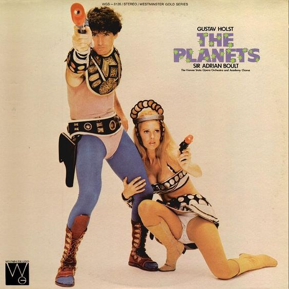
10 Likes
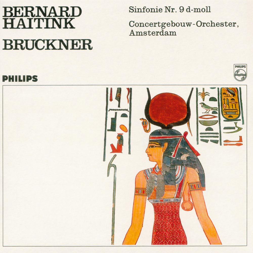
Haha. There was probably a mix up at the printers that day. Maybe it was meant for Aida or something. Never got fixed.
1 Like
Perhaps if we could read the hieroglyphs?
1 Like
I remember seeing that Planets cover. It’s as funny as ever. Thanks
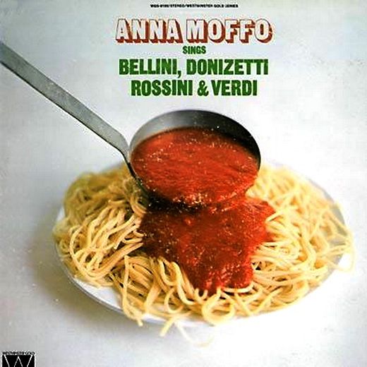
P.S. The eggs and bacon Brahms is a classic! (pun sort of intended)