I’m having a heap of trouble parsing these screens for basic information.
Firstly, it’s now split across two tabs. OK, so I get the design decision to show a tab which shows exclusive detail about library stuff. It’s more clicks, but yeah, progress and all that.
Now it’s an extra click to explore what’s on the streaming platform.
And here’s where it starts getting odd. The Discography also displays what’s in the library already. If I want to see what’s in Qobuz, but not in my library there just doesn’t seem to be a way to achieve this.
The previous layout made it really easy to make the distinction.
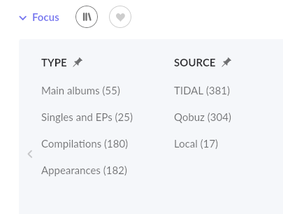
The Focus function doesn’t seem to help because you there seems to be no such operator as “+Qobuz -Library” and even if there was that would be a hell of a lot of clicking for something that was just ‘there’ before.
Am I going mad here or is anyone else finding this extremely jarring?
You’re not going mad: it’s much harder to figure out what albums you actually have in your own collection and which are only on the streaming platforms.
There should at least be a setting to always go directly to ‘discography’ if you prefer that tab.
Edit: who knows, maybe there are setting related to these pages, but since the settings menu is broken in Windows…
On top of that: Is it just me or is the overview tab taking ages to load? Is this due to the stressed servers mentioned in the banner on top of the forum?
When I disable Tidal and there’s no need to load external content, the discography tab disappears and the overview tab loads instantly
Hi John, but that gives the me same info as the Overview tab, doesn’t it? If so, what’s the point?
But that doesn’t filter what’s in Qobuz that isn’t in my library. It’s just everything in Qobuz. 1.7’s artist screen showed this information easily. I can’t seem to find any way to show that right now, long-winded or otherwise.
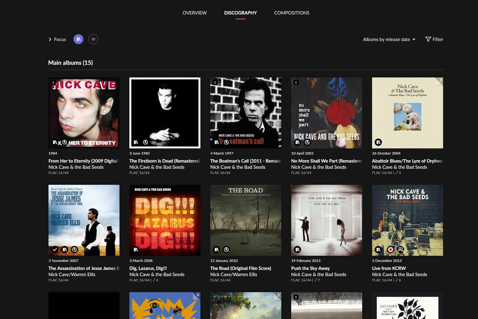
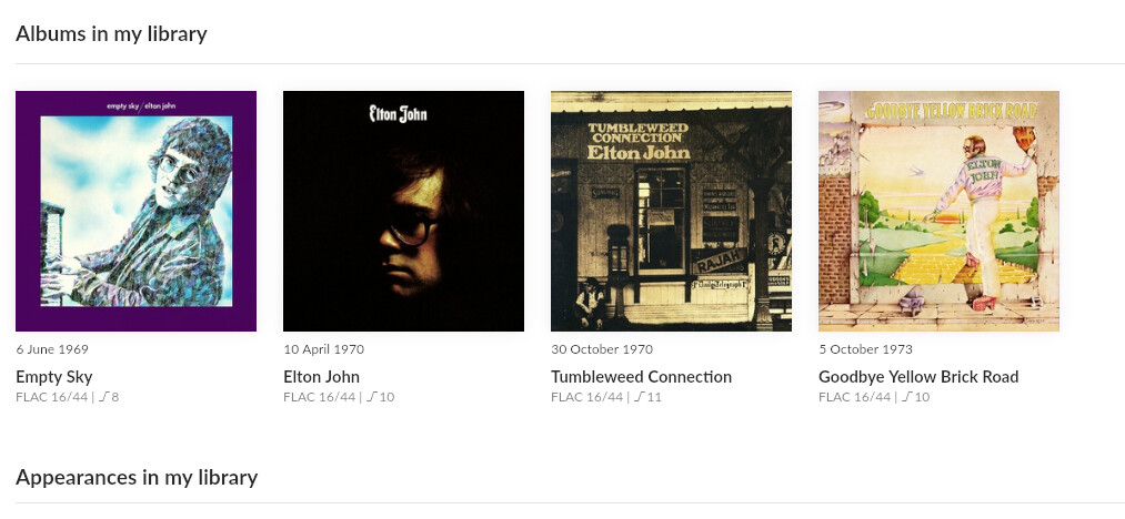
Discography:
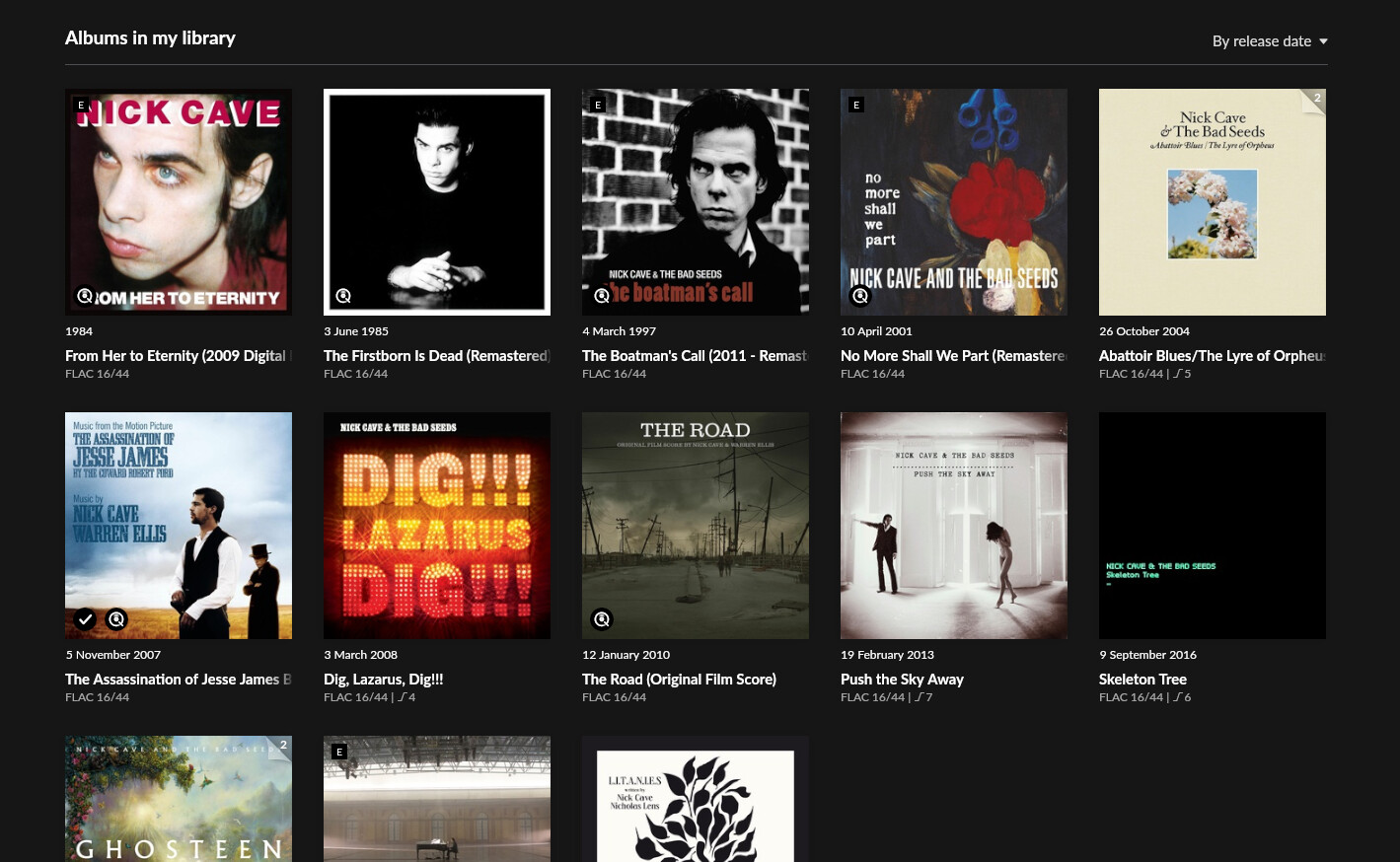
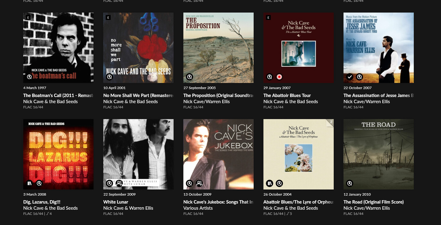
showing 35 albums, mixture of Qobuz and local. Note “in library” badge appears for local content only, regardless of whether a Qobuz album is also in the library. Confusing!
So not only can you NOT see what is in “+Qobuz -Library”, the views that Overview/Discography are displaying are absolutely all over the place with inconsistencies.
Indeed I’m surprised you can’t negate these focuses as I think that would work. There also needs to be a focus option for storage location as Library to Roon means local and streamed.
Hopefully this is a simple enough fix or enhancement.
You can’t I’m my opinion have too many focus options.
Sloop_John_B is absolutely right. People should explore a little more before complaining that something can’t be done. Having said that, I noticed that when selecting either Qobuz or Tidal or selecting both as source, I get the same result with both logos showing in the album thumbnails. Logically, there’s nothing wrong with that, but I agree that a ‘-’ option would be nice. It’s a moot point for me, really, as I will only be using Qobuz after my free trial of Tidal ends…
I think this is because the Discography has many sections including Appearances and Compilations where the Artist Names will be different. If they didn’t put artists names in the Main Albums section it would be inconsistent on that page.
In the Overview section it only displays that artist’s albums so there are no sections with other artists so it’s very clear who made the albums and thus they chose not to include it here.
Of course this is just a guess…
Having said that, it wouldn’t be hard to show the artist name redundantly on the Overview page…
So your solution would be to remove them from the Main Album section in Discography and then have them be inconsistent with the rest of the albums on the same page… your post started with “another strange inconsistency”… so you’d trade one for another? ok.
No, but what WAS an issue on the previous release was universal confusion about how you could see all the artist’s work at the same time. What we had was either what you had in your library, or what was left.
I know I tried to explain the ‘logic’ behind this at least a half dozen times to people who couldn’t see all of an artist’s work because of the bifurcation.
I don’t disagree with the point of showing all of an artist’s work, and the stuff you don’t have yet. This is the primary place you go to shop. So why not make it easy? But this is a lot better than what we had before.


 e.g.
e.g.