Hi guys, to start this off - I love this product more than anything else I have ever purchased (except my speakers). I tell everyone about it, and was ridiculously excited when I saw the 1.6 release notice.
I’m afraid to say I’m in total agreement with the negativity here. The UI changes are an enormous step backwards from my primary purpose of buying roon - because I wanted to use technology that made me forget I was using technology. Something that simplified all the ridiculousness of having local libraries, streaming music, controls to do everything under the sun, and purely allow the enjoyment the music, not something so complex or misfocused that makes me feel like I’m at back at work, stressed out or using anything even slightly resembling typical music software.
The immediately obvious items are:
The viewers eye should be drawn to the primary content area, and certainly not the now playing bar which should act exclusively as a fast access shortcut, not a screen feature. Eye’s are naturally always drawn towards the lightest colour and on a dark background all I can do is find myself looking at a very boxy, hard edged, stressfull now playing bar that’s lighter than the rest of the screen in Roon.
The bar is much too prominant and large and that’s just in the regular album browsing view. When it gets to the now playing screen it’s even worse. The bar is so large I find the software entirely unusable and I just REALLY don’t like it. My fiance had exactly the same response and looked in disgust when I just handed over the ipad to her.
My instant and hugely preferred feedback would be to return the bar to what it was before. But at a minimum it should be no lighter than the content area of the display, and the now playing icons to be aligned to the right of the album art to free up ~80 pixels of vertical space to reduce it in size.
The lyrics on the now playing screen hide under the screen selection icons - a big design no-no in my opinion. It makes the icons hard to see, and further adds to the stress of the display.
The new queue screen attracts all my attention to a gigantic bar on the right with enormous text that reads “Roon Radio - Roon Radio will automatically pick music based on your queue” and hasn’t changed or got out of the way for the entire album I’m listening too, and the giant now playing bar with a totally out of proportion tiny cover art icon with absolutely no focus on the queue itself which should be the primary focus of the display. You guys know how much I complained about the previous now playing screen, but those comments disappeared with the tidy integration of the updated queue functionality and was a beautiful integration. The new changes are a huge step backwards that honestly go as far as making me not wanting to use the software at all anymore
I love you guys enough that I will take a crack at this myself and propose some proper mockups, but I’m ridiculously busy at work, my business and the firehall at the moment (probably why I prefer Roon to be excessively beautiful and simple). When I do get some proper time I’ll propose some improvements rather than just be a critic. Other than that, thanks as always for your hard work. (Do please bring back the software I love though…)
Ha! Been there, done that. You need to accelerate through the next phase or two, acknowledge to yourself that asking for or waiting for anything other than core still-undelivered features (i.e. mobile etc) is a fool’s game…and then you’ll find yourself safely ensconced in “why should I even participate in the forums” mode…and everything will get better.
My, my, my. People do hate change, don’t they? I’ve seen this type of discussion almost every time an app or operating system makes interface changes. And every time it settles down after a few tweaks. This was a big step, not the final step. Keep the faith, folks.
Question: do you think you’ll have the same discomfort two weeks from now when you become more familiar, or will it always feel like it needs “your touch”?
I’d say I’m already fine getting around the new kitchen - it’s more like I will always be frustrated because I have to walk halfway across the kitchen to get something I always need that should be right at hand. But the food in the end will taste the same and I’ll go on preparing it. What choice do I have? Even though it’s not my ideal kitchen, I’ve already paid to use it for a lifetime.
I will say, I thank Roon for working robustly and upgrading easily. Trying to get a new version of Microsoft Office to open on my Mac is… well lets put it this way, I’m looking into other options (Apple or third party. Fortunately didn’t pay much for it as my wife works at Microsoft. Not sure why some things have to be so hard.
No, I actually love change, and was looking forward to a newly redesigned Roon. I’ve been calling for a UI change for ages. Unfortunately what we seem to have gotten is a pastiche of half baked layouts that often feature the wholly wrong elements mixed with the some of the worst of the old. Change just for the sake of change isn’t necessary. So, yeah, a lot of us are frustrated. Especially those of us in the US who can’t even take advantage of the new Qobuz integration, one of the primary positive focuses of the update. Not Roon’s fault I know.
I work in the software biz. I have a saying that a user experience needs to be about 15 times better than the current version in order for people to love it out of the box. This thread seems to show that it’s true (as has much research on my part).
I don’t really see any problems other than the now playing screen, and they’re re-introducing large album art.
I very respectfully suggest patience and flexibility. Give it a couple of weeks, and then document your concerns. If you do that, please ensure you provide a solution too.
I work in user experience and have done work for Disney, the LA Philharmonic, etc. - The experience needs a sophisticated UX/UI to attack how it can make more intuitive sense and still deliver all the features people want and use while holding the line on delivering an overall simple, elegant solution.
Not easy, not achievable as someone else suggest by pulling a kid out of grad school, you need more robust UX horsepower to fix it.
In the near term, fixing the foot size and color, some other things, would buy everyone time to rethink how complex the interface is.
I don’t want to turn off the time-code lyrics. It is a great improvement.
Brian said that you can determine in real time whether the lyrics are time-coded or static text. Brian indicated that you could address those two scenarios in real time. (Or at least that is how I interpreted his comments.)
Therefore, please simply change the UI so that we only have to click on the lyrics icon in the Now Playing screen a single time. We simply click on lyrics and turn them on and let the music flow, so to speak.
Your UI would then AUTOMATICALLY
(1) show the time coded lyrics when they are available
(2) revert to the text lyrics when they are not available
And switch back and forth automatically and seamlessly. That might be asking a lot, but is that possible?
UI changes are always tough… but you’ve been around long enough to know we have tougher skin.
Sweet dreams are made of cheese
I do not wish you gone. You are loud and opinionated; I personally like that. However, I do wish you toned down the insults and trolled less (see burger above). It’s just not productive.
I did not mean my original comment to be so harsh, apologies to the team.
I’ve loved Roon, it’s been terrific and greatly enhances the music listening experience. It has taken a step back with this release in terms of UI in my opinion, but does have good additions in terms of functionality.
I hope the screens I shared showed the areas I’ve found most confusing with this release.
Add user-supplied lyrics to your lyrics todo list please. This opens the door for people to hunt down and display lyrics, such as Christmas carols, hymns, and certain period pieces. Maybe translations of foreign-tongued chorals.
Specify a tag name (LYRICS comes to mind) and display the tags contents, if the other two sources come up empty.
Its a feature that would not detract in any meaningful way. Non-interested parties can simply ignore the feature. And even users like me couldn’t screw up a text tag. Or could they?
We read almost every post on these forums, and discuss as much as we can. But one thing we do not pay attention to is volume of requests or polls. The community is a vocal minority of our user base. It started out as a huge % in 2015. It’s now a small %. The community grows every day, but our total subscribers grow even faster.
We also are catering to many more types of music lovers than the original “computer listeners”. For example, a significant % of Roon members are iPad + dedicated Roon Core with no Mac/Windows/Linux involved.
I would respectfully say you may want to get beta designs into the hands of some the non-audiophile crowd but who might be highly visual persons, i.e. designers, photographers etc and who are also hifi and/or streaming enthusiasts.
As a photographer, I work with visuals and visual programs/equipment all day so ease of UX and eye/brain fatigue is important to me. It does seem as if this horse has been beaten at this point though. I understand that things like color schemes, font choices, etc are burdensome and most are fine with light and dark theme (I’m fine with dark). Perhaps in the future stick to the mono theme but offer a light, medium, and dark?
To me the UI change feels like a first step, not finished. For instance the DSP pages give me a better sense of what the idea is. That design consistency is not visible in the rest of the ipad app.
Are there plans to tie it all together in a later stage?
There’s a lot to nitpick but still waiting to get used to the chance to criticize it. While that happens, three things spring to mind:
I have a feeling if there was a option to darken the tone of the blueish grey colour bottom panel a bit, the backlash would be considerably less. Feels like that hits the people that feel the dark modes are precious in the face, and that instigates a negative-minded hunt for other UI features to bicker about. Original and 2 darker options overlaid below.
It’s now 6 big releases later but Mac app still does not have the support for OS’s native Back/Forward gestures. Come on, guys.
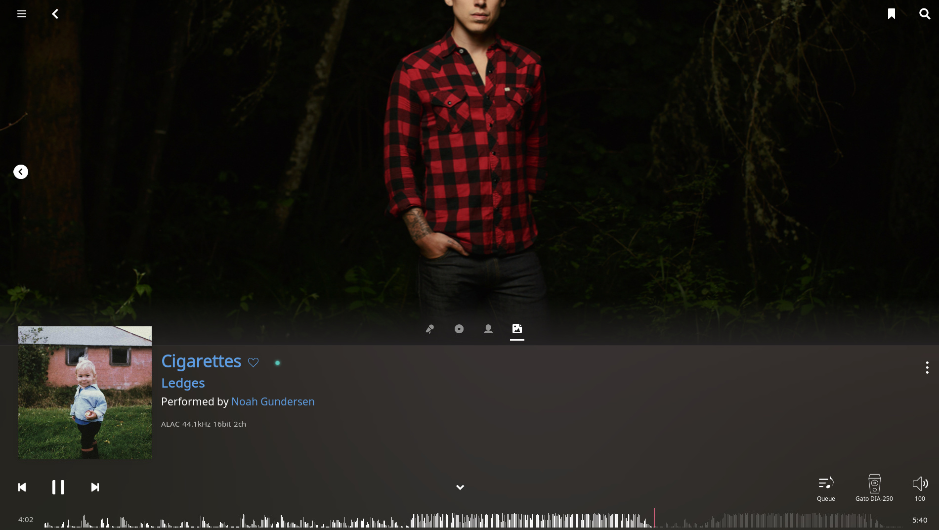
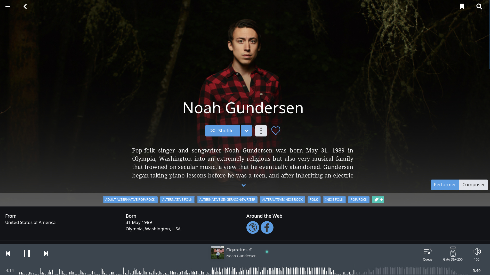
May be a bug but the Artist Image in the new Now Playing screen is from a different portion of the saved image. You don’t have to cut Noah Gundersen’s head, he’s done nothing wrong.

 Other than that, thanks as always for your hard work. (Do please bring back the software I love though…)