More on the delineation of sections:
Here’s a small UI change that would make a HUGE difference:
In the iPhone app, on the (full) Now Playing screen, replace this generic, uninformative icon:
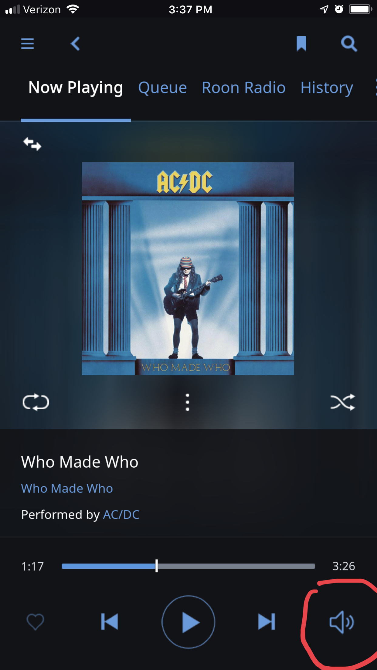
With this super helpful icon from the “minimized” Now Playing display:
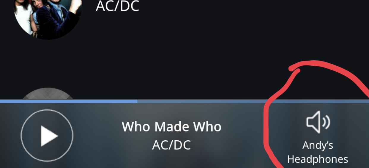
That would save us from having to dig several clicks deep just to know what zone we are controlling. It would prevent us from accidentally blasting AC/DC on the outdoor speakers at 1am, or from accidentally hijacking the living room receiver in the middle of someone watching a movie. It might even bring peace to the galaxy!
8 Likes
Hi Anders, like I said I do like the footer in the new now playing screen for it’s better integration in the whole view, in fact in this screen it’s not even a footer anymore, I like it. That might sound contradictional to what I said about the footer in the rest of the UI and it is. I’m not a UI designer, but I know how my attention works when I look at things. Personally I have no problem with the new now playing screen other then some nitpicking things like I mentioned, well only the unlogical things to be honoust. I was trying to figure out why people are so upset about it. I was refering to the footer in the rest of the interface, there the light colour as it is now in the current interface is distracting. It’s neither full integration, neither a delenation of area as you describe, it’s nothing of both right now and draws too much attention to its self. But all in all this is just a first step towards the new UI, time will tell. I just hope there is attention to some unlogical things in the UI that where allready there and some new ones creeping in wich might add up unnoticed and in the end scare people of. And indeed I’m not 100% fan of this kind of “modern” design but that’s o.k. I am more a person of form follows function, data over looks, but offcoarse I like pretty things as well and allthough it would not be my first choice I can live with this design as long as it does not interfere with function.
But as far as anexcessive delineation of sections, for example I really like the view of the artist page where my library albums are on a white background and Tidal content on a black background. Couldn’t be more clear then that for me, easy at first sight, easy to navigate, keeps me in touch with my own library. It is at least a whole lot more clear then the small symbols under the albums in the search result field on a total white background. Yes sections do help. Design or not, I personally find this kind of functionality way more important then the question weather it is old fashioned or not.
Things might fall into place.
I guess I’m in the minority here, but I mostly like the UI changes. In the desktop version, I’m not a fan of the grey, the tiny icons, or the tiny text. (Hint to the UI folks: make sure someone over 45 checks the text to see if it is big enough.) I particularly like the changes to the DSP screen.
One request: Add the DSP Presets selector to the Volume Control window and/or the Signal Path window.
Actually, one more: Why do I use a left swipe to scroll right on the Albums page, but I have to click a right arrow on an individual artist’s page?
4 Likes
That’s a very good point ![]() I have done this many times late at night. I’ll put my headphones on ready for a bed session and hear music blasting out in another room. Mostly user error but I think your idea has a solid basis.
I have done this many times late at night. I’ll put my headphones on ready for a bed session and hear music blasting out in another room. Mostly user error but I think your idea has a solid basis.
I am liking the UI more and more, it is definitely a grower. I had to search for images of 1.5 to jog my memory for how it looked. The now playing screen is really nice, it’s clean and uncluttered. I like how you can configure the now playing options as I didn’t want lyrics showing up first and have re-ordered everything. My now playing now shows an artist picture (I have come across quite a few that are incorrectly cropped but I understand that this will improve as the algorithm learns). Maybe the colour of the footer could be a few shades darker but after comparing it to the old black footer I definitely prefer the new one. The new waveform doesn’t bother me, it’s just eye candy and I don’t spend time staring at it when I am listening to music. I do think it is better now that it spans the screen. I am glad that an album art screen is coming back for other users who want it, I never used it previously.
Radio is a revelation, didn’t use it before and I have already added 23 new albums.
All in all I’m very happy, thanks Roon Team. I don’t doubt that things will change. That’s life and I can adapt. I know from using software packages for the last 20 odd years that in a few weeks I will not even remember what 1.5 looked like. How many of you spend time thinking about the the paw masher screen?
7 Likes
I think most (possibly all) of the complaints about the color of the footer bar are coming from users who favor dark mode. IMO, a little fine tuning of the footer-bar color in dark mode will resolve the issue for most “affected” users, thereby demonstrating that it wasn’t such a big deal after all.
1 Like
Yes, a user error that could easily be prevented by fixing the UI. (And having to dig into a sub menu just to figure out which zone you’re controlling is definitely a flaw in the UI.)
As my Human Interface Design professor at Georgia Tech used to say, “If people are repeatedly using an interface the wrong way, it’s the fault of the interface, not the fault of the people.”
Thanks for commiserating and confirming that I’m not the only one who makes this mistake!
2 Likes
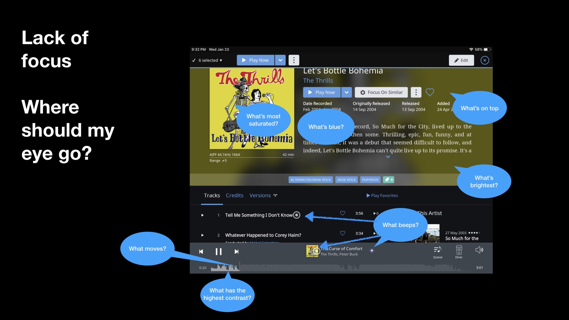
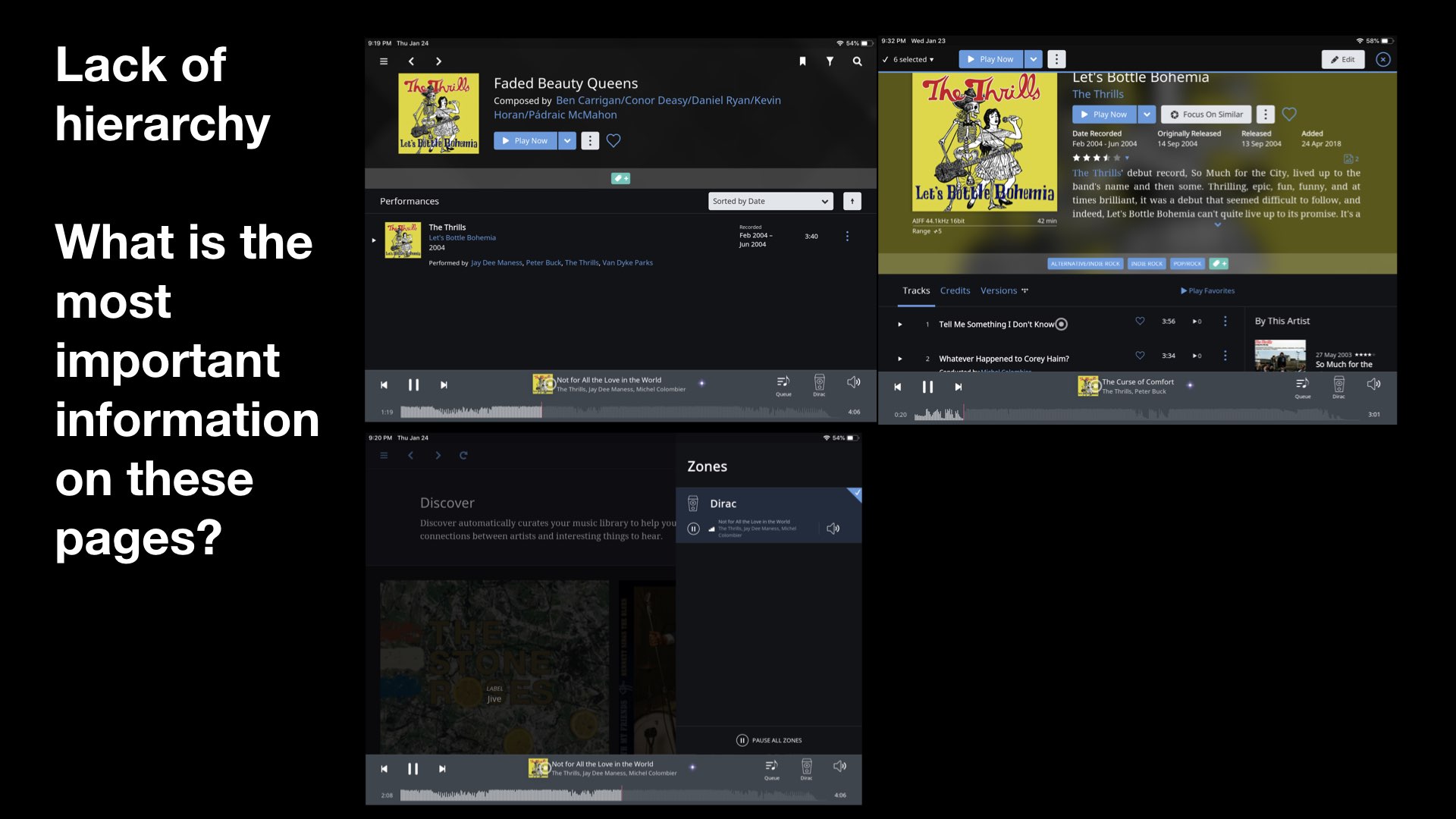
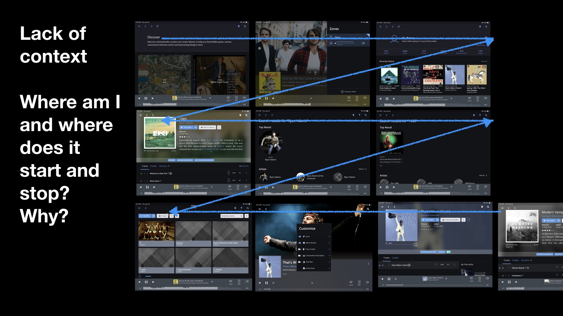
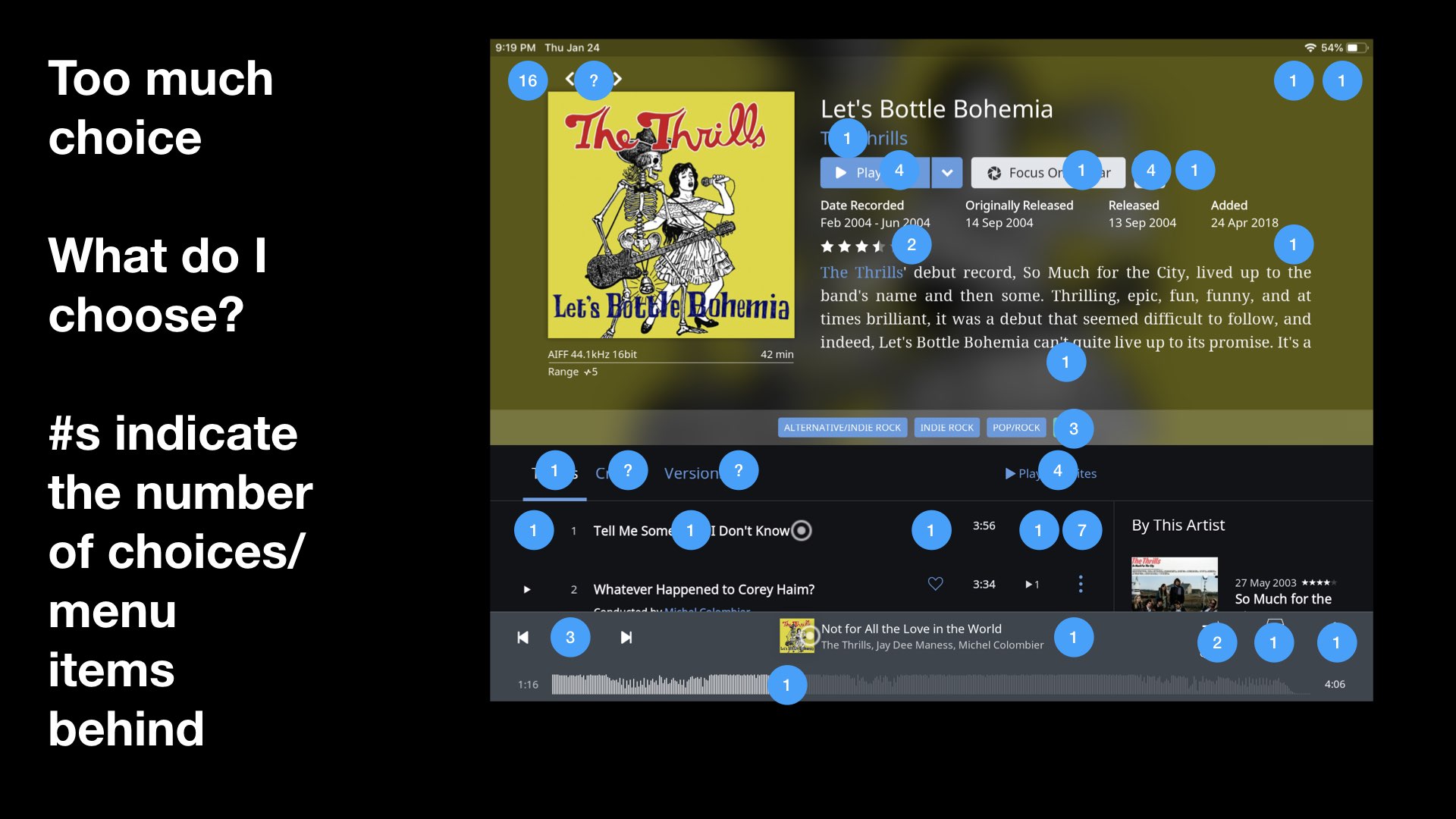
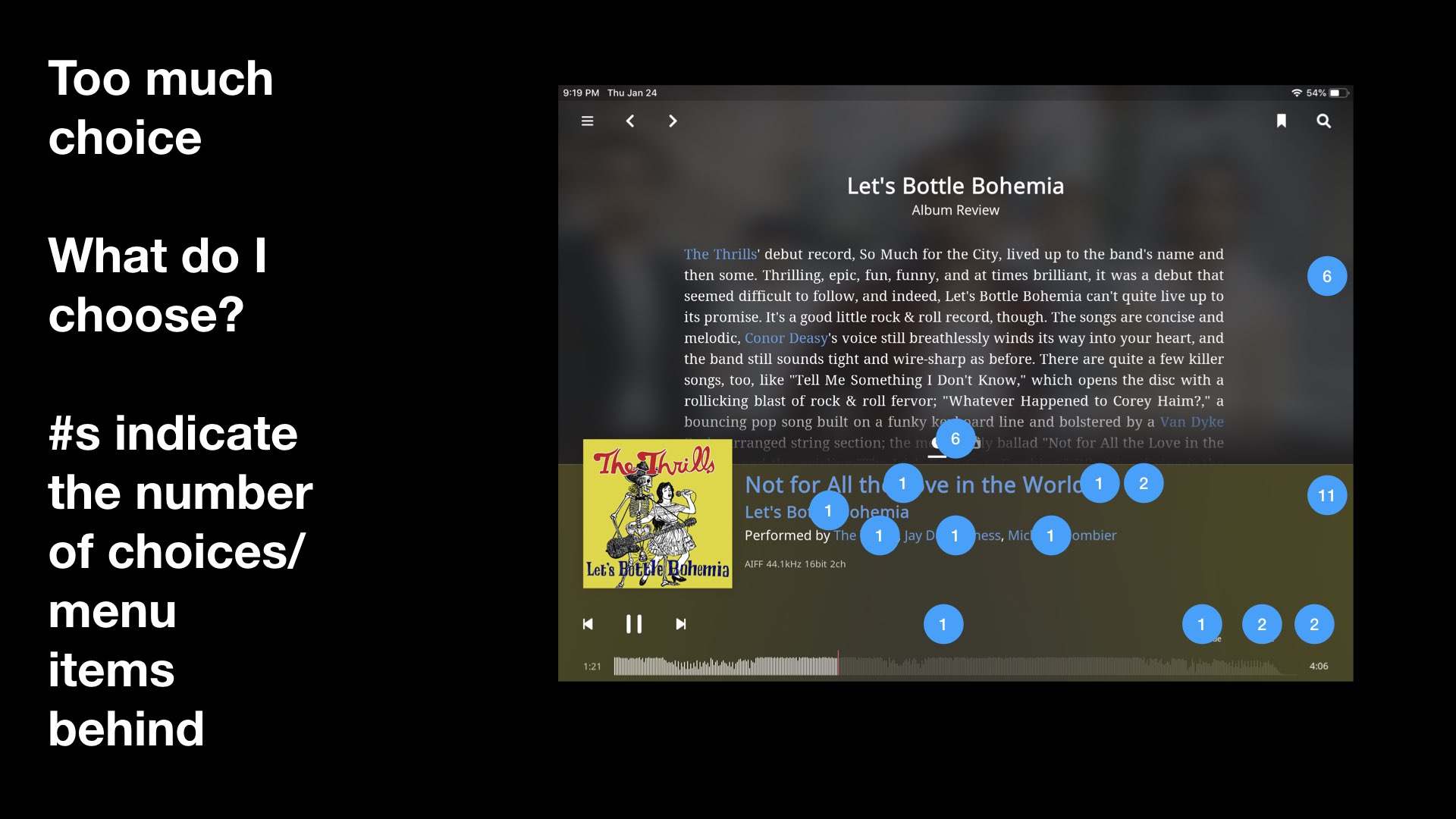
Below are images an notations of my confusions around the new UI
Having analyzed this a little more, it is clear there are some annoying, new design elements (ex. footer). But the main thing is, this has been added to and added to over time, like many digital products, and it has just lost focus.
I loved Roon, I hope this can help make it a little better
12 Likes
Excellent feedback! I dont agree on most acounts but i appreciate your efforts on explaining your p.o.v.
Like someone put it, Roon should be “Apple-ish” in it’s UI, it should be obvious what you can do, how you do it and why. Quite unlike the popular comparison object, JRiver which is a jungle of options an configuration and also sports a very cluttered (however quite familiar) UI.
But Roon, and it’s new UI is very Clean, spacious and simple, but you still can shape it after your prefs in most aspects. I love it! Without hesitation!
5 Likes
Both?
1 Like
Nicely done. When I look at your pictures it just reminds me of a comment I have been making on the interface from the first day I have used it and wich never went away. Too widely spaced elements, inefficient use of screen real estate wich results in a wonderous combination of trying to be clean but becoming cluttered in overview at the same time.
1 Like
The desktop version of Roon was designed to be usable with a touch screen. I recall that when Roon was new, some people went that route. That was before we had iPad/Android Roon, so I wonder if it is time to drop the touch screen friendly layout from the desktop version (or make it a theme).
I love my touchscreen laptops, so please don’t drop the touchscreen friendly layout…
3 Likes
47 posts were split to a new topic: Customizable colors [not on roadmap]
I did not realize I could drag the order of the customize play now options. That is great! I was not feeling the karaoke lyrics to be displayed first.
1 Like
Just one of the many reasons to have “Mouse Overs” for menu choices as supposed to just having pics and letting the user guess or remain clueless of ‘hidden’ functionality.
3 Likes
Interesting debate and update. Here is my impression:
- First of all I do not find much change anyways
- I do not find new features that I wanted to have
- I do not like the new lyrics display. The previous was much better. This is Karaoke.
- The peak level meter at the bottom is a good thing.
- The footer bar at the bottom is a step back, it annoyed me right away
- Dynamic range numbers are still wrong but I measure it with the original tool anyway
- Complaints about DSP and so on do not apply to me, I use HQ Player
- Preferences look pretty much the same
I really do not want to see this footer, it is really ugly, grey on white. It is too big also and it is wasting too much space for too little content. I would like to shrink it or send it to back. I am scrolling my database etc. while listening and it is in the way of my focus…and it gets worse when I click it. Who approved this, this is a very bad design in my mind.
3 Likes
The simple ability to select and drag to resize would fix this for ‘all users’ and the ability to choose a color scheme based off a color palate would resolve the color issue for all users as well.
Some of the many many reasons why giving users a choice ie ‘flexibility’ is a good thing.
But then my thinking and Roons vision are completely different…there must be a big-picture plan to this color choice thats just beyond my small thinking.
3 Likes
If you ever get a chance to check out the Android PHONE version, you would like it. They use that blue for type and it pops really nicely against the black. The Android phone version, while certainly slower than my iPad 12.9 or Mac Pro desktop (I’m platform agnostic) and shows less of anything at anyone time, is almost perfect, imo, as to the use of switching screens for different functions, the play bar changing color depending on which screen etc. Very nice.
2 Likes