A post was merged into an existing topic: Customizable colors [not on roadmap]
Danny,
The proof is in the pudding, so to speak. You told your critics that they can always speak with their dollars, cancel, and get a refund for the remaining month.
I voted with my dollars but in the opposite direction.
Version 1.6 demonstrates that Roon will have a long and healthy life. You’ve added another streaming service in case Tidal disappears. You have listened to your subscribers and improved the Radio. You listened to your subscribers and added streaming lyrics. And you improved Roon in many other ways.
In the last 48 hours you have said, quite clearly, that the comments offered by subscribers, including me, will be addressed in a future release within the limits of what is possible for the application.
That is a great record, and I voted with my dollars.
Yesterday I paid for a Lifetime Subscription.
I urge others to do the same. Vote with your dollars, and support Roon.
14 Likes
I do think it is more Windows like. That’s great in my view. I like some control. Apple ‘sensibility’ is for people who don’t understand computers or software. It has it’s place, I suppose, but I prefer the way the Roon UI is headed. That said, there is some clean up to do… like the overview page.
Beauty is in the eye of the beholder; I love the new interface and have found little to complain about. Radio improvement and Qobuz integration are the cat’s meow for me.
Kudos to Roon and the entire team for this release.
2 Likes
Danny,
One request for the Radio. Can you please include in the Settings the ability to turn off the box – permanently – that keeps popping up that asks “Skipped the XXX. Tell us why: [with three choices.]”
I often fast forward, i.e. skip tracks in Radio, and want to just ignore that popup, and prefer it not appear at all.
I don’t want to fill it out, as that would tell Roon that I don’t want a certain type of music to appear, and I don’t want to influence what Roon does on a permanent basis. I might have not liked a certain choice at the moment, but I might really like it in the future as my musical tastes change and evolve. Which they do, thanks to Roon!
So I just leave it alone, and let the Radio roll along, so to speak.
At the same time, I’m not suggesting that the box be eliminated, as it performs a useful function if you want to fill it out.
I just don’t want to see it every time I skip a track in Radio.
Out of curiosity, when I click on with and say I didn’t like the track or it doesn’t fit, is it changing what I want to listen to, and only me, or is it changing it for all Roon listeners?
So if other Roon listeners are clicking on that box as I type this, are they changing how the Radio works for me and everyone else?
1 Like

There is a detailed discussion about that here–
Regarding the UI I actually think Roon is heading in the right direction. Sure, due to the gradual approach by Roon there are inconsistencies, but the screens they have introduced are imo an improvement (minus how search results are represented*). If all screens were to take on the same design approach as Now Playing, we’ve reached the target as far as I’m concerned. I understand that people want album art there, I personally like the artist pictures.
*The search results themselves are pretty solid for me
2 Likes
Regarding complaints about the new footer design, I like how it blends into the Now Playing screen when it is showing. If the footer is collapsed, perhaps moving some elements around would accommodate many remarks in the feedback threads without affecting the core design principles:
- Move the album art in the lower left corner, making the album art as high as the footer itself
-> People seem to prefer it as large as possible, as opposed to the small icon in the center - The frequency wave would not extend to the whole width, but up to the album art.
-> People seem to dislike the fully stredged wave (I don’t, but I also don’t mind it being smaller) - Move the playback buttons back in the center.
*Note that I am quite happy with how the current footer is
1 Like
With a few tweaks the new UI will be excellent and is already quite good. People just hate change and some are going to react as if the sky were falling. Especially if they don’t get there way on every little detail.
We will go through this all again with next update.
4 Likes
For the most part this screen looks pretty damn beautiful too me. I would not like to go back to a black footer but perhaps it could go darker? I also wonder if reducing the height of the expanded footer would help as there is a lot of empty area, although reducing it too much would make it look cluttered. I’m sure the Roon Team would have played around with this already and decided on what looks best. It’s a shame the Play/Skip controls have to be on the left if they weren’t there it would make it easier to reduce the expanded footer.
I wouldn’t like to see the screen dumbed down any further and made more “Apple” like, as has been suggested. I have been an Apple user since Panther and I am not liking the GUI changes that have been made in the last couple of MacOS versions (they remind me of my 8 year old nephews school projects with pictures stuck to A4 paper and bold marker pen headings).
I disagree that there are too many options to dig through the different screens. I think the Roon GUI strikes a good balance between the technically minded user and the technophobe partner  . I don’t disagree that there isn’t room for improvement but I been wondering how many of the users who are complaining would have complained if this was the first version of Roon that they were using. As has been said already, there are far too many people who cannot cope with change and a few that seem to think that the world should revolve around them and their opinions.

4 Likes
a quick mockup of what would work better as a footer in my humble view without changing the dimensions
original:

pimped 

8 Likes
Well, I like it, but notice what happens when you toggle to the Now Playing screen - in your version, the play controls would have to be moved as well to a possibly more inconvenient place… Still, nice suggestion. Let’s see what the Roonies decide…
Give me 5 min 
2 Likes
I think that’s a bit of a generalisation.
Like in all other walks of life, everyone will be different. Some people embrace change, some prefer to keep with what they know.
Also everyone has their own take on good design, and whats important to them in a product that they may interact with quite a lot.
I work in visual design (although not software GUI/UX I should add) and 1.6 is a step backwards overall for me.
It’s not because I hate change - far from it - it’s because I just don’t like the way the design has evolved. I think it’s a bit of a mess as a whole (although there are aspects I like), and I mch preferred aspects of 1.5 (and earlier).
I’ve seen this ‘people don’t like change’ sentiment bounded about a bit throughout the 1.6 feedback, and I get the defensiveness that must kick in after releasing something the team were probably passionate about, but from my POV it’s just not right.
Disastrous is a strong word and not what I would have chosen particularly. But incoherent, inconsistent, unnecessary, messy, unfinished are a few I think are appropriate.
I’ll say it again, in my opinion, you can’t update a UU piecemeal in the way it’s being done here. That’s a horrible idea.
1 Like
@danny Since you plan to do a quick update on the footer to mitigate the problems identified here may I suggest you consider making the background color the same as the background in the dark (black) and light (white) themes. I hope this is a relatively simple change.
As for general feedback:
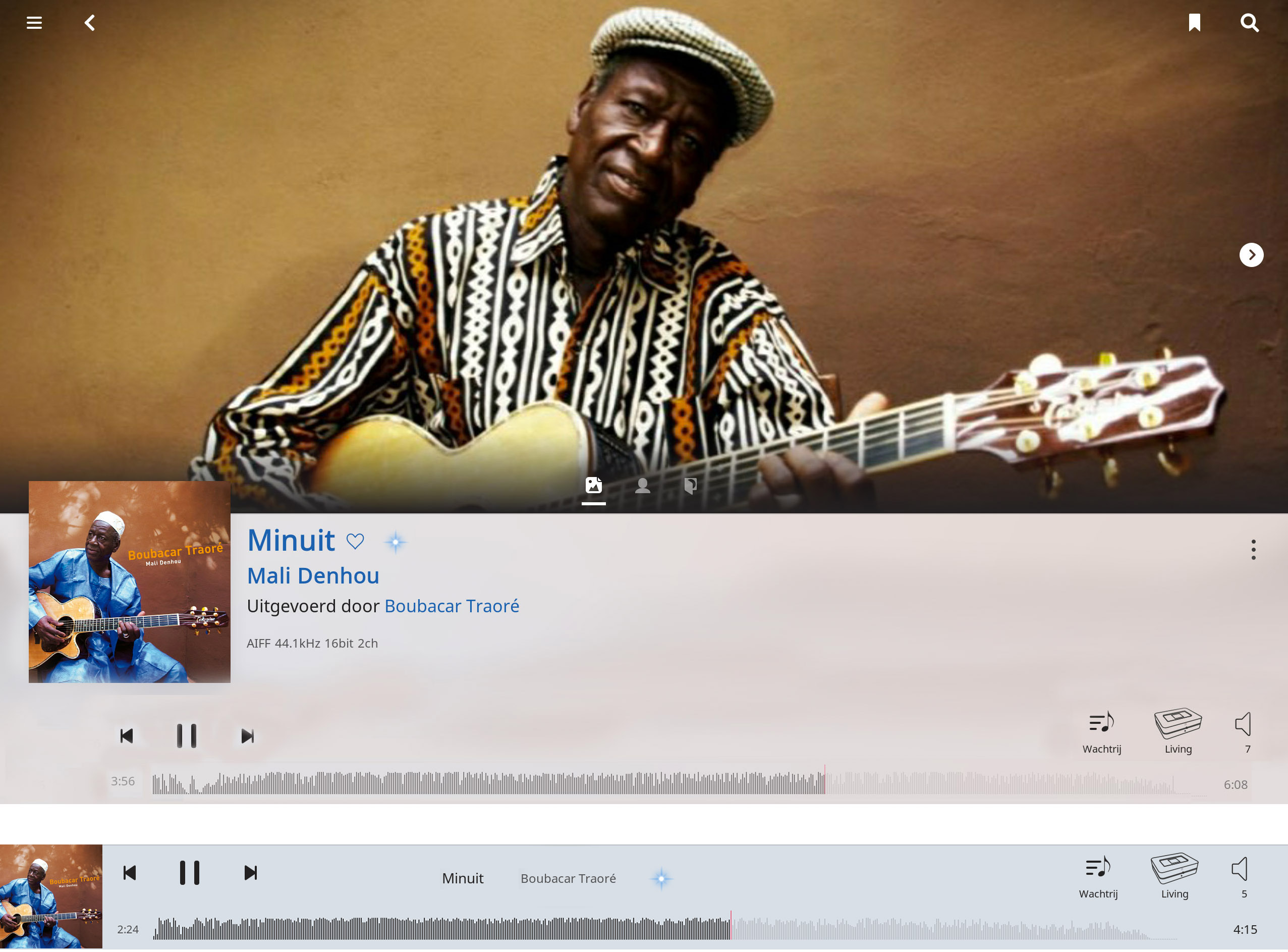
- Now Playing screen looks good; the artist images are coming in ok for me now and look forward to album art option
- I prefer the old waveform display to the new one
- The image of the album cover in the footer looks too tiny (better not even have it?); interesting suggestion by @stevev1 though I can see his specific approach may not work because it moves the playback buttons–he’s on to something though
Otherwise, the UI direction seems positive. It is just disjointed now across the various views and this creates an eye sore.
I wish I could turn off the waveform. I never liked it.
1 Like
Wow that is SWEET!
That is nice, but the font is too small for me to be able to read without getting very close to the screen.
3 Likes