Sorry missed a bit …
Switching off the Show Playlist reduces Playlists to a single Line entry in the menu rather than showing all
That’s fine for me
Sorry missed a bit …
Switching off the Show Playlist reduces Playlists to a single Line entry in the menu rather than showing all
That’s fine for me
Problem: if you have multiple profiles, then the playlists from all the profiles are displayed. See my other thread on this How to disable visibility of playlists from other profiles?
@mike - Great video - THX
It works just fine.
If I ad a local track:
to a Qobuz playlist, than the streaming track (Qobuz) is integrated:
It would have been very nice if that was not the case. I prefer local tracks.
Torben
Turned it off straight away as it’s just a mess and ruins the UI and I don’t use playlists enough to care. Juries out on the new menu layout either although settings button is welcome, but overall just seems a bit cheap looking compared to old menu not sure the icons bring anything to the table.
Have you tried turning off the show playlist in the other profiles? Might be a work around until this gets sorted out.
I’m probably going to echo the sentiments of some others:
Cheers,
Martin
Already added feedback in EA so won’t repeat here.
But tweaks and improvements aside, many of which it’s sounds from Mike’s video are already in the pipeline.
I’m absolutely loving the attention that has finally been given to playlists. As a fan of playlists it’s rekindled my use of Roon since this was released in EA.
Well done, Mike & all the Roon team involved with this ![]()
Looking forward to seeing the future improvements.
Yes, I did. However, this hides the entire (local) playlist section and several klickes more are required to get to the place wehre playlists are visibile to a particular profile.
Many thanks for the update. Management of playlists was one of the points I raised in the recent survey. I just played around with the new functionality and will provide more detailed feedback later, but one quick question now.
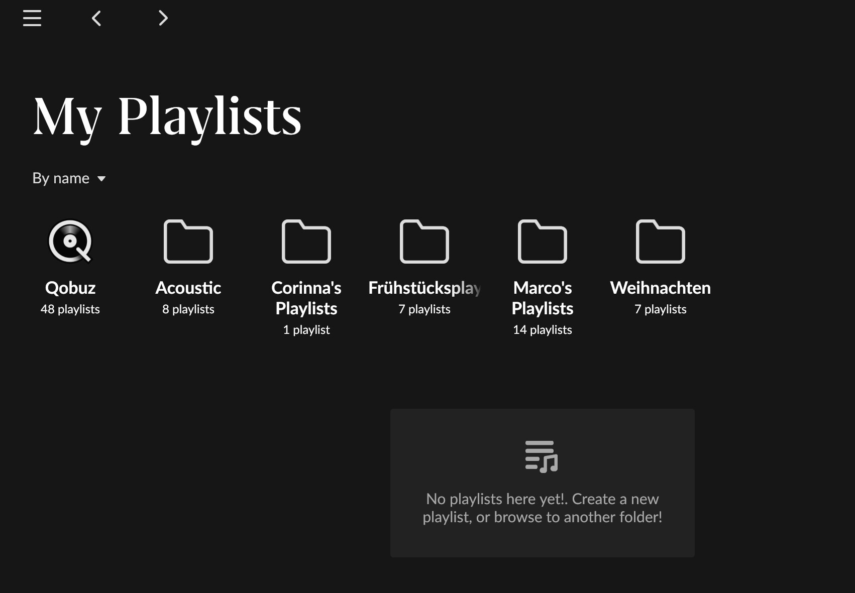
From the video, it seems that the playlist main view shows folders at the top and a full list of all playlists below that. However, I can only see my folders. Is there a setting to change this?
Not just when ‘Show playlists in the sidebar’ is disabled - although it appears to be more difficult to provoke it when playlists are shown (and the menu becomes longer than can be accomodated in the panel as a consequence).
I spotted this independently (and before I found this thread) and raised a feedback topic:
On the above screen your playlists are in folders, only those playlists not yet in a folder appear at the top level on that screen.
What might be a nice feature improvement is the ability to ‘pin’ or favourite certain playlists (even if deeply nested in folders) and have them brought to the top of the main playlist screens as “pinned favourites” and displayed / grouped slightly differently.
Those ‘pinned favourites’ would would also make a great set of candidates for showing (or ‘pinning’) at the top of the sidebar menu, above say 3-5 recently played or updated ones.
As mentioned above you could even extend the ‘pinned’ favourites idea to ‘playlist folders’.
@j_a_m_i_e
Many thanks for your reply. I really like your proposal to pin playlists to the main view and use them in the navigation on the left hand as well.
I thought the same BUT Go Settings> General
Set to NO it drops Playlists to a Single Menu Item all the clutter disappears.
Click and you get to all the functionality described by @mike
First of all, thank you so much for focusing on playlists! As a young and fairly new Roon user who values albums and playlists equally, it is very very appreciated. I’m really looking forward to all the future planned playlist improvements.
I really like the 2 way sync and folders features, and I also liked the icons and the new sidebar structure. (except the “exit full screen” button that occupies a potential playlist slot in the sidebar when in full screen mode)
I would add a “recently played” sorting order, as I find it more useful than the “last updated” sorting order. And the ability to pin certain playlists so they show up on top no matter the sorting criteria used.
But most importantly, I would absolutely LOVE to be able to link/upload my own images and write my own descriptions to my Roon playlists and to see Tidal/Qobuz curated playlist image covers and descriptions in Roon as well, in the same way we see them in their apps; instead of the current playlist covers made by the first 4 tracks images of the playlist.
I would love to have the same aesthetics used in the Roon curated playlists (such as Prog & Proud etc…) also in my Roon playlists and in the Tidal/Qobuz playlists, so with:
This way I could curate my playlists like I truly want, have a much more aesthetic pleasing playlist view and enjoy the process of creating and curating my playlist collection way more.
I find this playlist cover feature super important to browse playlists. As important as when you browse your albums and you look at the album covers to find the one you want.
Having all the playlists with cover images being built with the first 4 tracks covers of that playlist makes it very confusing and messy when scrolling to find the playlist I want, and also aesthetically “bad”. Especially when you have lots of playlists.
It’s both more useful and more pleasing aesthetic-wise to have, potentially, all your playlists with nice single covers.
As of now, I need to focus on the titles of the playlists to search for them, when I could just find them in a quicker and easier way by looking at pictures I uploaded myself or at Tidal/Qobuz own images (the same you see on their apps). Especially with the new sidebar, if I had each one of my playlists with a nice single recognisable cover (maybe also in that sidebar section next to the title) it would be much easier to browse them while scrolling in the sidebar.
Oh also, talking about Roon curated playlists:
And still no track numbers? It is sad.
Only had a brief look at the functionality so far so may have more to comment in the future. BUT I really want to thank the team for releasing this new functionality and for the very apparent rejuvenation in the teams enthusiasm for the product.
Also, I think the short video on the functionality is a very welcome addition and a way forward for future lessees and what’s new.
Is the Early Access program not here to have early feedback and adapt it right away?
There were some very good inputs such as
and I’m a bit surprised that seemingly easy improvements like these are not yet in the final release
but in general: nice update! I’m certainly going to use playlists more in Roon from now on.
Please allow the option to add a customised image for playlists. Also notes and descriptions and such would be nice.
Well if every valid but non-critical EA feedback were implemented before release, nothing would ever get released ![]()
And we don’t know how easy it is to add a collapsible playlist menu to the side bar. If such a widget already exists in the UI toolkit, then using it for the playlists would be easy, but if it doesn’t exist then it would be more effort to implement it. (And nothing else in the side bar is collapsible, so I guess the widget does not exist)
I guess they did quickly implement what was easy, the slightly awkward switch in the settings