I’m not saying that it’s the end-all. But an option to warn about duplicates already when adding would have the same identification challenges to overcome (and in a more difficult scenario because it would have to be nearly in realtime)
1 Like
Also, put Discovery on the sidebar and make it a lot better. ![]()
1 Like
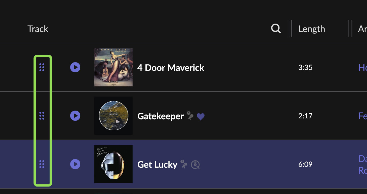
It would be great to have index numbers and the ability to lock a manually ordered list. As it stands, there is no way to get your manual-order back if you accidentally click on any other headings (e.g. Artist).
2 Likes
Index numbers may be nice but regarding “manually re-order the tracks inside a playlist” - not sure if you mean this, but you can (and this is not new) by dragging these handles (though of course only for your own playlists)
3 Likes
Yes, thanks, I amended my post.
1 Like
Got it ![]() in 10 chars
in 10 chars
So you added folders…. Sort of. Haha.
Nice improvement on syncing playlists in both directions. Thanks.
I am not so sure about the way the UI is looking now in the sidebar and with the folders. I hope you don’t turn Roon into foobar!!
That’s fine. You made an assertion on the length of time these features were under development (“a few weeks development time”). I was commenting on your assertion with counter observations. I’m happy to have new features coming. (I think someone else was commenting on backlogs)
With the new features you can order Roon playlists as well as Tidal/Qobuz, not Imported. Which come to think of it, they are not really “imported” or they would be editable. They are more aptly named “External” or “Read Only”
I would like to see more viewing options for playlists, not only by tracks (like by album, by artist, composition,…).
Here’s my ‘Playlist Management’ feedback, for what its worth…
a) I never use playlists, I just want to FIND an album and play it, but thanks all the same.
b) how about going through some of the long standing feature requests? Boxset images?
What I was trying to say was mainly that there is too much to do for one release, so let’s not get upset if not everything is added at once - see the context in which I replied the quote that you chose. In development time, 12 weeks are “a few weeks” for me, and this is the same as 3 months. And they may have thought for “many, many” months about it - probably for years, looking at the feature requests. But obviously we have no idea when they started actual work. So I didn’t mean to put too fine a point on the exact time scale in my post.
Indeed, thanks.
2 Likes
Love the experimentation here! Lots of potential.
Some points of interest from my initial experience:
-
I have 255 playlists… from when I did a transfer from Spotify to Qobuz using Soundiiz when first moving over to Roon. That’s a lot of playlists, so the sidebar was jarring to see at first.
However! Since it’s the last thing in the sidebar, I actually don’t mind it so much. They can sit there sorted by most recently updated and it’s a nice handy list.
It’s still a lot to scroll through in that small space, so ideally I’d like to be able to filter that down, or just show the most recently played or updated N playlists instead with a small “view all” there. I am going to want to look through all 255 playlists in my sidebar basically never.
I have it currently turned off… the settings option was easy to find in the logical place, and I am thankful it’s an option. Thanks for that.
-
Very first thing I tried with playlists was dragging a track into a Playlist.
This is a new instinct for me in Roon, because before, there was never an “object” or a list container at the same level / on the same screen as a track. It never made sense to drag anything before, and menu-driven actions were sensible and clear.
Now that playlists sit in the menu, always available, the instinct is very much to manipulate them more directly.
So, congratulations on the new UI paradigm. It comes with additional affordance expectations for free!
 It’s like you stuck a doorknob on a fence panel… people are going to try to open that fence now.
 -
Icons in the menu. Nice! I like 'em.
Overall I like the updates. You may have opened a can of worms, but it’s in the name of progress, and that’s great. Keep going. Thank you!
4 Likes
To be honest - it is awful update. You completely ruined playlists functionality for me. Why do I see playlist from other users? So basically personal/shared playlists are now broken - now they are the same, there is no difference if it’s a shared playlist, my playlist or my wife’s playlist, they are just some playlists in different folders. Why playlists are the same for all users? I don’t want my playlists visible to other users, only those I share. What the point in that case in separate users?
2 Likes
That’s just great… Thx guys…
Just waiting for the unavailable filter, and I’m in heaven… Keep on the awesome work
2 Likes
I think “somewhere” is the point. It appears to be only on Mac (so not on iPhone or iPad - can’t speak for android or indeed Windows) and it’s pretty well hidden and not so slick in operation.
I’ve used it now though so thanks - I even deduped the family Christmas playlist, removing not just one but THREE of the same Michael Bublé tracks from it….for which I am forever in your debt ![]()
If the focus is on playlists as stated (which is good - I approve - I use playlists almost exclusively) then some redesign and refinement in duplicate handling - the bane of every playlist users life - would be most welcome.

The navigation change actually kind of works for me. I was hoping for some playlist editing improvements, tho… something as basic as multi-select drag-and-drop to reorder. Hope that’s coming soon!
…and now so do I - and actually sliding the screen across (which I had kind of forgotten you can do - as everything I need is in the default frame) I can see it.
Thanks!
1 Like
And @Matt_Crayton, on the phone there is generally little editing and what there is is focused on a subset that’s somewhat related to playback (ratings, tagging, …,) instead of managing, so it’s not there.
Yes the horizontal scrolling is not very obvious
1 Like