So I’ve run in to two more things.
I like that “Exit full screen” shows up on the side bar, why not let use use “Enter full screen” from there as well?
And why can I only put local playlists in groups? It’s not possible with a playlist created in Qobuz. Maybe it will come?
I assumed that my ROON playlists now will appear in Qobuz app automatically. But that is not the case. I needed to move/copy my local playlist to Qobuz folder of ROON to get this playlist in Qobuz. Is that necessary?
Btw: The German translation for the new playlist features is still missing.
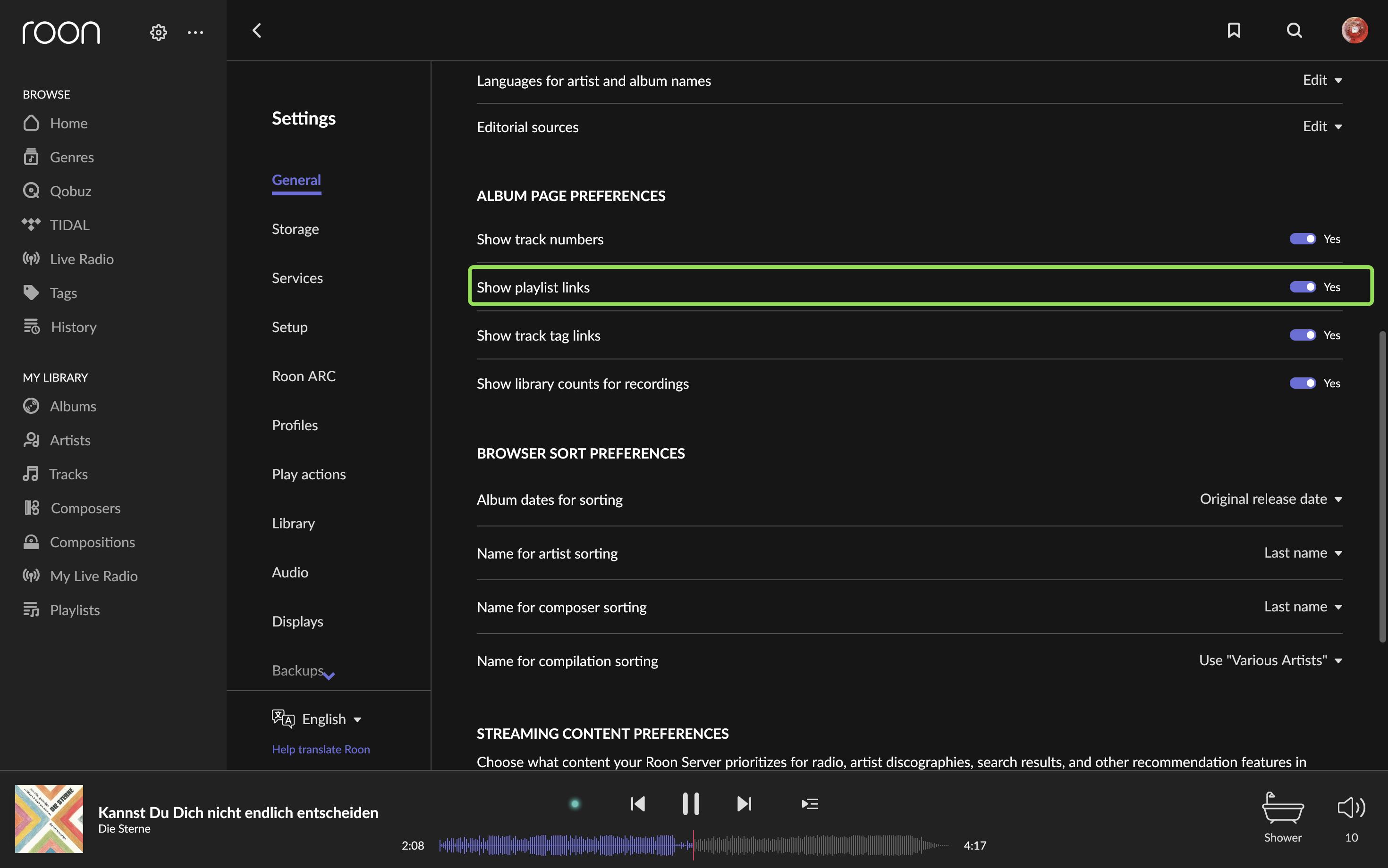
That’s on the “coming soon promise” list - Sometime (soon)
1 Like
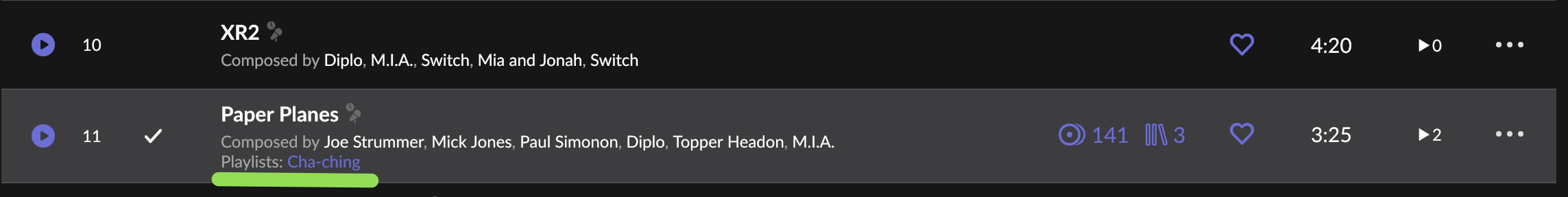
Very well, what would still be needed is the possibility, starting from a track, to check which playlists it is associated with (as for TAGs) and possibly add or remove associations to some playlists. To do this I created a tag for each playlis, but it is not very convenient to keep the tags aligned with the ply lists.
Thanks for the quick reply, I hadn’t seen this possibility (there’s always something to learn!). Of course it helps me…
2 Likes
To be honest, i was a bit shocked about the new UI and playlist mess after install of the actual update. I immediately hated the new sidebar and was happy to find the “turn off” button. That’s what i have done now and i am fine with that.
UI changes are always very difficult, you can’t please everybody with that. But at least it is possible to turn it off and get back the old style. Some people like it, some not. I don’t
Yuk.
I’ve turned off the playlist in the side bar but why are there three different navigation methods depending on what I want to do?
- Sidebar: BROWSE, MY LIBRARY
- Gear: Settings
- 3 dots: Community, Support, Roon Store, Full Screen
Why not just put it all in the sidebar using consistent fonts? Of course that doesn’t work if the sidebar has been cluttered with dozens or hundreds of paylists but its ok if the sidebar is reserved for playlist subfolders.
Others will have other opinions I am sure but it seems quite a mess now with no obvious way of adding new menu items when they arise.
Well for me thats a slam dunk Fantastic Job!!! love the sync to Tidal and the icons are fine. Great Job.
Notice how so many people are now advocating for FOLDER BROWSING!? (tongue-in-cheek)
Glad to have playlists as a single menu entry leading to a management page since playlists are now more complex. A drop down menu is a fine idea as long as it drops down only from the carrot and not from the text link which, IMO, should still go to the management page.
I am also very glad to have a settings gear up top instead of scrolling down to find it in the home menu. In fact, with playlist display off, the entire menu displays on my windows install without scrolling, even with the window shrunk to its smallest.
Looking forward to more improvements, hopefully without undoing existing functionality.
Would love to see similar treatment of live radio. Currently, can’t organize my stations the way I want by renaming if they are already listed in the main station database. Having the ability to rename all stations (for alpha sort) and put in topical folders would be terrific.
2 Likes
You guys nailed it. Bidirectional sync was in my top two requests on the survey. Thank you. Keep up the great work.
2 Likes
I do really like the new look of the sidebar.
Now, the actual playlists themselves… it would be lovely if they looked more album pages. They look a lot like a spreadsheet at the moment and I find it looks odd compare to the rest of Roon. Anyone else?
3 Likes
Playlists, Tags, Bookmarks, it would be great if all of them could be represented with custom images and be browsed like albums.
11 Likes
I love the new Playlist features! Reordering tracks in playlists is hard work in the Tidal native App. In Qobuz it works without problems! So I am very Happy that I can reorder my Tidal Playlists via Roon now. And thanks to the other new features I basically don’t need the Tidal & Qobuz native apps anymore. Thank you Roon Team!
Yes it is. I would not want Roon to automatically copy/move my playlists to a streaming service. I have many which contain music which the service doesn’t so those playlists will become incomplete if a copy/move is attempted.
3 Likes
A post was split to a new topic: Navigation Link for Roon OS Systems (Nucleus & ROCK/NUC)
Love the new playlist functionality and it is great to have folders. The only issue I have is similar to others where I have a profile and my wife has a profile. I don’t want to see her playlists and she doesn’t want to see mine. We should be able to assign playlists to multiple profiles and move them in/out of folders independently.
1 Like
This may have been mentioned, but wouldn’t it be better if the sidebar contained the folders, as maybe collapsible/expandable headings? For me, the benefit of having folders is that I can organise different playlists into related sets rather than one long list. A big long list in the sidebar just reminds me of one of my other bugbears - the big long list of bookmarks that would also benefit from nested folders, or some other way to organise them.
9 Likes
+1
My list of Bookmarks is getting out of hand.
7 Likes
Agreed. I’m making a lot more use of Bookmarks (and they work very well indeed); a way to ‘organise’ (hierarchical, nest, collapse etc) them would be an advantage… TIA!
4 Likes