I really appreciate the functionality of this release, but I feel like there were some pretty significant regressions in terms of the design and feel of Roon with this release - not limited to the presence of individual playlists in the sidebar.
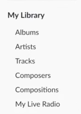
Consider this image from the Roon 2.0 sidebar against the design of the newly updated sidebar.
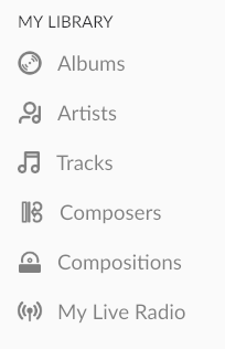
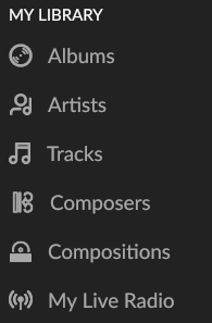
The icons are the first thing that I notice. They look good in light-mode, but there are aliasing issues with how they are displayed in dark-mode.
When it comes to the browse menu, I don’t like the presense of the Tidal icon. It feels like branding and advertising and I wish it wasn’t there. There should be the option to hide these icons altogether.
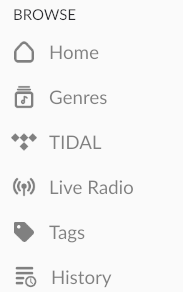
The next thing I notice is that the section headers are a smaller font and they have been changed to an all-capital letter typeface. Neither of these seem like good design decisions. Conceptually, the section headings (Browse, My Library, and Playlists) represent larger concepts than the items below them (Albums, Artists, etc.). The larger concepts should be portrayed with a larger font. The use of all-capital letters is anxiety provoking and seems to have been done to compensate for the smaller font size.
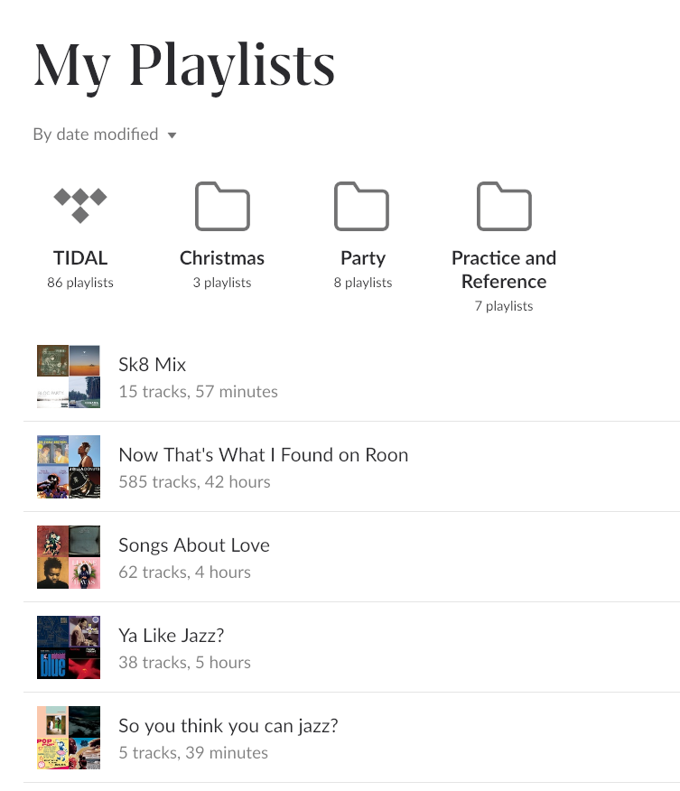
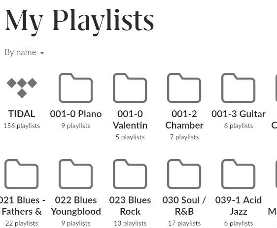
On the playlists page, I love the ability to group playlists into folders, but the folder icons are unnaturally large, and again the Tidal Logo is present. The folder icons on this page could be 25-50% smaller without compromising the ability to click on them accurately. I’d also appreciate seeing the folders that my tidal playlists are organized into - rather than a Tidal logo.
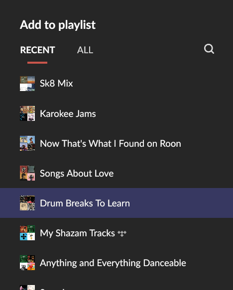
On the “Add to playlist” dialog, the presence of playlist images is distracting and cluttered. The images are too small to communicate anything meaningful and they’re not necessary.
The Tidal logo is also present - in-line with the playlist names, I think this is okay in this context since it’s somewhat necessary, but it should probably be the same design as the tidal badge that get’s shown on albums if you have it enabled. That would provide some parody to the design and make it fit in a little better.

The last design gripe I have with this release is that the Composers Icon makes no sense. What is that? All of the other icons are easily recognizable, but the Composers icon is too abstract. Maybe just add a Victorian wig to the artists icon? Sure that would be stereotypical, but that’s the point of icons.