Has the font changed or is it now not bold (on the dark theme)?
Certainly to my eyes things are more slightly difficult to read.
.sjb
Has the font changed or is it now not bold (on the dark theme)?
Certainly to my eyes things are more slightly difficult to read.
.sjb
Just noticed this in the last hour, don’t think it was like this at 7am ECT.
Not easy on my old eyes.
I’m on the default white theme. Everything looks washed out. More difficult to read, it’s now more difficult to distinguish between topics you’ve read, new topics, and everything else. Makes me want to visit the community less.
I know chrome was just “updated” at least on my box. Could this have affected the font?
I’m not using Chrome and my browsers weren’t updated. I’m thinking ‘no’ that is not the cause.
Same issue here, using Safari.
No, this is part of server side changes introduced by Roon Labs. Probably the most visible change is the enhanced top row:
As was already noticeable with the introduction of Roon 1.8, Roon Labs likes to make questionable decisions regarding fonts.
I use firefox on Win10 machine. And it hasn’t updated in last 2 days. I use white theme (default) and the fonts are not so light that I also struggle to read. Seemed to have started this morning.
Yeah, it’s a more “corporate” look so I’m guessing it’s intentional. The main font could do with a little more weight/size IMO.
What is near illegible remains frustrating to these old eyes ![]()
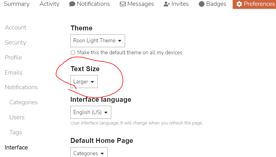
Go to your Avatar, top right of screen: -
Click once
Click “Preferences” far right
Click “Preferences” on the dropdown
Click “Interface” far left
Select “Theme” then “Roon Dark Theme”
Select “Save Changes” bottom of screen
Done
Slightly different layout on Safari (iPad, iPhone) etc but same options. Just need to click on “Account” dropdown after “Preferences” then select “Interface”.
Obviously Art, where craftsmanship (Typography) should have been used instead, or at least considered.
Short definition: Typography is the art and technique of arranging type to make written language legible, readable and appealing when displayed.
The dark theme is just about totally illegible IMHO.
Just offering the option for those wondering where it can be changed. You don’t need to change it ![]()
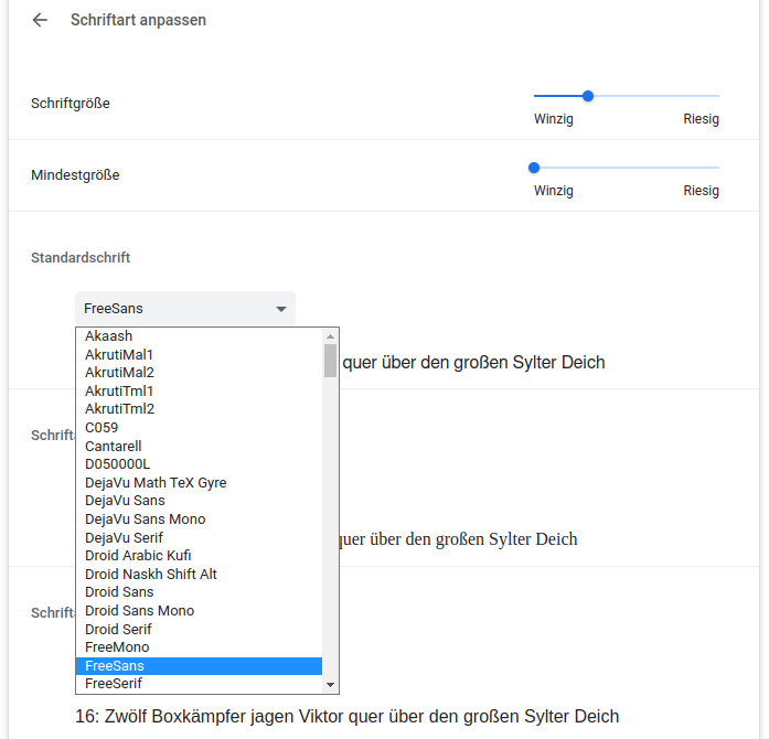
For what it’s worth you can also increase the default font size in the settings slightly adapting these instructions:
Helps a bit but it’s the font weight that’s the issue…
This font is terrible. Astigmatics (like me) tend to prefer serif fonts anyway, but this one is really crammed together – hard to read.
Thanks, I have it back to the dark theme now.