Good for you, catching the spirit of the times! I’m only 52 and I still haven’t made peace with my mobile phone 
Roon is one of few “modern” things I love. I hope 1.8 does not “modernize” things too much!
1 Like
In the subject of the e-mail sent out today it had “Introducing Roon 1.8 (part 1 of 5)” and then in the body it states “Next week we’ll be rolling out the latest version of Roon, which is so big that we’re sharing a series of previews over the course of this week. Today, we bring you a peek at Roon’s completely new look and feel.”
The perennial naysayers are already complaining and the release hasn’t even dropped. I guess I did not expect anything different but I am still somehow disappointed…
19 Likes
Thanks for the advance notice; and good luck with 1.8!
As a classical-only music lover, can anyone assure me that those focusing chiefly on composer, then work (and not (necessarily) ‘song’ and performer) will be catered for, please?
Thanks  .
.
1 Like
Looking really slick, looking forward to this, the new focus and dashboard elements shaping up well!
Nice video presentation. Look forward to trying it.
1 Like
I liked the first video. It really does look fresh, and more Focus can only be a good thing. I’m excited!
4 Likes
If you had listened to the Roon podcast that was recently posted, you would have found clues about mobile…
New design looking good, though I already see that it unfortunately doesn’t have a global filter/funnel. In other words, if I’m in Overview, or anywhere besides the Album Pages, and say I decide I want to hear Kind Of Blue, I can’t just go to a global funnel up top and start typing in “K-I…” but still have to go to the Albums page and then filter from there. First world problem for sure, but I’m hoping Roon could continue to cut down on some of the continuous navigating that needs to be done in order to do the simplest things.
The landing page promo video is not only a great teaser for the upcoming 1.8 update, it’s as good of an explanation for what makes Roon special, and worth utilizing, as I’ve seen. It’s a really good explainer.
3 Likes
Roon 1.8 looks great. May I ask, does Roon management have any comments on the SQ of 1.8? There are some who felt the latest build of 1.7 may have been a small step back in SQ. Let’s not debate that. I use Roon and love it. I’m just curious is there are any expectations that users should have regarding the SQ of 1.8?
3 Likes
This is from Darko’s report.
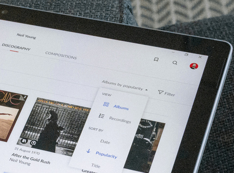
certainly the funnel is on this page
.sjb
1 Like
Is this a cosmetic release or will it have Atmos?
1 Like
I hope we’re not stuck with that purple (etc?) color(s) everywhere. I like the current Dark Mode, subdued layout. Let the color be with the Album Art not the interface, plz.
3 Likes
Gotta say really like that new look to roon. I am really hoping that one of the changes in 1.8 is like someone else said earlier on in this thread and hoping that can finally add my own album reviews and notes directly into roon, so it all flows seamlessly within roon itself instead of having to open an external PDF application to read stuff as that just felt clunky as hell to me and really did not like it. Fingers crossed this is happening in this release.
1 Like
That is an interesting use of the word “or”.
1 Like
446 days from the last point release of V1.7 B500
1 Like
Nice display of purely subjective opinion. Change, evolution, improvement and updates are inevitable and part of ordinary life. Roon cannot please everyone but they certainly couldn’t stand still and refuse to innovate and progress. You’ll either get used to the new interface or move on to another product as we all or free to do. And “tuned to time” simply means up to date with current trends, functionalities and user expectations in 2021 with a look toward the future.
1 Like
Does it support Tidal Family Subscriptions fully yet?
2 Likes
I very much like the new style and I’m sure the revamped Focus will be much more efficent, but I really liked the charting on the old Focus pane, esp. by Genre, Year released. It sadly looks to be completely text based now, with charting just for play history.
I’d also be interested to see how the editing metadata screens have changed. Of course bulk revisions/corrections to meta for unidentified albums should be carried out in a third-party app, but for the odd album the current editing - file order with sliders etc… are very poor UX.
One of my biggest wishes is for a Guest user profile, which just allows playback/playlist creation with the options to edit/delete removed. Essential when you let friends/family use the control apps.
1 Like