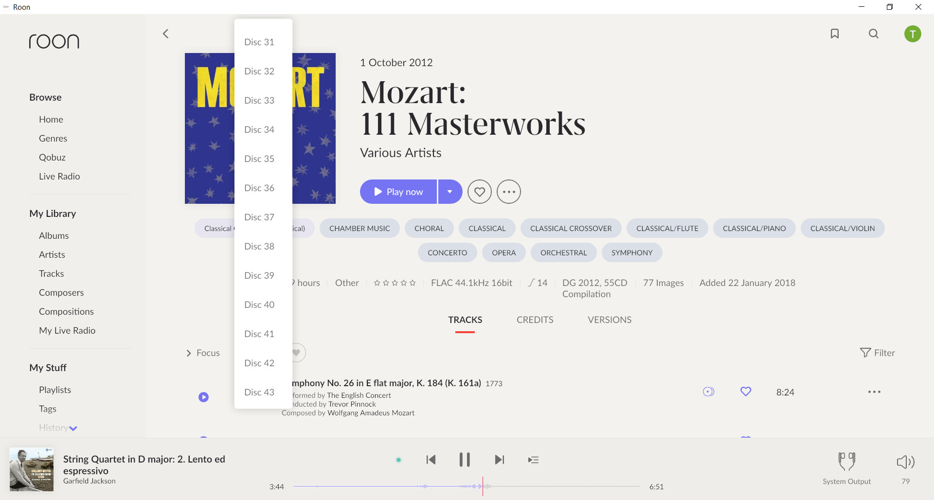
Initial reactions are favourable - although it will take some adjusting. The classical search stuff appears to be much better - I am now able to find a particular composition within a box set, rather than just being given the box set and the ability to look at the discography for a particular composition (at least what is available on Qobuz and my library) is amazing. I am sure I will be using this a lot.
Not all the changes are to my liking - but on balance I think you have got this right and I will adapt to the new look and feel. There is one thing for certain, you cannot satisfy everyone all the time, and you would be foolish to try to do so.
This is a major step forward for classical music lovers. We may be a very niche taste in terms of the overall music listening scene, however we tend to want to listen to high quality audio and many of us, being old white males (if not quite yet dead😀) have the money to spend pursuing our musical interests!
While everything seems to be working allright and I appreciate some of the visual tweaks, the amount of wasted space on my ultrawide monitor is incredible. Artist views fills up the width but everything else is narrow, narrow (even the spectrum bar which used to go all the way across is concentrated in the middle third of the screen).
Settings for ultrawide resolutions would be appreciated, but am happy everything still seems to work fine on my setup.
Just installed it so not very much to comment on yet other than the fonts are now really small on Macos and windows in certain views. I’m using a macbook pro 13" with 19201200 resolution and windows on a 23" screen with 19201080 resolution . Never had any problems with Roon, or any other app but it looks like this version is primarely made for Ipads. I read something in the release notes about a font scaling being in beta but can’t find anything in the menu. Does that mean custom font sizing is coming anytime soon? If yes, that would be really really great. Font and colour customisation are right on top of my wish list for years now. For now, readabilty has taken a step backwards. In some views in the light version it looks like there is a vaseline filter over the fonts. Maybe this is by design but it’s not very nice when trying to read it. In the black version purple on black is even worse then blue on black. Completely invisible.
I think it’s no secret that I have never been a fan of Roons interface colours/fonts/screen real estate choices so I only want to say that nothing has changed regarding that. I can live with ugliness (personal taste, yes I know) but it’s start bothering me when it gets in the way of functionality. Others seem to be happy, that’s great.
By the way, on windows, the menu is broken as well over here but that has been mentioned many times allready so I think it will be on the bugfix list by now.
The new focus filter is a major improvement by the way. Other new features seem very promising as well. Lots to explore for the next days.
Congrats on the successful rollout. My initial thoughts:
-Love the vertical scrolling.
-Love the Discography view.
-Hate the artist circles. Smaller space for me to pick up on artist ID.
-Hate that on iphone, bookmark is moved to dropdown menu - less efficient when the whole idea IMO is direct link to something.
-SO much white space! Guess it’ll take a while to acclimate. Seems to be a ton of wasted real estate. For example, on artist albums (PC remote), there’s space for ~10 albums per screen. I miss the wider view of many albums through the years.
Miss the album ratings display in artist’s albums/disc and the MQA badge.
Initial reactions are favourable - although it will take some adjusting. The classical search stuff appears to be much better - I am now able to find a particular composition within a box set, rather than just being given the box set and the ability to look at the discography for a particular composition (at least what is available on Qobuz and my library) is amazing. I am sure I will be using this a lot.
Not all the changes are to my liking - but on balance I think you have got this right and I will adapt to the new look and feel. There is one thing for certain, you cannot satisfy everyone all the time, and you would be foolish to try to do so.
This is a major step forward for classical music lovers. We may be a very niche taste in terms of the overall music listening scene, however we tend to want to listen to high quality audio and many of us,being old white males (if not quite yet dead😀) we have the money to spend pursuing our musical interests!
(On technical matters - the update went smoothly and I am able to access via my iPad Pro as well as my Android phone. I did not update these in advance as advised by you - but was prompted to do so the first time I used them after the update on my Core.).
Automatic update didn’t work on OSX core or remote, maybe because the core is an m1 but remote is intel. Didn’t work on last 1.7 update either.
Downloaded the installer from the website, guessing it was the latest build as the file size had more than doubled, even though banner still said 1.8 coming soon.
Manual install went great, iOS and Android worked great.
An error did pop up a few times saying there was an error and roon radio was sticking to library music. Guess some backend services have fallen over. Just glad roon can keep ticking, for me it’s essential that core library playback still works even if I’m or Roon is offline.
Enjoying the new skin, and already discovered two new artists based on the new recommended music bits.
Also enjoyed what I saw in the composer / concert music section so far.
Did just have a strange situation where when I changed tracks the music changed but all the remotes still showed an album from a while back, then couldn’t change tracks anymore or even stop current one. Restarting core app seemed to fix this.
Valence is only picking tracks from my library and not including Qobuz on one artistI did not select this in the queue display.
I am also getting no choices because Valence can’t find any similar tracks to an artist that is well known. She has a number of albums and collaborations. I listened to her last night and Valence was able to pick similar artists quite well in my library and on Qobuz.
More touches needed to get to screens that were previously quicker reachable.
Tracks are not numbered on albums and playlists. Why? I have very long play lists and it helps on reference.
Very unstable on ipad. Blue screen artifacts. So many users have these issues. How can this be missed during a testing phase?
No album covers anymore on iPhone too. Very bad. Serious downgrade if you also count numbers have been removed. Wonder based on what good research this was all decided. Maybe listen more to the customers.
From a happy users to a frustrated users. Discussed this week a lifetime license but this helped taking the decision.
Very new however the interface looks modern and fresh.
The first thing I noticed is when viewing playlists on the iPhone. In the prior version each song in a playlist had the album cover icon on the left side. These album icons are now gone. If it was possible on the iPhone in the previous version I do not know why they are now removed.
DEAR ROON!
Please, please, please get rid of this horrible, close to unreadable, “I’m so oldfashioned”-looking, absolutely unsuitable serif font (for example) … There are more than just classical music lovers in your userbase, who’d for sure appreciate a more modern, more tidied up (not 100 different fonts, sizes etc. on one screen) UI. I was really hoping you’d modernize it with this version, but UI-wise it’s such a huge step in an absolutely wrong direction, that I’ll seriously look for alternatives now!