I use an Android smartphone as my controlling device for Roon. While roon has provided me with a good user experience over the last few years, version 1.8 is almost impossible to use. There are so many restrictions and also major bugt that I am now a little bit lost…
Dear Roon team, is there any chance that you are putting some development work on the Android client for smartphones?
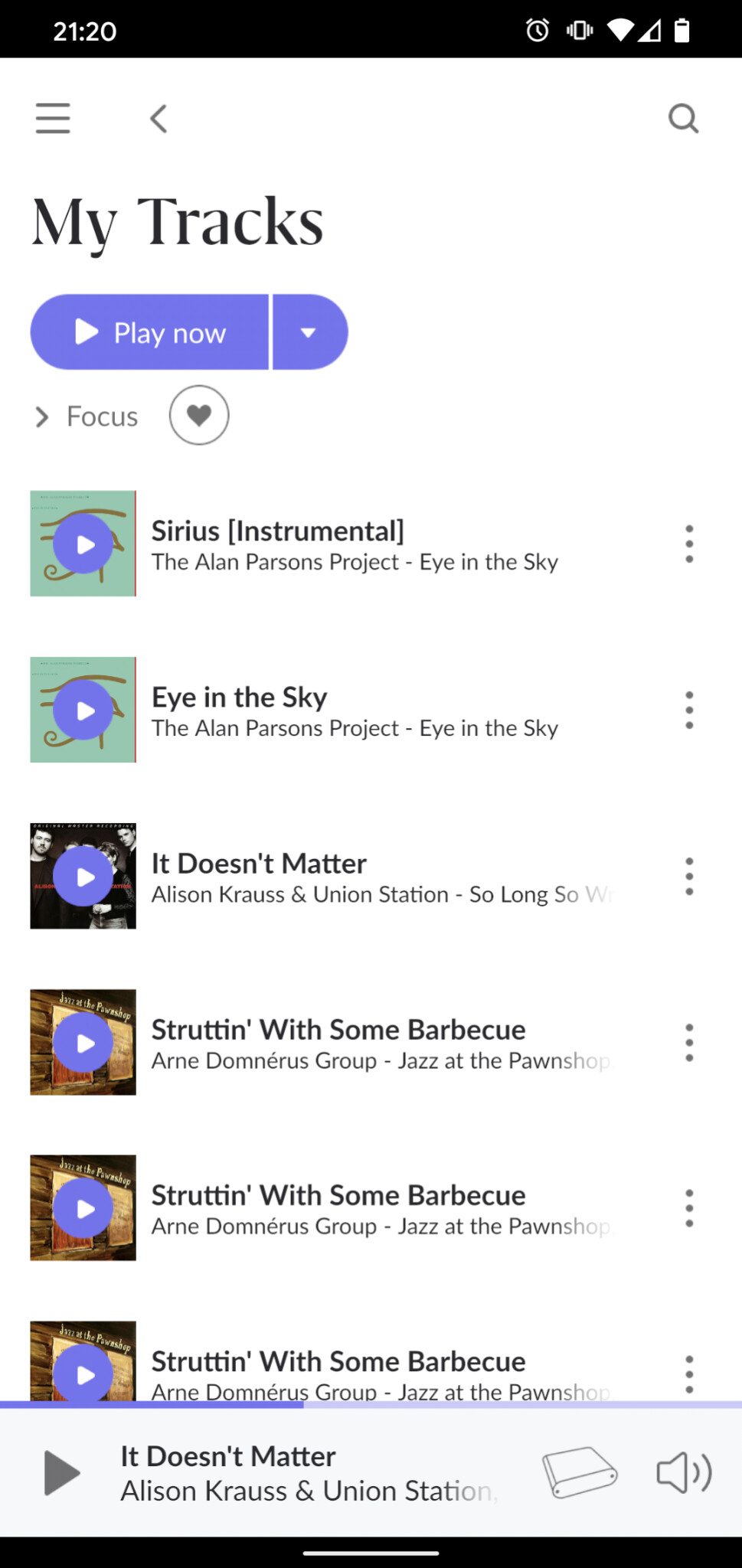
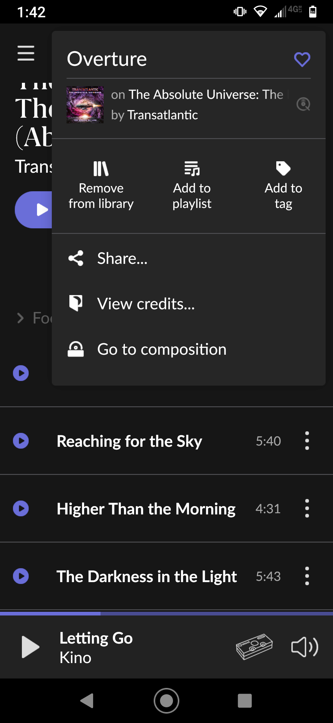
It is not possible to add a track to my favorites (there is no heart symbol). Also, it is not possible to see, to which playlist a track has been added to. Touching on the Album or Artist does nothing. You cannot get to the Album or the Artist. While on the same track under “My Albums”, there are the two additional options “View credits…” and “Go to composition”, these options are missing under “My Tracks”. Inconsistent functionality on the same track… why?
Again, no sorting option of tracks within a playlist. It is also nearly possible to manually drag a song to another position in the playlist. The six dots on the left side most often don’t work and you are ending up in selecting songs instead. Finally, there are no album covers for the tracks in a playlist.
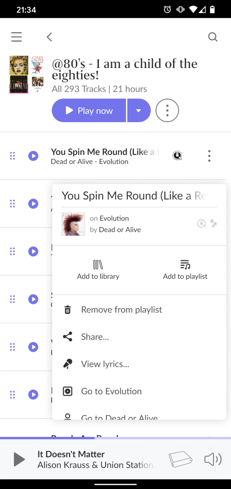
While suddenly there are two additional options that allow you to select the artist or the album, the pop-up menu is being cropped in a weird way, so you have to scroll within the pop-up menu. There would be enough space, but roon has simply implemented this pop-up menu function badly. BTW: Touching the Album text or Artist on the right side of the album cover do nothing at all.
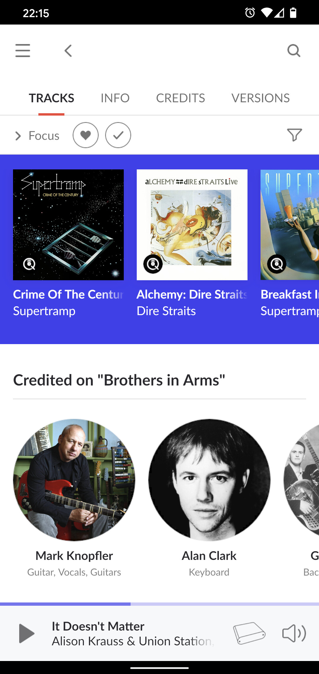
If you select the credits of an album, roon presents huge circles that force you to scroll almost endless. Then suddenly it uses small circles (which by the way are perfectly readable). This waste of space and the design inconsistency using different circle sizes for a the album credits is annoying. A fun fact: If you are looking at the credits of a single track of the same album, roon comes up with a totally different representation. Here we go:
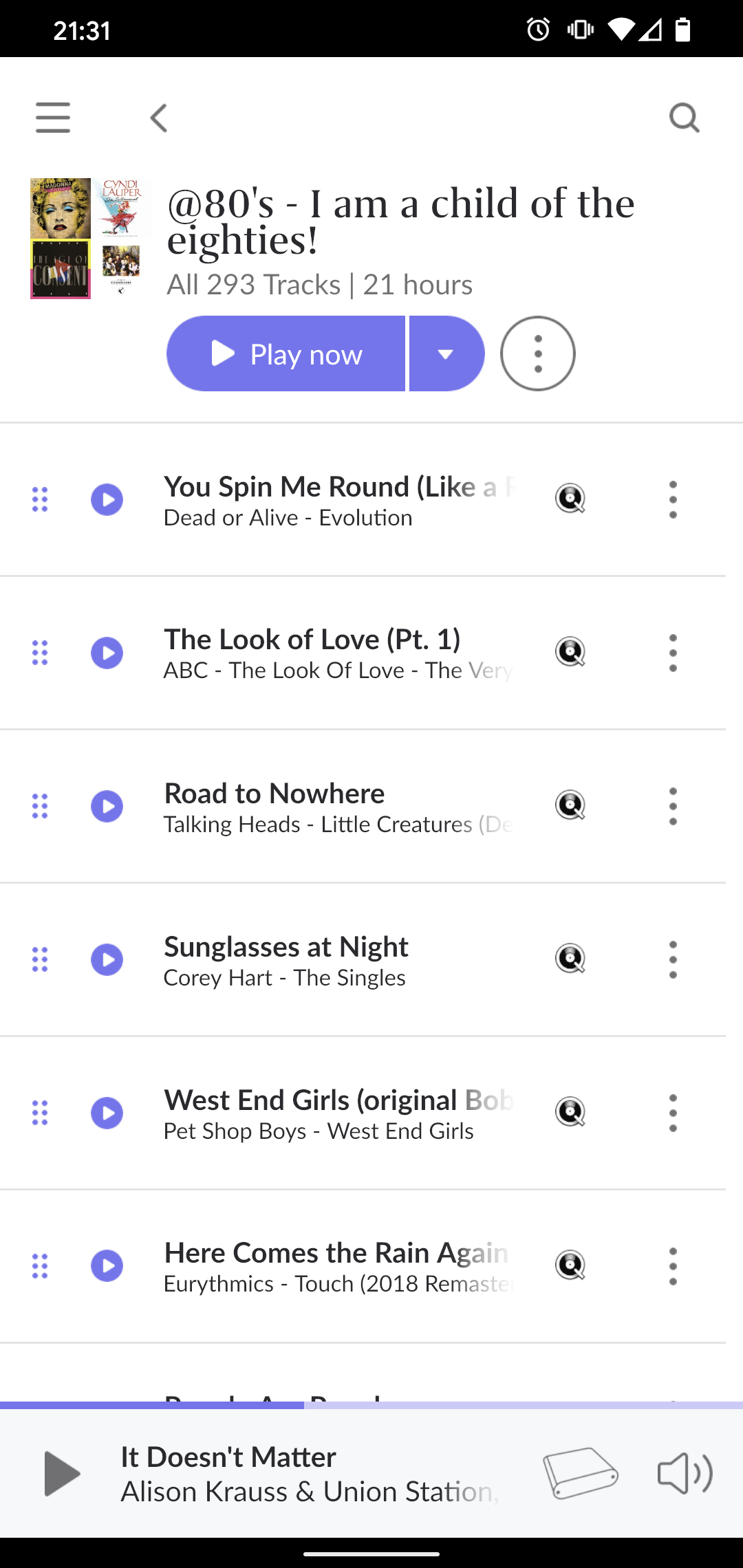
Roon on Android smartphones now forces you to scroll in all directions. Vertically and horizontally. This is poor design. If you chose to provide only portrait mode on Android smartphones, then please optimize the UI to work in portrait mode.
This is a general issue that I have with Roon 1.8, not only on my Android smartphone. But on the smartphone, this isssue gets really ugly. I know my name, thank you. No need to remind me. I hope I do have some more healthy years until getting Alzheimer. Do I care about what I played recently? Not really. If you offer a “More” button, why do I have to scroll horizontally at all? Again, inconsistent portrait mode. There is much information, that I don’t want to see, when listening to music. I really don’t care about the length of my recent session. There is so many statistics, that get higher priority than the reason I am using this platform. I just want to listen to some music.
Please dear roon team, give the Android smartphone client some love. You killed my user experience. Bring it back to life, please…
Agree with all of the above, Android seems to be the least developed interface in 1.8, maybe you ran out of time?
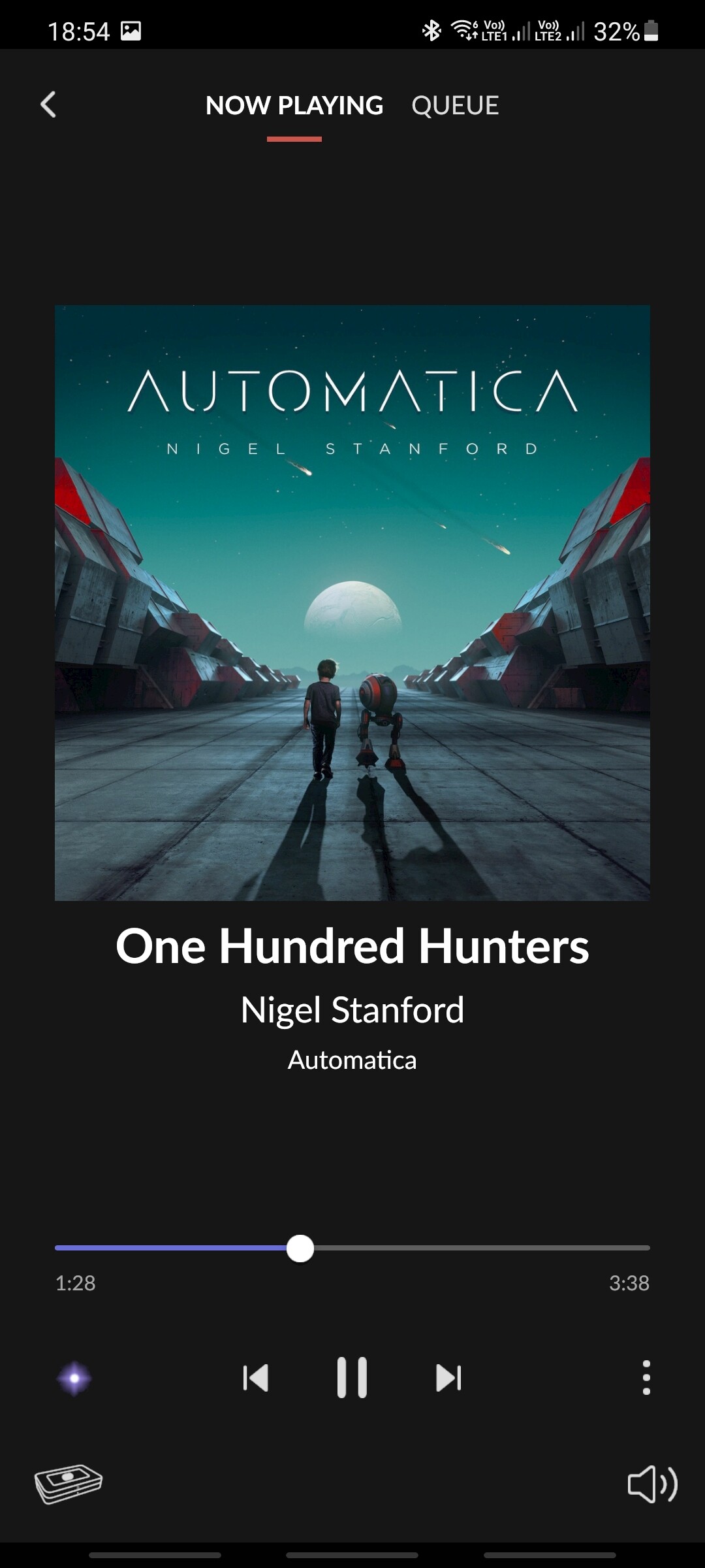
Also there is no song resolution info in the Now Playing page on Android, there is in ios and windows.
There is a lot or empty space under the album art.
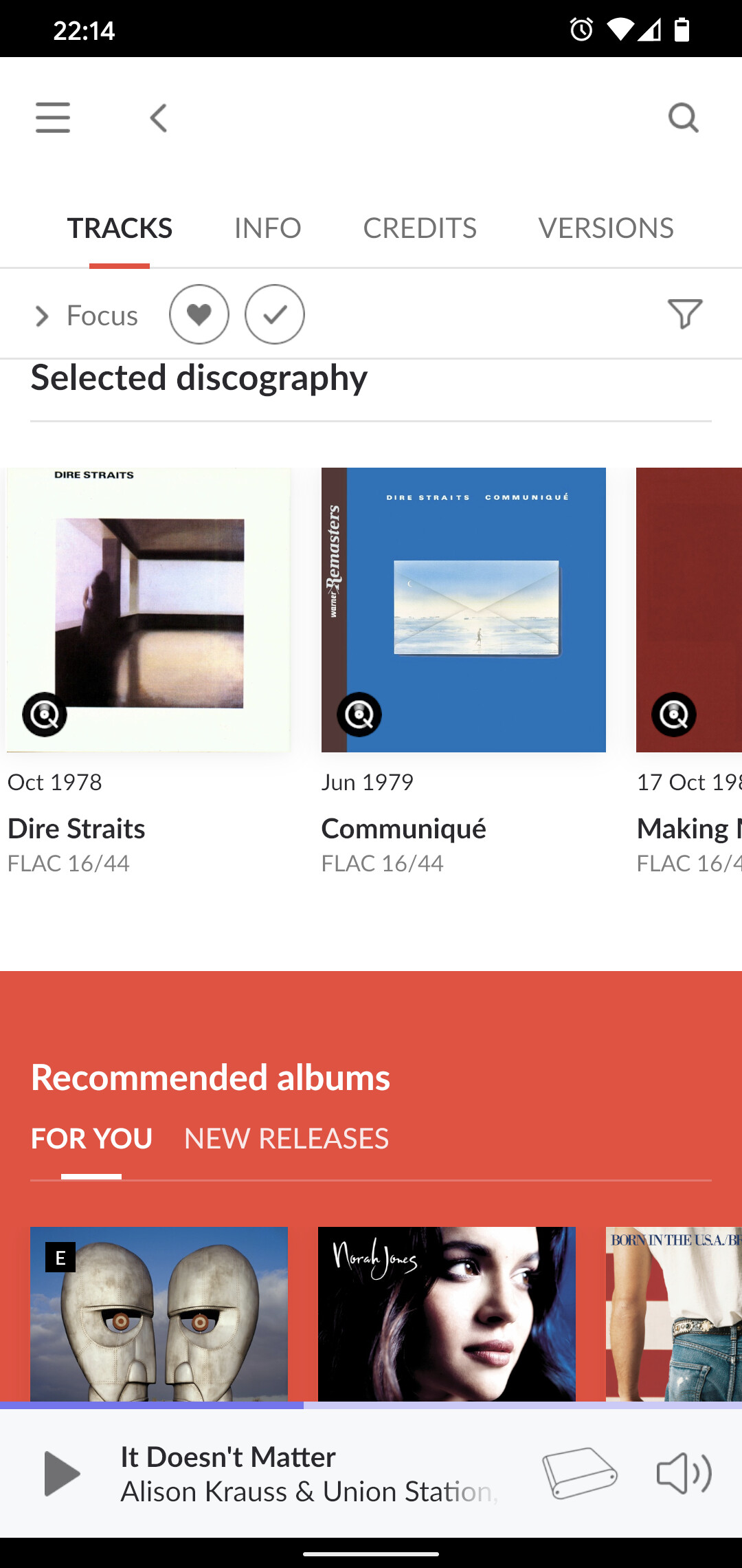
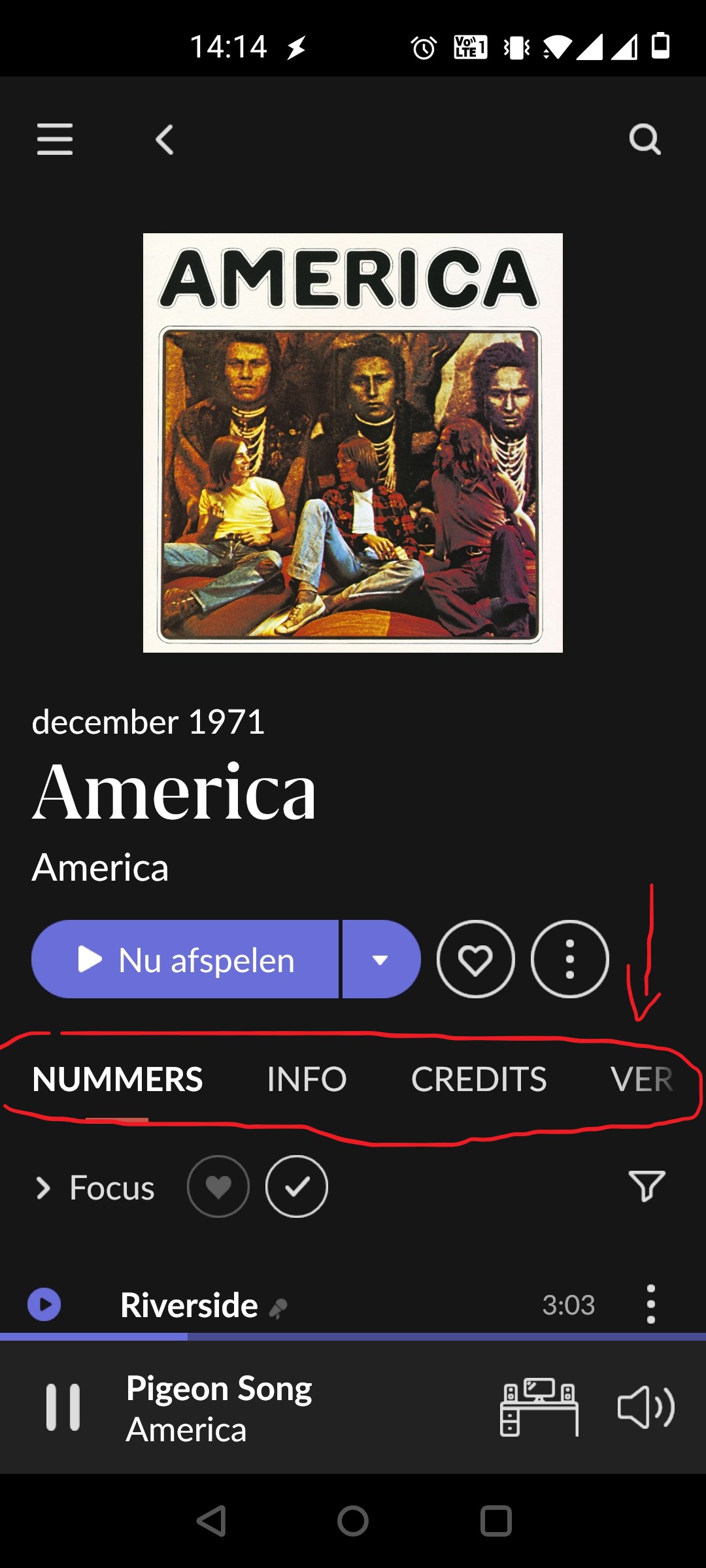
In addition to the above the tab titles in the album view are to large and don’t fit the width of my screen. They are OK on the first start of the app but coming back to the app from running in the background they are too large.
The my tracks is definitely the poor cousin. It really needs some loving. Dear developers, When you add the ability to sort in Android pretty please persist the last selected sort order between sessions. Also I really don’t understand why when adding a single track from an album it adds all of them to my tracks. That would be a bug wouldn’t it? Keep going, you’re getting there from an empathetic software developer…
1 Like
AceRimmer
(Smoke me a kipper, I'll be back for breakfast!)
5
May I ask what phones you are using?
On my motorola moto z4 I can sort tracks and I have the heart button to like individual tracks, although it is not where it used to be. I have to click on the three dots and then it is the upper right corner.
Mind there was an update to the android Roon app a day ago so maybe you do not have the very latest version?
I am picking out this point because this is everywhere on desktop and tablet as well, and I have not seen it mentioned anywhere. Makes the menus much slower to use and looks sloppy.
I can reproduce everything else you wrote on Android phone (Motorola Moto G8 Power, Android 10), thanks for the summary
Are you doing that from albums or tracks? Albums is ok, tracks not so much. I have a Samsung Galaxy s20.
AceRimmer
(Smoke me a kipper, I'll be back for breakfast!)
8
From within an album, select an individual track in that album with the three dots and that screenshot is what I see.
And that is the only way I have ever “liked” an individual track…play an album and if I hear a standout track to my ears I would then like it.
Then when I can’t be bothered to select an album I might just select my liked tracks and hit shuffle.
It depends from where you are using this function. It currently only works on Albums, but not on “My tracks”. Also, when playing songs from a playlist or using the Roon Radio function, there is a menu option to go to the Album or Artist, but the heart button is missing. The Android client is totally inconsistent
Forgot to answer: I am using a Google Pixel 4 and the latest Roon App.
While using Roon Radio, there are no Thumbs buttons on the “Now Playing” screen to indicate if Roon did a good job picking the song.
AceRimmer
(Smoke me a kipper, I'll be back for breakfast!)
11
You could be right Alex but the only way any tracks get into the “my tracks” section is when I add them by liking them from an album list so its not something I would ever have noticed.
As for them to have got into my tracks I had to have “liked” them to start with and would have no need to ever do so again…if that makes sense…
Now if the like heart was missing from the albums selection then yes I would have noticed.
Hi Kevin, I often like individual tracks while playing using Roon Radio. This function is in general great for exploring new music. But while I am doing this, I am not adding the whole album to my library. And I am also not listening to a specific album. I just let the music flow and add the nice songs to my tracks (by using the heart button). Maybe at a later time, I go through my liked tracks and start looking at the artists, their albums etc.
1 Like
AceRimmer
(Smoke me a kipper, I'll be back for breakfast!)
14
Got you Alex.
Just a different way we like our individual tracks.
I can see how your way would show this problem so I revise my opinion on the like feature.
I very seldom listen to the Radio as I have found it tends to play tracks for the most part that I am not interested in overmuch.
But that is just me obviously!
Yep. It’s like they chose the box size without thinking of what will go in it. Best to fit the box to the type. Not a big deal, but another indication of something just not thought through fully, which can be found all over the app.