To an extent yes, but many software products offer color choices or themes. They have Dark and Light already. I think if they had offered 2-3 Darks and 2-3 lights, no one would have even bothered tinkering with the color over rides.
2 Likes
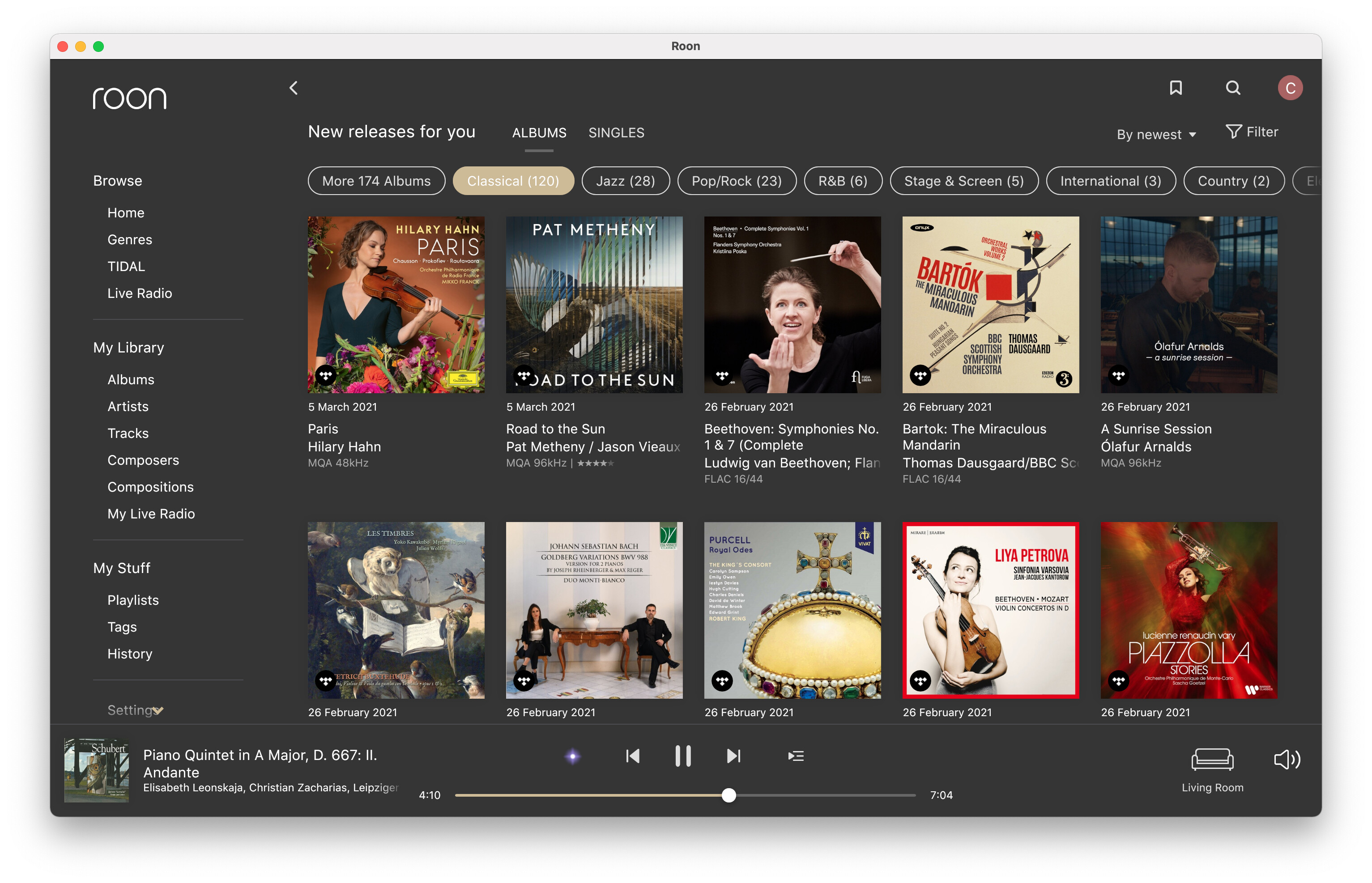
Which is why I ‘themed’ mine to pretty much match what I work with daily in Photoshop and Lightroom. I don’t find it ugly at all compared to the OEM 1.8, in fact quite the opposite, though, yes, I have seen some re-themes that don’t do it for me at all, even compared to the OEM 1.8. Hopefully Roon can see fit to make a middle gray theme that is optimized for readability and relaxation of the eyes. The problem is 1.8 has lots of blank space, so that either acts as a flashlight (light theme) or a black hole (dark theme) by going to the extremes on both.
6 Likes
For me functionality trumps aesthetics and accessibility concerns are a real issue. High contrast, large font UIs designed for the partially sighted are rarely pretty, but that’s a very poor reason for not providing them. I’d like to see Roon take this more seriously, and I have (ageing) 20-20 vision. In truth both my useful functionality and aesthetic appeal are both on the down slope now ![]()
Very nice design. Full points. 
Why doesn’t Roon offer something like this?
2 Likes
Thank you. I have no idea what Roon were doing/thinking with the design of 1.8 and won’t postulate on it as that just gets one in trouble around here. But thank god for the ability to manipulate the colors and fonts ourselves.
2 Likes
Hi Charles, would you mind sending me a copy of the colors file? It seems like you’ve pretty much nailed the mid-gray market with that one ![]()
2 Likes
To me too, please, that’s wonderful.
I use Lightroom a lot. What do you mean you themed it like LR?
I like your film shape - can you share it with those who like it?
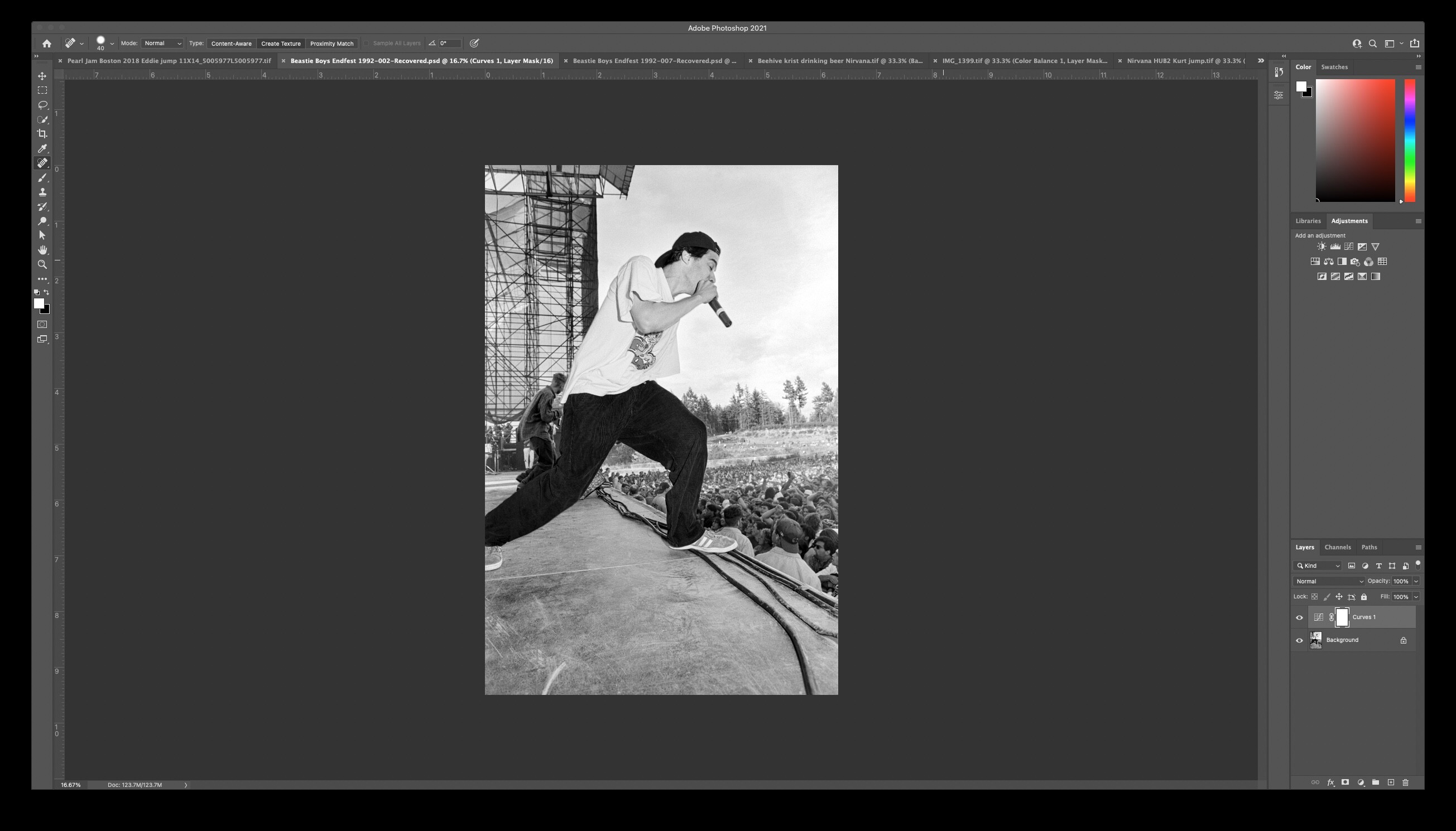
Sure - for windows or Mac? I’ve made them on the Mac. Or I can share the actual image and then folks add it to their own atlas files.
Does anyone know if the iPad app theme settings are changed the same way?
This is the folder for the dark theme… the colors file is a config file, all text.

// ===================================================
// Theme Colors
// ===================================================atom-background #181818
atom-background-fade #181818
atom-black-fade #181818
atom-separator-light #4D4E51
atom-separator-heavy #A0A2AA
atom-classical-background #252527atom-grey4 #ffffff
atom-grey4-hover #ffffff
atom-grey4-insensitive #10%ffffff
atom-grey4-marked #72%ffffff
atom-grey4-secondary #A8A8A8atom-grey3 #FFFFFF
atom-grey3-hover #C2C2C2
atom-grey3-insensitive #20%C5C5C5
atom-grey3-marked #C5C5C5atom-grey2 #3C3C3F
atom-grey2-hover #4D4D50
atom-grey2-pressed #4D4D50
atom-grey2-insensitive #50%3C3C3Fatom-grey1 #1E1E1E
atom-grey1-hover #2D2C2C
atom-grey1-insensitive #ACACAC
atom-grey1-marked #85%1E1E1Eatom-grey #3C3C3F
atom-grey-mapping #BBBBBBatom-genre-mapping #ADADCC
atom-blue #6B6ED9
atom-blue-hover #787CD7
atom-blue-pressed #787CD7
atom-blue-insensitive #40%6B6ED9atom-blue-mapping #4F5E9E
atom-onebox-blue #4F5E9Eatom-orange #C9544B
atom-orange-hover #C2372C
atom-orange-insensitive #F6B1AB
atom-orange-mapping #C9544Batom-green #57C6B9
atom-green-hover #4CAFA3
atom-green-insensitive #295E57atom-red #E02954
atom-red-hover #CD274E
atom-red-insensitive #6C1A2Eatom-selectable-blue #193A5E
atom-selectable-blue-hover #17304D
atom-selectable-blue-checked #414245atom-selectable #333333
atom-selectable-hover #393939
atom-selectable-checked #1F1F1F
atom-selectable-insensitive #1F1F1Fatom-bluebg-noalpha #242424
atom-bluebg #242424
atom-bluebg-hover #292929
atom-bluebg-pressed #292929
atom-bluebg-insensitive #242424atom-footer #242424
atom-classical-footer #2C2B2B
atom-zebra-stripe #28282C
atom-panel #242424
atom-classical-panel #2C2B2B
atom-popup #262626
atom-border #414245atom-graph-1 #5456D2
atom-graph-2 #898CEB
atom-graph-3 #D7D8F7
atom-graph-4 #AAC0FE
atom-graph-5 #81A2FF
atom-graph-6 #5B5B5E// ===================================================
// not theme colors. these should not change
// ===================================================
atom-white #ffffff
atom-white-hover #ffffff
atom-white-insensitive #05%ffffff
atom-white-marked #72%ffffff
atom-white-button-hover #22%ffffff
atom-white-button #12%ffffff
atom-black #000000
atom-black-hover #2D2C2C
atom-black-insensitive #ACACAC
atom-black-marked #85%2C2C2E
atom-waveform #75808F
atom-fade #1E1E1E
atom-highlight #FF8000
atom-yellow #E6BB72// ===================================================
// used by dynamiclist scrollbar in 3/2020, before changes in master. Question for brian2: are these colors correct for the new dynamiclist?
// ===================================================atom-purple #5D9CE0
atom-purple-hover #7fb5eb
atom-purple-pressed #4996E3// ===================================================
// brand colors
// ===================================================
dropbox-color #ffffff
facebook-color #3B5998
twitter-color #1DA1F2// ===================================================
// BACKGROUND & DIM LAYERS
// ===================================================
feedbackpanel #aa000000
dimlayer #70%000000
Great! Roon, please implement this!
I have a Mac. Maybe share the actual image so we can all add it to the atlas files, but you lost me when you mentioned adding layers, colour and opacity.
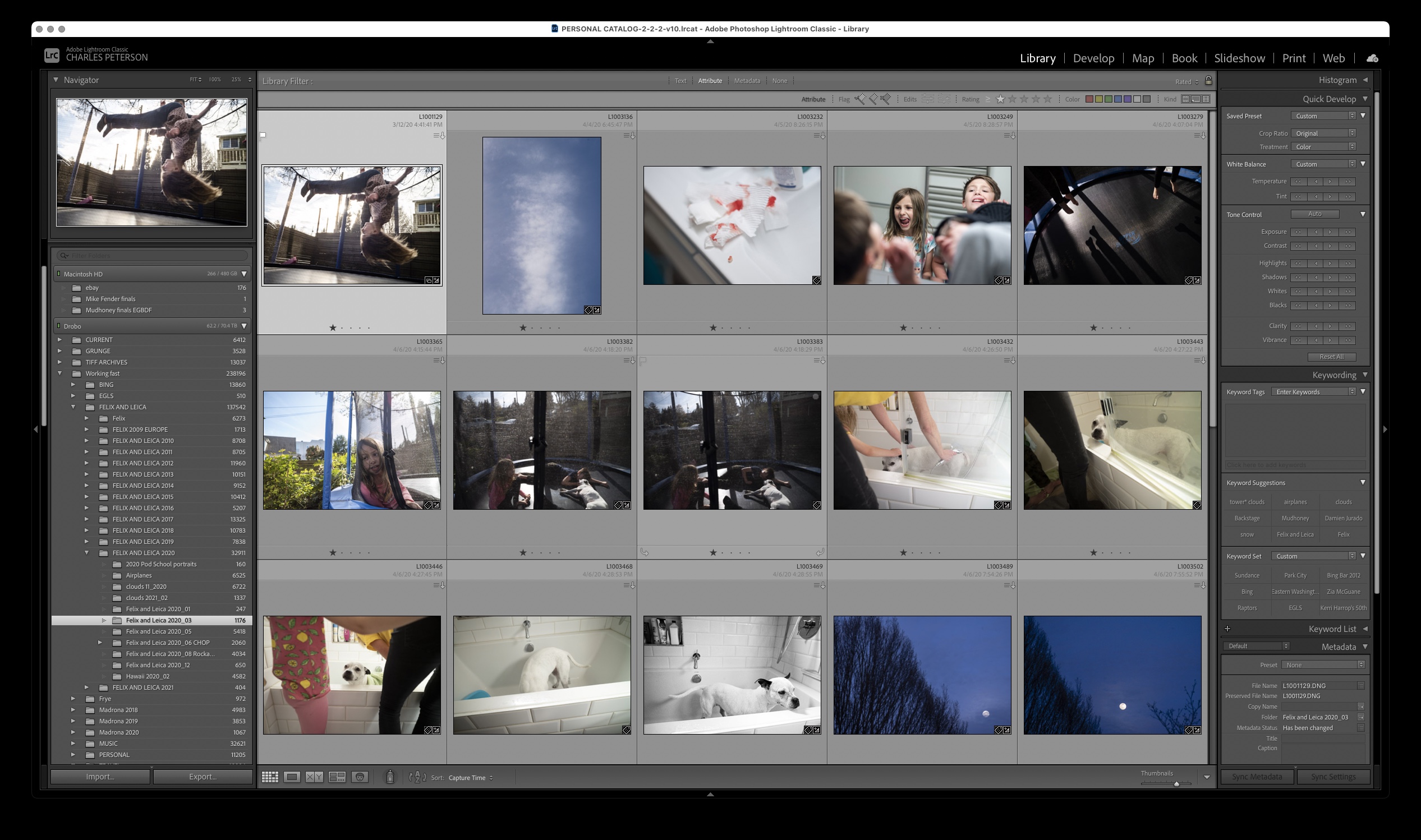
There you go… the Mac atlas files (Windows ones have a different layout) of the film. So you’ll need to take the relevant sections and put them into your atlas files…


Here’s the full atlas for Mac… although uploading it seems to upload it as a jpeg, so it’ll need the format changed.
I may be wrong, but I don’t think that will work as that will give you a .png file with a white background rather than a transparent one. Maybe post them as a zipped file with a dropbox link.
Good point. Forgot about jpeg and the lack of transparency.
https://drive.google.com/drive/folders/1PYjEu-16ASXJStmGvRdDTtm8FYQ1iZ5T?usp=sharing
Thanks, that works for me on a Mac.
I tried this (the shapes modification) on my laptop and it works and looks great: I love it!!
On my Surface Tablet, however, I cannot get it to work. I made sure to repeat the exact same steps, but still: Only circles …
I am aware that at least one other person has (or had?) this problem on the Surface - has a solution been found?
1 Like