yep that is exactly what I have done 80% restored at present. Fingers crossed it all goes well.
Edit
All up and running now and blasting out AC/DC 
yep that is exactly what I have done 80% restored at present. Fingers crossed it all goes well.
Edit
All up and running now and blasting out AC/DC
LOL. No just a favorite of mine. The title track quite possibly one of the most beautiful, ambient solo piano pieces ever.
It should be fine. As you’ve already restored once today you know your backup’s OK.
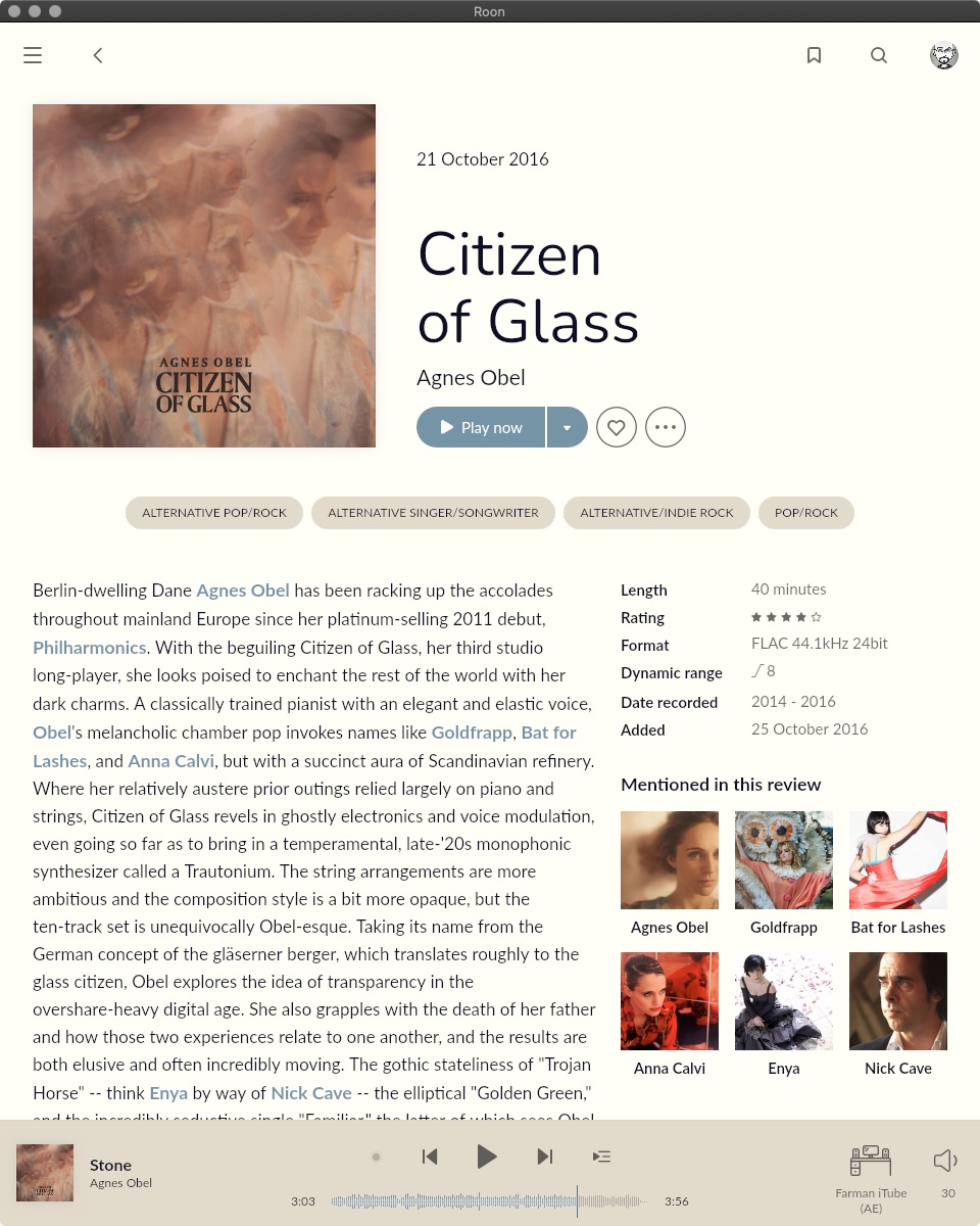
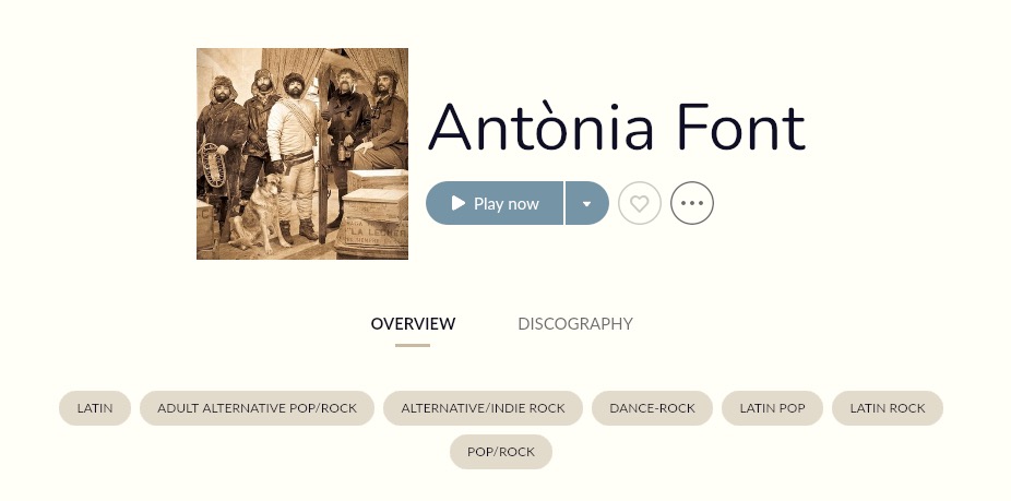
I decided to join in. Nunito for the title font, AvenirNextLTPro for the text.
A here’s a few more font related images …
I though I quite liked Roon’s new font, but after changing it I wouldn’t go back.
Nice hybrid of serif and sans serif. (Looking at the “Q” and the “g”). I’m seeing definite size differences with some fonts. Garamond displays at about a 10 point while Merriweather is 12 point (just guessing).
Franklin Gothic Book
Franklin Gothic Regular
Nice. Avenir is one I was considering.
Wow, nice to see Jim Noir on here! Discovered him around 2007 and have listened to all of his albums, some EPs and other random tracks. Pretty much love every single song I’ve heard from him. I’ve been really digging his newest album AM Jazz and the follow up EP.
I like what you did with the album title!
Loving all of the color themes everyone has been posting! Keep them coming!!
@Charles_Peterson, I’d also suggest Montserrat. It’s very readable.
Thanks for the heads-up - I wasn’t aware there was a new EP <… heads off to bandcamp ![]() >
>
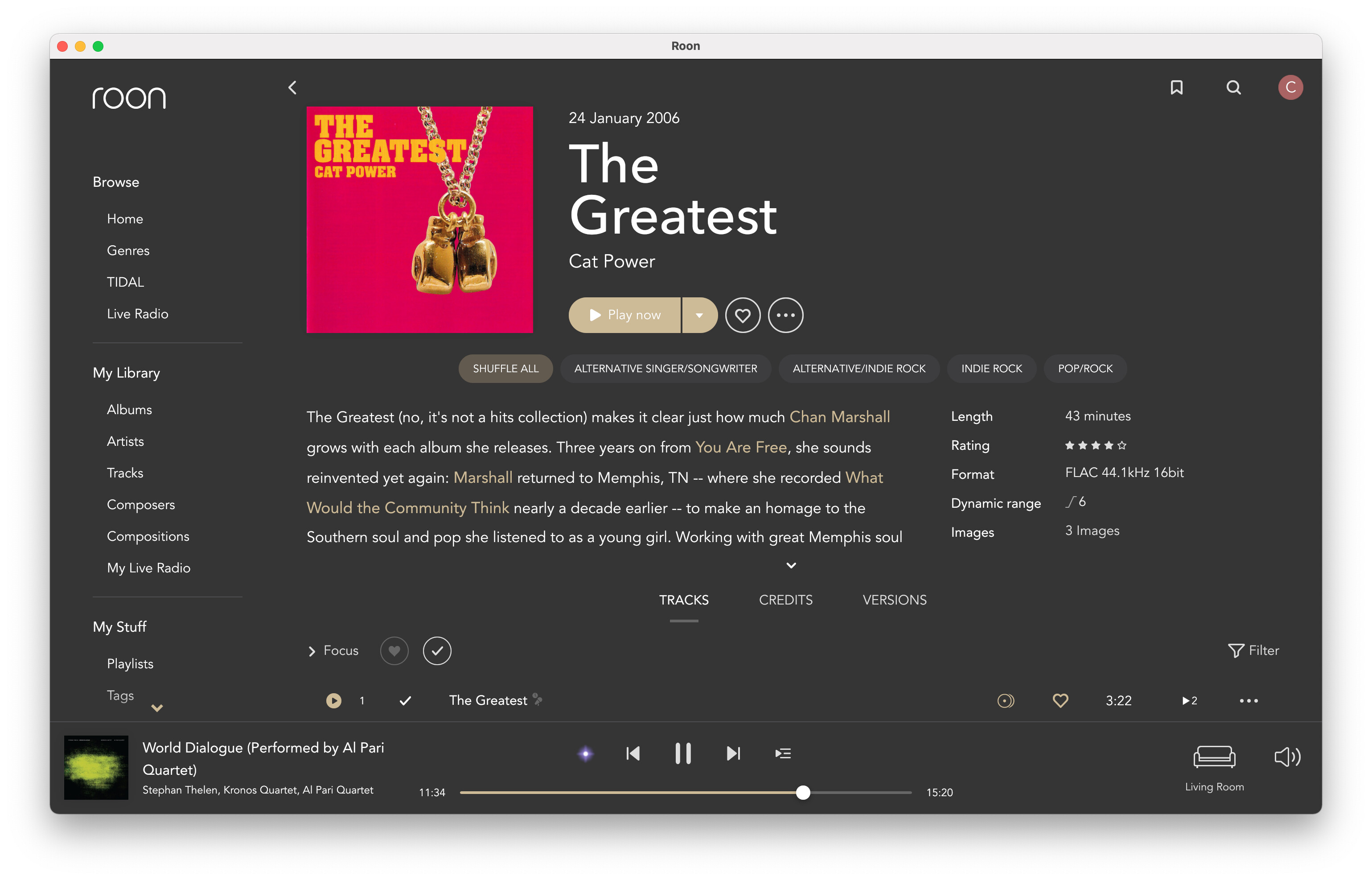
Another possibility, instead of switching Lato out, is to replace Lato Bold with Lato Black. This makes it much easier to parse the links in the text.
If you’re interested, I’ve updated this theme. Nothing major, but I think there are a few small improvements. You can download the new version here.
Avenir theme. More readable so was able to go a bit darker on the background. It’s all a bit hit and miss as type is not meant to just replace another without finessing size, spacing, kerning etc. But I think I like Avenir best so far - nice cross between the modern of Lato and the solidness of Franklin. And for once the title break actually makes sense here!
I suspect the backgrounds of our similar themes will be identical at some point soon. Yours is getting darker, mine’s getting a bit lighter ![]()
I would like to try and work out a light theme as well, just don’t have the energy for it at the moment. Not supposed to be my job!
Haha. No, you would have thought Roon might have managed this for us. Perhaps we should send them an invoice for all the effort we’re having to put it. As for light themes: I’m happy with mine now, but have run out of enthusiasm for creating any more. I have six to play around with now - that will do to be going on with.
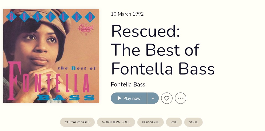
I sure hope they do something about the extra big point sizes. It’s like being shouted at all the time vs just emphasis (which would be an only slightly larger or bolder type). Esp ridiculous here, where the date is repeated right below the album.