Really? I’m not sure what you people are comparing Roon to, but there are some really terrible UIs out there that are coming from the really big players. iTunes? Awful. Netflix? Really really awful. Amazon Prime video? Really awful. Photoshop? Incomprehensible. TBH the UI I’m most impressed with, despite being forced to use it for 5-9 hours a day right now is Zoom.
1 Like
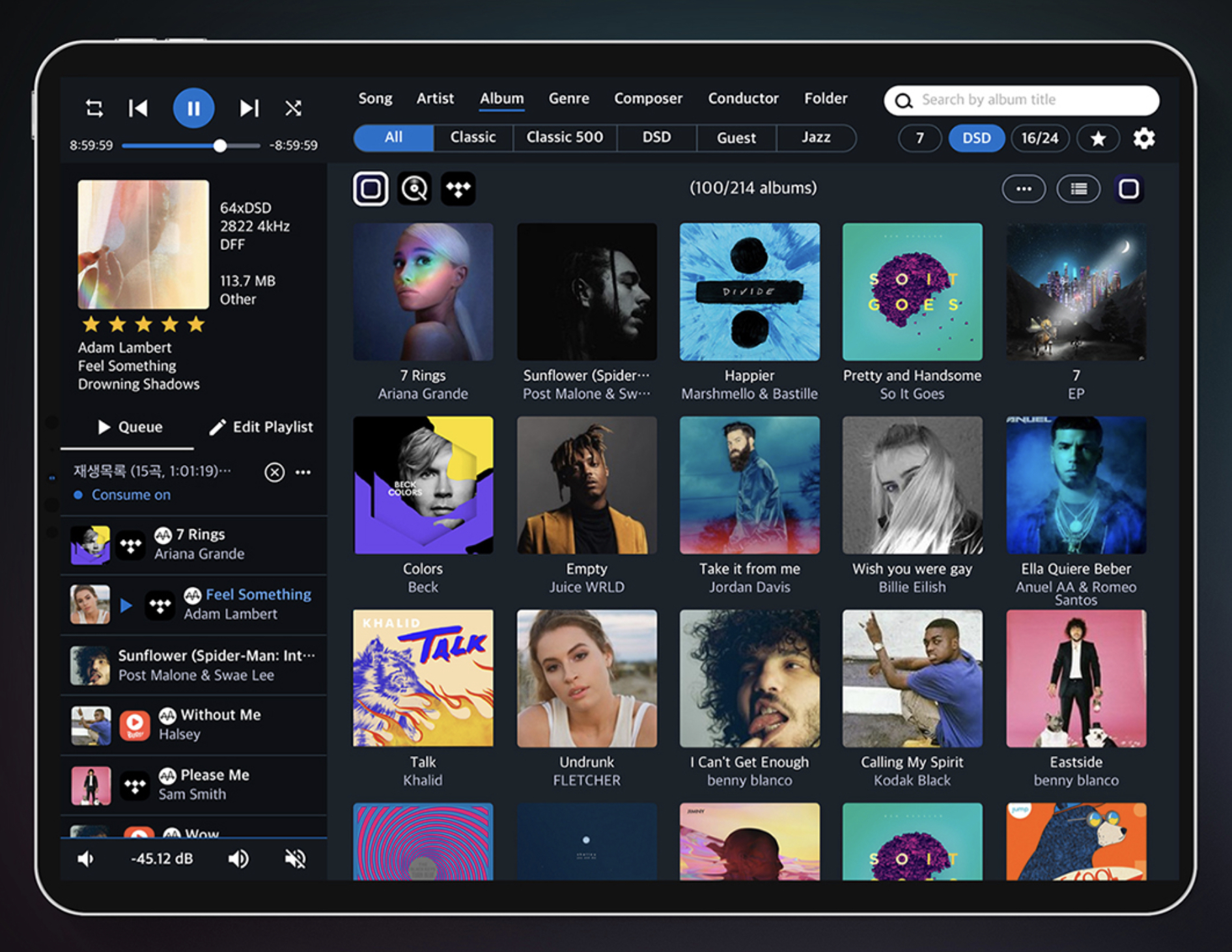
The OP is right, the UI is an abomination of inconsistent and incomplete workflows, capabilities and half-baked ideas that haven’t been followed through. No point discussing it though, nothing will ever be done about it and those accustomed to it and its obvious shortcomings will just tell everyone they’re wrong because its great and they love it.
4 Likes
Yet, it isn’t…strange. It certainly could be improved upon and I hope that Roon will improve it. But, if it is not, I am perfectly content with what I am using today…
2 Likes
The UI is a mess, and yes Roon still is the best music player out there but In The Land Of The Blind, One-eyed Is King. That says more about how bad the competition is than how good Roon is. Yes, there are a lot of bad players out there, so when I discovered Roon I thought why not, it’s not the end of the world, In general I don’t like the design of the interface it is too much form over function to me and it has a lot of quirks but it was still in development and very promising and the competition is doing worse so I jumped on the wagon. As of now I would love to see some more TLC for the basics of Roon, nothing has changed in the four years I’m using it. Yes there has been development and a lot of new features but all the quirks and inconsistencies that where there four years ago are still there, pratically all of them. To be honoust that has dropped my faith in the future of Roon quite a bit. Yes they are still ahead of the competition but I have to say that when something better comes along I have no hesitation to switch over.
9 Likes
I don’t think the UI is an abomination. I do think it’s a bit odd. I’m no software designer, but I did develop a database app for my workgroup. The data was very old and came from several different sources so the initial app was pretty simple. As I accumulated additional data, realized new requirements and acquired new skills, the app just grew. I knew how it worked because I designed it and it met my needs. Did it work for anyone else? Probably not so much. That’s how I see Roon. It’s like it just grew. Does it work? Sure. Is it inconsistent, difficult and cumbersome? Yes.
1 Like
Spot on!
Equally! It really is an abomination (had to google that one…).
Different layouts whereever you look. Like a schoolboy coding UIX
1 Like
My 25 yr old won’t use Roon because ‘it takes too long’. This is a missed opportunity.
My wife won’t use Roon because she feels it is for computer nerds. This is a missed opportunity.
I use Roon in spite of it taking too long and not being a computer nerd.This is a missed opportunity because I would use it even more if the interface was slicker, cleaner and less cluttered. Ergo it wouldn’t take too long and I would not need to even consider computers, databases and metadata.
So when I listen to BBC Radio 4 I need two specifics displayed on the screen:
- station logo
- output
Mouse clickers and finger tappers can have their desires sated by as many screens as they desire but hidden from the fundamental information listed above.
Surely the same simple display for music choices is enough for most?
4 Likes
David I so agree. The Roon experience is similar to an amateur who, on designing a spreadsheet, shares it with baffled colleagues who find the display wholly incomprehensible.
2 Likes
Agree with most you say but no this. Even highly complex applications can be wrapped around a slick UI. And I forone am only here because Roon can handle (sometimes) complex tasks.
No. looks terrible. Lumin looks a lot slicker than this. UI design is an art. Few companies - except Apple - recognize this.
1 Like
The Conductor app looks awful - way too busy. Agree that Lumin is good, but I never use it other than to adjust settings for my T2.
3 Likes
Apple is not entirely immune from bad UI design. For example, I find iTunes (and even more so the Music app on iOS) to be a pretty awful UI - glad I don’t have to use it hardly at all any more.
2 Likes
iTunes ? Remember their DVD player ? The iCal faux leather modelled on that of the great leader’s private jet ? Or the mouse that recharges on its back ?
I remember when I first got Roon it took some time to get oriented and figure out the UI so I can agree there is room for improvement and I understand Roon is working on it (this came to the forefront when they updated the “Now Playing” screen).
I look forward to changes but whatever they do I hope they don’t mess with the “Focus” functionality; it is fantastic.
2 Likes
I guess the people who complain about the UI don’t remember or weren’t here for V1.6.
I think that was the version number.
For that update, the villagers massed with pitchforks and torches.
In that case, Roon did listen. So, if anyone has something contructive to say, rather just venting, there is always the Feature Request section.
1 Like
Take a look at JRiver and get back to us.
1 Like
as an example, look here and you got a constructive starting point:
Synchronise the look & feel of the "Artists" and "Composers" view with the "Albums" view
1 Like
@SKBubba who cares about JRiver?
Yes, I agree that is disconcerting, but I think most UI complaints are about usability.