I just want the file artwork displayed as large as possible.
I can’t seem to configure it to get rid of the Artist Photo and just display my file artwork.
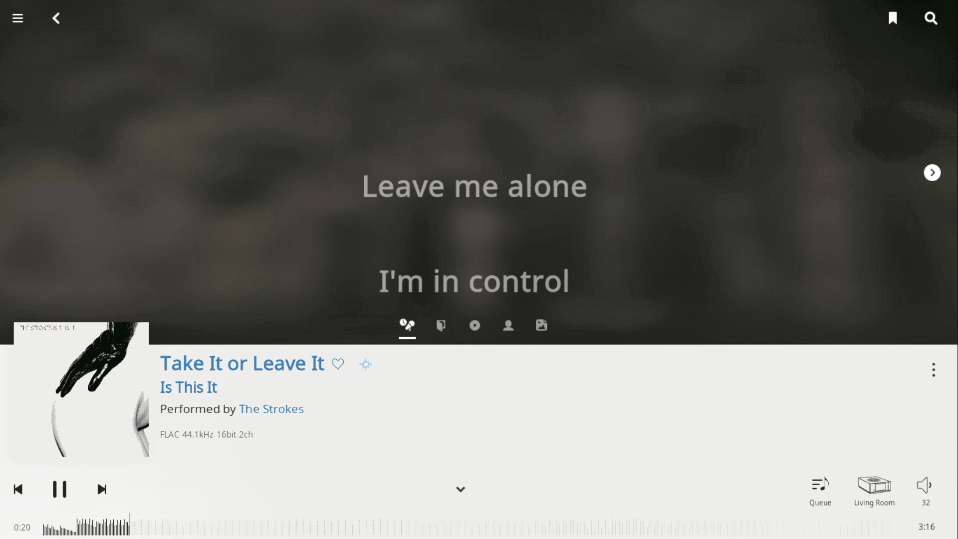
It’s great to have all the extra information when I’m browsing. But for the now playing screen it would be nice to be able to glace up and see the artwork of the track playing.
I agree I want to see the album art on the now playing screen. The small icon on the left is hopeless. It gets even worse for unidentified albums as two thirds of the now playing screen is blank. Ugh. To get the full album artwork is now two clicks away.
Decent sized album art is also not available on the queue screen anymore either. Yet a huge part of this screen is taken up with a boring radio icon. I rarely use Radio so this is just ugly for me. Can’t this only be active when radio is active and activating radio part of the three dots menu at the top of the queue screen?
It’s a great idea to make the Now Playing screen configurable, but why leave out this obvious use case.
There have been previous threads about the now playing screen having larger artwork, and using track artwork. You would have thought they would have at least offered that option for configuration
Adding an “album cover view” to Now Playing should be reasonably straightforward – we’re already working on some designs, so look for that in a future release soon.
During alpha testing we actually increased the size of the album cover on Now Playing at least twice, but from what I can recall we didn’t get tons of feedback like this-- there seems to be a perception that what you’re seeing in Now Playing today won’t change or expand in the future, and I just want to be clear that nothing could be further from the truth.
We really see the current Now Playing offering as just the start of what’s possible here – there’s so many ways we want to enable discovery and exploration using the current track as a starting point, and this screen was intentionally designed so that we can continue to add functionality, and everyone can customize and get what they want.
So consider “album view” as “on the roadmap” and head over to feature-requests to let us know what else you might be interested in seeing here.
I agree. I also can’t get the keyboard shortcut for the Now Playing screen to work. Other shortcuts still work, so I’m guessing it has been completely removed?
I agree with other users: please bring back large album cover art to the now playing screen!
Also return Cmd-S/Ctrl-S keyboard shortcut.
And please return “up next” track.
The new now playing screen is a little disappointing. Would like to see an alternative with large album art, track, artist, and album title in large font (Sometging 5gat would look nice on an iPad Air or other 9 or 10” tablet. Not worried about Up Next as that’s on the Queue screen.
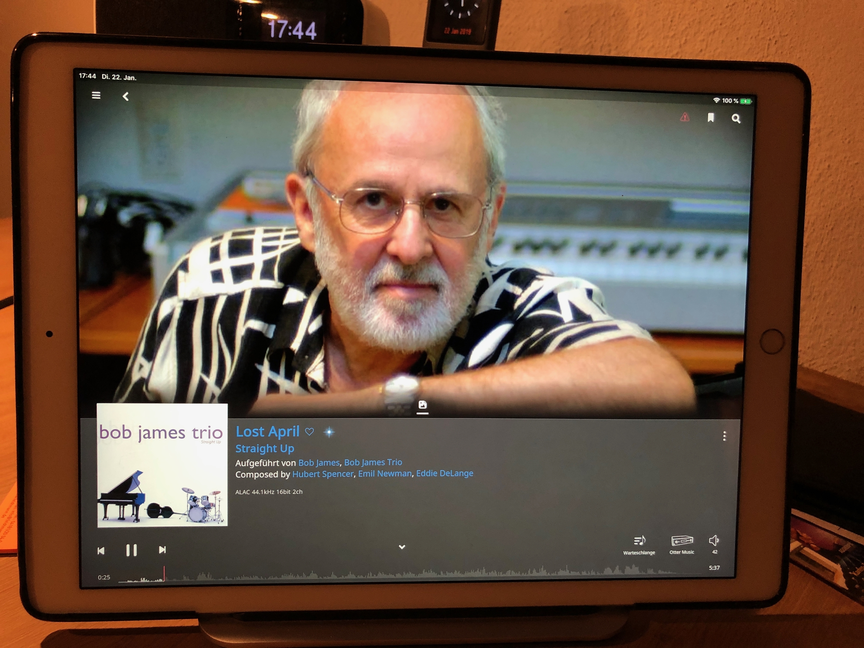
I’ve gone through a few of the new threads regarding 1.6 and hardly a mention of the album cover art no longer being an option to be shown prominently in “Now Playing.” I personally use a Laptop as an end-point hooked up to my hifi and like to see the album art shown as the main focus of whatever is playing. Would much rather have large album art than a picture of whatever band is playing. I noticed it’s fine on iOS but not on Mac OS or windows. Bummer.
Many of the new features are great, but this is a case where one really dumb step backwards undermines the improvement.
I TOTALLY AGREE WITH THE ABOVE COMMENT.
The old interface was far superior, at least in so far as it included the album cover in the Now Playing screen.
Now we’re forced, all too often, to look at a low res photo of the artist. When viewed on a TV in a theater room, this is a major step backwards. Roon is apparently trying to duplicate the photo function of J River, except they have implemented the feature in a far worse way.
How could the developers be so dumb? In the old design, the high res cover art that we have all downloaded appeared. Now it is wiped out, and all we are left with is thumbnail in the corner.
In one move, Roon wiped out hours of work on the part of many subscribers to download high res cover art.
What is worse, are the really dumb photos that we must now stare at, whether we like it or not. Or we can look at the bios or artist info, but of course, that is cut in half or worse.
This is just plain moronic.
Did the developers actually test their own product before they released it?
PLEASE. RESTORE THE OPTION TO SHOW COVER ART IN THE TOP TWO-THIRDS OF THE NOW PLAYING SCREEN.
Or even better, restore the option to show the album cover so it occupies most of the screen with the latest song or title showing below that. That was the option that we could open and close.
I posted the above in the main thread on version 1.6 and hadn’t seen this separate thread. The above post was moved to this thread by the moderators.
Now that I’ve read the above response from Mike, I’d like to thank Roon for seriously considering this issue, and promising to address it. My apologies if my previous post was not expressed diplomatically.
My own recommendation is to restore the option for cover art to prominently display across most of the Now Playing window, as in the previous version.
As I said in my post on lyrics – Roon is still fabulous, to coin a phrase from one of my previous threads that I started. It will be even more fabulous once a few of these glitches (treatment of cover art in the Now Playing window and lyrics) are addressed.
The integration of Qobuz (once it is available in the US) and the new Radio feature moves Roon beyond fabulous. It is, to use a description that a group of ten year old boys applied to my home theater, Emosewa!
 and head over to
