bbrip
February 10, 2021, 11:17am
1
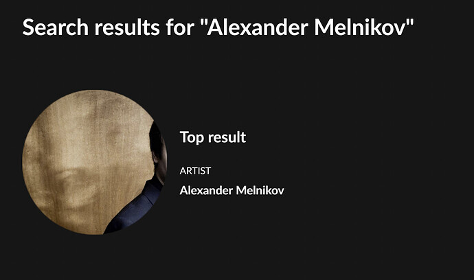
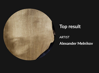
Looks like Some artists jumped out of the picture for Roon’s round artist/composer icons: See Alexander Melnikov:
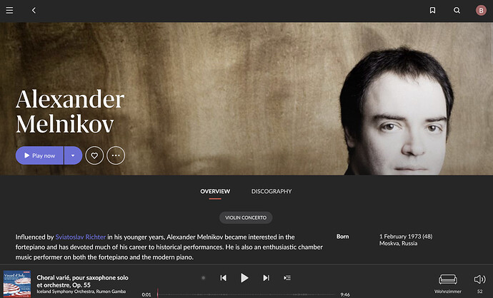
This is how he actually looks on his detail page:
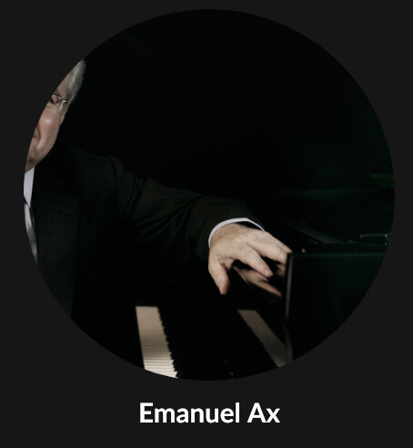
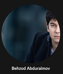
It might be useful to consider focusing on the face of an artist/composer for that round icon. I have hundreds of these kind of occurrences.
Many thanks for investigating / fixing.
3 Likes
pstrisik
February 10, 2021, 5:20pm
2
Better yet, go back to square icons to minimize lost parts of the image. The same thing happened when 1.7 was released. There was such an outcry about the round images the developers reverted to square. Here is attempt #2 to implement a poor, form over function, change.
bbrip
February 10, 2021, 5:28pm
3
I dont mind square or round. As long as it shows the artist and not just some background
1 Like
mike
February 16, 2021, 10:25pm
4
We have some improvements planned in this area, to ensure we get the face properly centered in various views.
Not quite ready to say more, but we’re aware of the problem and have a plan. Stay tuned!
7 Likes
bbrip
March 23, 2021, 2:55pm
5
@mike , While your release notes for 778 mention
Fixed centering of images in Image viewer
I do not see any improvement here at all, the artist / composer pictures are still way off center. So, where’s the trick that I am missing?
I’d even be happy if they simply added a manual way of framing the picture, much like I do with my display picture on websites
bbrip
March 24, 2021, 5:58pm
7
ya, I could live with that if auto-center is too scientific…
system
April 26, 2022, 5:52am
9
This topic was automatically closed 365 days after the last reply. New replies are no longer allowed.
