@danny Which is more popular - light or dark theme? Do you collect those stats?
I’d always presumed most people would use the dark…
@danny Which is more popular - light or dark theme? Do you collect those stats?
I’d always presumed most people would use the dark…
Don’t know if we do, but I can check later. Out walking the dogs right now.
A bit old, but mid ‘17 it was ~2:1 in favour of dark:
This seems like something worth putting effort into. I can guess as to what a high contrast theme would be, but is there a well defined definition you know of?
I’ll check in the US to see if any groups that research into usability for the alternatively abled have any guidance.
Need a new voting thread due to the change.
Light here. I personally dislike all of the dark interface of Roon, Tidal, Spotify, Mac and so on. Can’t get along with it. Have abandoned all software that made the switch to dark theme only. Had to switch foto editor, video editor and others, just can’t work with it so why torture myself. No, please no dark for me. A terrible trend i.m.o. The light theme was the reason I did find Roon in the first place in my search for an alternative to my no longer maintained old player. If it was dark only I would not have given it one second of a thought. I have Tidal only because of Roon, I use Deezer on the road because I can’t navigate in Tidals dark theme.wich doesn’t mean I long for a totally white interface wich is just as worse. I just don’t get along with one coloured interfaces in general.
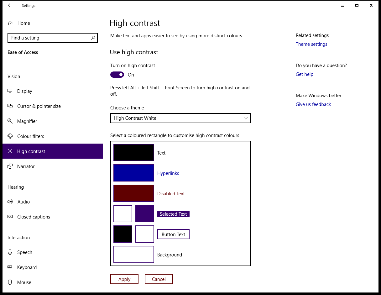
Danny, I suppose a starting point would be the high-contrast features built into Windows 10? MacOS will have something similar, I’m sure.
Themes are different from “more colors”…
The dogs are dark ánd light at the same time! New theme after all? ![]()
@Edward12 – I can’t tell if you are trolling or if you are being dense.
You are asking for apples, @G997 asked for oranges, and @Geoff_Coupe asked for a wheelchair.
7:1 themes are pretty much black on white or white on black, or close to it… not so hard to build or maintain.
4.5:1 gives us some flexibility and we could just modify the current themes easily to be 4.5:1.
What if users would create theme variations on their own - and maybe “on their own risk”? Would that be acceptable? Would you consider adapting to it (like maybe then loading theme definitions from the core, maybe as part of profiles)?
No I’m not trolling. But sure you can call me dense, why not.
What I’m getting at is you seemed pretty set on two choices [period] with no flexibility. I mentioned themes in another thread and of course that was shot down before it even could get off the ground. From my POV I see flexibility for ‘one’ person without even considering how many users are ‘visually impaired’.
Call me a troll, call me dense…call me any name you wish.
If we were talking in person, you’d see my body language, facial expressions, etc to see how “flexible” I was. Online, you miss all that and are making the classic mistake that makes online communication so antagonistic.
Let me help by being more clear…
Given a scale of 1 (totally open to change) to 10 (firm like we are on UPnP/DLNA or folder browsing in Roon), see our flexibility below.
On the subject on themes and colors:
On the topic of global user-scalable fonts:
Wow. You are intent on being a martyr! It is getting tedious!!
The difference between your idea not getting consideration and Geoff_Coupe’s visual impairment idea getting consideration is HUGE. If you can’t see that, you are aren’t a martyr, you are selfish!
After using Dark since basically day 4 of my Roon experience (years), I went to Light for the last day. Wanted to see what I was missing, especially after Danny said most of the Roon guys use Light.
Well for me Light is horrible. It has absolutely nothing engaging my user experience. Its cold, sterile and frankly its looks like an afterthought…not very becoming for a product like Roon.
Dark for me and leave the grey bar and it’s space as is. At least I know what I have vs. another unknown change…
Indeed! Martyr was the word I was reaching for.
I prefer Dark which is most beneficial at night when my eyes are tired and then I have the bright light screen in my face. Dark it is.
Interesting.
Some online sources, like Youtube and Washington Post, offer a light/dark choice.
Others, like New York Times and this forum, do not.
Is your choice of what to use affected by that feature?
When given a choice, which do you choose?