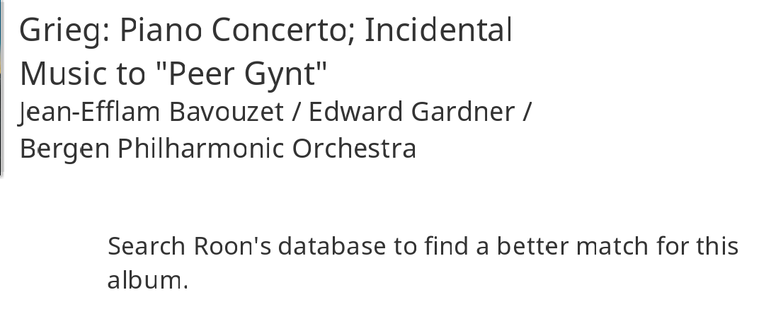
I use the Windows Roon client and the font always looks really skewed and low resolution - I’ve attached a screenshot so you can see what I mean.
Anyone else see this or is there something on my PC that I can change?
Cheers
Jamie
I use the Windows Roon client and the font always looks really skewed and low resolution - I’ve attached a screenshot so you can see what I mean.
Anyone else see this or is there something on my PC that I can change?
Cheers
Jamie
Could be related to what was discussed here:
Ah yes - looks similar, although I also have vertically misaligned text as well as the tops of certain characters missing.
Odd that it doesn’t seem to be everyone that’s suffering from it though.
What is your video GPU and driver version?
I have this as well, Win10Home, scaling 125%
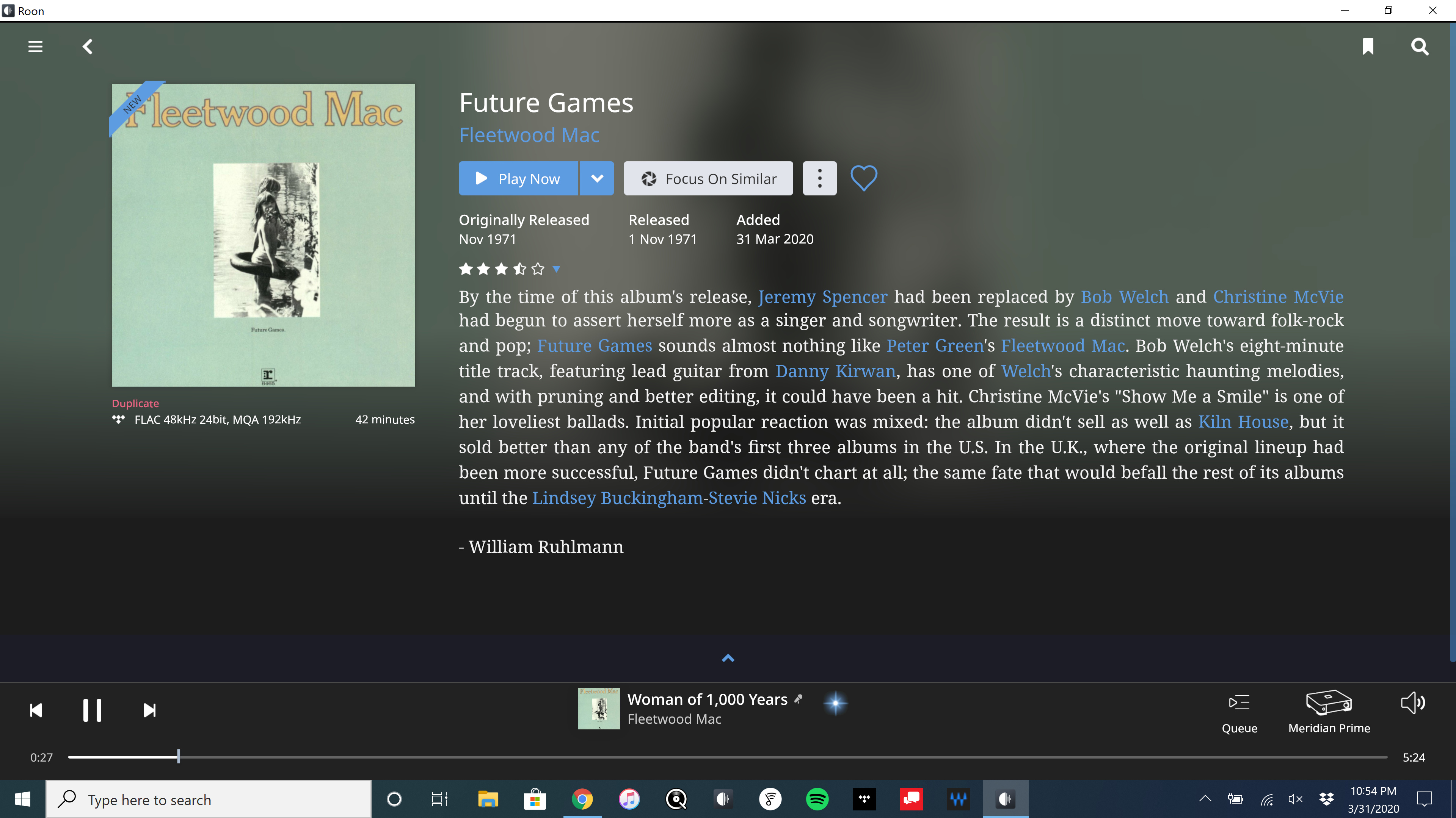
I see it on one of my PCs and I’m pretty sure I know why. I almost always notice it on the pop up window Roon displays when starting–if it’s more than a line of text the top line is missing some pixels.
I haven’t posted about it yet because I need to remember what specifically I changed on my PC that has the problem. On that PC, I had an issue where on the desktop, windows (7 in my case) had a stupid idea about how many icons it fit vertically (there was a blank space on the bottom for almost another icon). I tweaked something so I’d get one more row in. So related to scaling of something. I’m guessing fonts.
I see it on my Laptop which is a dual GPU system. Roon is using the nVidia Quadro m1200 in 1920x1080, Windows 10 Pro, 125% scaled. Driver version 419.17.
Changing the scaling to 100% doesn’t help so it’s not that.
I have similar issues with font rendering
YES! That’s fixed it. I changed my font scaling to 124% and it’s now perfect. Windows 10 client.
Shouldn’t have to though should we - definitely a bug.
Cheers
Jamie
This is definitely a bug in Roon software.
UI looks so bad that my eyes literally hurt after ten minutes of reading…
I have 4K display, but I use 150% scaling (at 100% is OK).
This has regressed in recent builds for me as well - my fonts look like this on various clients.
Would be nice to get this fixed properly - I don’t think I’ve come across a single application since about 1995 that can’t get fonts right.
Glad someone posted to this thread recently, because I had pretty much decided the font appearance in Roon, after the 1.7 upgrade, although not perfect, was acceptable. Right after the 1.7 upgrade, I realized that others were complaining about certain display issues, but they didn’t seem to necessarily match what I was seeing. I couldn’t figure out what was going on with my setup, but overall, it was not that disturbing.
I have a Dell XPS 8910SE PC running Windows 10 Pro in my bedroom and use it in conjunction with a Topping DX3 Pro DAC when listening at my bedroom desk to headphones and alternatively to an active PC-type speaker/subwoofer sound system. I’ve got a NUC Roon core delivering files to multiple endpoints/AV systems throughout the house, but it has been the appearance of Roon on my bedroom desktop display that has been a little disconcerting.
Anywhose, my bedroom PC monitor is a Hewlitt-Packard HP27q with resolution capability up to to 2560 X 1440, but it’s run at 1920 X 1080. Because I’m an old fart and like my desktop icons and fonts a little larger, I run the display settings set to Medium-size icons, which puts the scaling of the screen @ 125%. So, long-story-short, that made all the print graphics in Roon look like they were hand-set on an old type-setting machine (not aligned linearly – like you see in some of the above graphics postings). For a while, I thought that might have been a Roon-choice to make things look a little old-fashioned or nostalgic, but the type in the Roon Settings headings, etc, often looked double-imaged, with individual letters distorted or partially obscured – so I knew something wasn’t quite right, but they were still readable, so I just let it go. However when I came upon this thread, with posters suggesting alternate custom display scalings, I tried setting the HP with several custom scalings other than, but very close to 125%. For me, I found that 123% rendered the best type-faces throughout Roon without noticeably altering my desktop icons/font-size appearances. So, everything in Roon looks totally normal and great right now, and I guess I’m a happy camper keeping the display scaling set @ 123% (unless there is a long-term problem with that I don’t realize – as stated previously, I’ve had it set at 125% for a long-time). Apparently, the new 1.7 fonts in ROON have an issue with the previous setting I was using (125%) on my system (as well as in others’ as indicated by several of the preceding posts in this thread). So, thanking all previous posters for their input.
Just posting this as a “FYI” for others that might be encountering similar issues to what I have had – now resolved and gone  .
.
I am encountering this issue as well. Windows 10 Pro, scaled @ 125%.
Will this be fixed? Looks terrible. I don’t see it so much at 100% scaling but then that is a little crazy on the eyes on my 3440x1440 resolution.
+1 for this issue for me as well. 4K display, NVIDIA graphics stack, Win10.
@support I have the same issue on a Lenovo X1 Carbon running Windows 10. The scaling in Windows is set at 125%, if I change the setting to 100% the text becomes so small that it’s difficult to read and unusable. Screen resolution is 1920 X 1080. Has been any work done to resolve this problem as it seems to be an issue for quite a few Roon users? Thanks
I’ve had this issue since day one on my win 7 laptop. It’s been consistently there through many Roon updates. One of several little nagging issues that just linger. Other systems are fine. I do have scaling to something higher than 100% on the laptop, and I’ve tried 100% and it was still a problem. I’ve given up experimenting because doing so scrambles my desktop icons and it’s annoying to have to put them back.
Yup, we’re working on it.
No estimates about when a fix goes live or whether it fixes every single instance of this, but we are aware of the problem and actively working on it now.
Thanks Mike much appreciated!
Fences is great program that can help with icon origanization and keeping them in the same place no matter what resolution you switch between.