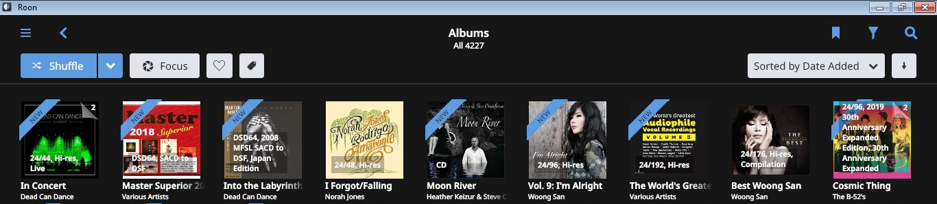
I think the additional album info should be limited to 1 or 2 lines, just for the sake of maintaining a consistent look on the album view screen (yes I am OCD). If you look at the far right of the attached image, the additional info covers the entire album.
I agree I dont think the fonts are bold across the board (although some titles and so on are clearly intentionally bold) but I do think there is some additional smoothing or subpixel stuff being used to render the fonts. Maybe this is what people are reacting to?
Im ok with it, it will just take a while to adjust and then it will seem like the norm.
3 Likes
A post was split to a new topic: Can’t find Core on Android (Build 500)
To me that I don’t have a strong eyesight, bold fonts help a lot.
Since the fonts themselves are rather small (especially within the Android app) the bold font option is the only way to increase contrast.
The ideal would be a user-adjustable font option so that can anyone tailor them according to their preference.
2 Likes
its got to do with the number of lines of code to be compiled. If the number is prime you’re in luck, rest of the time you’ll be starved for air, limited to a single dimension and increased compression to remove those pesky dynamics.
Occasionally the lines of code may represent a fibonacci sequence. When that occurs the resulting sonics will induce euphoria and those builds will become known as the Golden Ear releases. Many followers will refuse interim upgrades, waiting on their deathbed for the next Golden Ear release.
I suspect 1.7 is a Golden Ear release. ![]()
21 Likes
I’m not a developer, but this seems like a productive suggestion. Thanks for clarifying what might be the culprit with bold text.
1 Like
In 1.7, can anyone confirm that the search functionality has been updated within Roon so that those who don’t use a streaming service but have large collections will get all the benefits of the search improvements launched some time ago. I was pretty gutted that this limitation was put in place (although I can understand it for small collections without streaming) and would like to see if this has changed.
Thanks,
Crom
1 Like
is there a helpfile for the new functions somewhere?
i still get no “new releases” or Recommandations after my indexing in roon is ready
A post was merged into an existing topic: Can’t find Core on Android (Build 500)
Do you have TIDAL or Qobuz integrated into your Roon, or is your library only for local files? I suspect, if the latter, that you won’t get any NRFY or recommendations, because they are sourced from the streaming services, and if you’re not using any, you won’t get them.
1 Like
aha ok
i use just my local library, not Tidal or Qobuz.
thought roon would search for simmilar things in local library too
thank you for explaining 
Roon Radio will work on just your local library, but NRFY and recommendations need a streaming service to draw results from.
1 Like
A post was split to a new topic: Updating Roon App on Core
A post was split to a new topic: Qobuz/TIDAL Can’t Login Message
Thank you.
I have a huge library and can say speed is MUCH faster. Great release and great job
2 Likes
So you are using the regular Android version of Roon remote on your Fire tab?
What are you on about re bold text?
1 Like
Still playing with the new features. But a few things immediately stand out
1. Track numbering
I assume I am in a minority but I switched on track numbering as it is no longer the default. I’m not sure what the pattern is but I think it is Qobuz integration. If I click on a box set I am getting a long unreadable screen dump numbered “disk - track”
1 - 1
1 - 2
1 - 3
1 - 4
…
2 - 1
2 - 2
2 - 3
6 - 1
6 - 2
6 - 3
etc.
I’ve never understood this “streaming” logic. I don’t play my music a box set at a time and prefer more human size chunks like a disk at a time. If I then click on Disk 1 , Disk 2 etc., that is what I see, a single disk with no disk numbers only track numbers. In 1.6 opening a box would jump straight to Disk 1 so this I find annoying as when I open a box I need to make a second, extra click to get into the 1.6 navigation. There is no box set handling solution in 1.7 (yet again) so this just feels like salt being rubbed into the wounds.
2. Search
There was a longish thread about a search on Chopin, throwing up Schumann, Debussy, Nielsen and many other composer albums as well with no obvious connection anyone could fathom. On my system that is not the case any more if Chopin is the search term. I just get Chopin albums. However, if the search term is Frédéric Chopin then I still get a lot of other composers with no obvious connection. I also tried “Michael Jackson” as that is the example in the release notes and I get Michael Jackson albums. But I also get every conceivable variation of Michael and Jackson and also some mystifying ones. I didn’t know for example that Michael Jackson did a backing vocal on one track from Stevie Wonder’s Hotter than July album (All I Do). I suppose some people are interested in those details but I would have thought for most, although a technically a correct search, it is a baffling result cluttering the screen.
3. Fonts
I suppose the choices were to do with supporting readability on more remotes, smaller smartphones maybe. Personally on a laptop and an iPad I don’t like the changes but then I didn’t like the grey footer in 1.6 either (still don’t). I don’t think there have been just just font changes though, there seems to be layout changes as well. I don’t remember having difficulty figuring out where that track numbers were in 1.6 but I certainly did in 1.7. I exited and rebooted roon several times before I realized where the track numbers were. So difficult to put my finger on it but I don’t find readability improved.
Roles
I haven’t had time to thoroughly check. But initially this all seems much more rational with arranger / librettist etc. clearly displayed and also soloists being “featured”. A really nice step forward. Now, if only the font and layout aesthetics were up to the standards of “classic” roon . . .
Sections
I really like this although I need to play with it. I was a little surprised that the sections are not “live” links like “works”. That probably doesn’t make any sense for Opera but it would be nice for other multi-tiered works like the Vivaldi Seasons.
Qobuz Integration
I have the impression that this is much improved in terms of metadata integration? I found it common in 1.6 that roon would find no metadata at all. Roon seems to find Qobuz metadata in 1.7 much more consistently now but maybe that’s wishful thinking with a few examples and I have to play with it a bit more to be sure.
If Roon is using multiple font weights—versus just regular, italic, and bold—then “fixing” the concerns about overuse of bold text will probably be more challenging.
I personally hadn’t noticed any issues with “bold text” being overused.