It’s a mess. And not consistent. Klick more and that info vanish. Put me up for beta tester next time 
5 Likes
Happy to report a seamless upgrade process and Roon itself seems to be working fine - NUC Rock, iMac 5K & iPad 12.9 Remotes, RoPieee and Node2i endpoints.
But not so happy with what it has upgraded too. I agree with waveform display, ratings (especially) and other issues that many have raised which can presumably be fixed. But the whole design is targeted at portrait tablets and this is a real concern. Apart from the huge album art it looks OK on the iPad in portrait although bad in landscape. On the desktop there is just so much wasted space and those huge images, it would be nice to see more than a handful of albums on a 5K display. A scrolling display is welcome but only if it is smooth which it certainly isn’t on the iPad or the iMac. Not sure how much is underlying Apple graphics drivers and how much is Roon, there is certainly an element of delay fetching images. Hopefully caching can be improved or perhaps the database is still upgrading in the background.
I miss the look of the old Focus, functionality may be improved but having to scroll sideways forever is tiresome. A reset button would be nice too.
Well done on the install and I like many of the ideas 1.8 incorporates but please make more intelligent use of display real estate.
2 Likes
small detail for QA… when you press the 3 dots on a selection, and go to ADD to PLAYLIST, the playlist that you had previously added to was defaulted to be top of the stack…that is missing now and should be slipped back in. It is a subtle and useful feature. thanks.
3 Likes
Still no notification bar basic control like forward, back, play buttons? Lacking in both ios and android… Why
1 Like
This doesn’t seem to be the case with the MAC OS app. It returns to the same location from where I had entered the Album. Looks to be Windows app only issue.
The bottom is bigger but I’m experiencing more jitter
1 Like
I concur.
Going to be interested in all available information concerning these new limited shuffle aspects of the new 1.8 build – and whether a workaround, or fix, or some relief comes into sight.
The shuffle function is my most used feature of Roon. I run “shuffle all Tracks” most of the time – often adding tracks to different playlists as they come up. Allows me to keep listening to old tracks with new tracks I frequently add coming up in the shuffle as well. Do not want to lose ability to shuffle all my tracks (way over 5000) or any playlists larger than 5000.
In younger days I used an Olive music server in a like way. One of their software updates resulted in a similar shuffle limitation that was fixed.
4 Likes
You can filter to just local music with two clicks.
1 Like
The white background is too bright. What happened to dark mode? Definitely not an improvement in my opinion.
I agree with others that font is too small. With my contacts in, I need reading glasses to view on my iPad.
1 Like
Firstly, thank you for the flawless upgrade, again - no issues upgrading on the core (huge library on NAS, hyper-v VM core), 2 windows machines, and a bunch of apple devices - everything works on a bunch of bluesound endpoints and roon bridges. I’m always happy when there aren’t any errors or failures during the upgrade process and I just want to say “good work” to whomever may be involved and reading this. I’d buy you all a beer if I could.
I also really like the new ipad/iphone applications - they seem like they are finally natively designed for mobile now and it’s much faster than 1.7 (for me at least).
Classical search is fantastic - and highlights how I have very few good images of composers who have been dead for a couple of centuries.
I also love that tags are in focus now - and how combining two tags intersects or only selects the items with both tags (rather than all items with either, or a union/conjunction). This, to me, is the proper way to handle logical “AND” operators in this scenario. I only wish I could do the same thing with “hearted” tracks - and select all tracks that are “not hearted” (yet) in focus as well. Also, natively having performers and composers in focus is a godsend.
As for visual style and functions on windows, I’m a creature of habit so, as with all things, I have to learn to adapt. I’m sure I’ll learn to appreciate most of the changes and long for the days of yesteryear when “it used to be easier to do whatever” - but that’s my issue. If anyone catered to my desire to not change over the years, we’d still have windows 3.1 - style desktops and physical keyboards on smartphones. There does seem to be a lot of scrolling to do things that I do routinely though.
Top Tracks was a function I used a lot, so I’m looking forward to that returning. I also use Discover a lot, and now it’s a little more cumbersome to get to.
I guess I like serifs.
1 Like
Updated to Roon 1.8 and ran into issues with Sotm sms-ultra Neo no longer discovered.
Actual software update of the Roon core on NUC and update on Android devices completed as expected.
I updated the firmware on the Sotm SMS-Ultra Neo to the latest 0.5.1 but still have the issue.
Through MACbook able to access the web interfact for Sotm meaning it is on-line and accessible. The roon client is not discovering it.
All other roon end points (Arcam, etc) are discoverable.
My primary music playback system is now broken with this update.
Please respond ASAP. I have tried DHCP settings, IPV6 etc all on the roon server on sotm. I rebooted several times, restarted roon server on core and on sotm Same issue.
Anyone else with Sotm Have issues?
Thanks,
Jai
Upgraded smoothly but from first few hours experiencing the interface, I must say I do not enjoy the new layout (basically talking about desktop version):
- Why suddenly incorporated some new fonts that looks like Times New Romans? It is not consistent with the other fonts and looked awkward
- Too much spaces and I have to scroll a lot to find what I need
- The queue list changed and each entry’s visual height increased and so in one page I can only see around 6 tracks
The listening statistics is a nice feature but in general the layout looks strange to me, which I always enjoy the original layout being elegant and stylish but now it looks like some MS Word pages
2 Likes
I can’t say I like the new look so far. It feels like a lot of info kind of randomly floating all over the screen (iPad as remote). It’s like I don’t know where to look on the screen for info I want. It just feels “messy” compared to 1.7. Perhaps that will change with time as I use it more.
Roon Radio is not working properly for me. It gives an error and says restricted to local library (I subscribe to Qobuz). 
1 Like
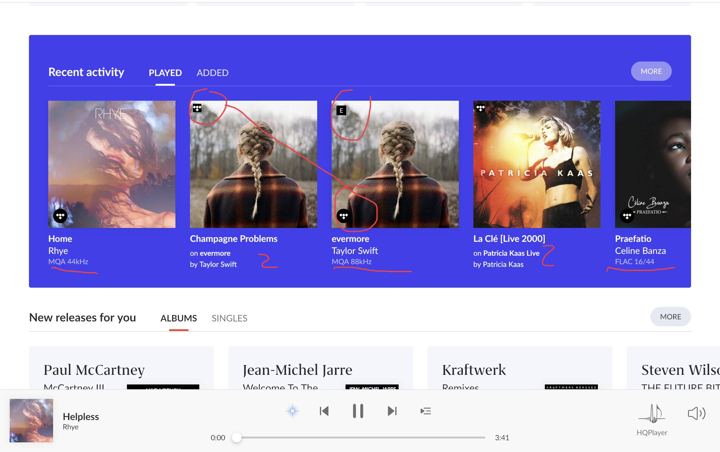
I think the check marks are the track “picks” for the album. Could be made more clear.
If you all do not prefer the new white Roon app icon for the Mac and windows, check this out: Custom Dark Mode Roon 1.8 icons
1 Like
Tag window when trying to tag an album:

Tag windows in focus:
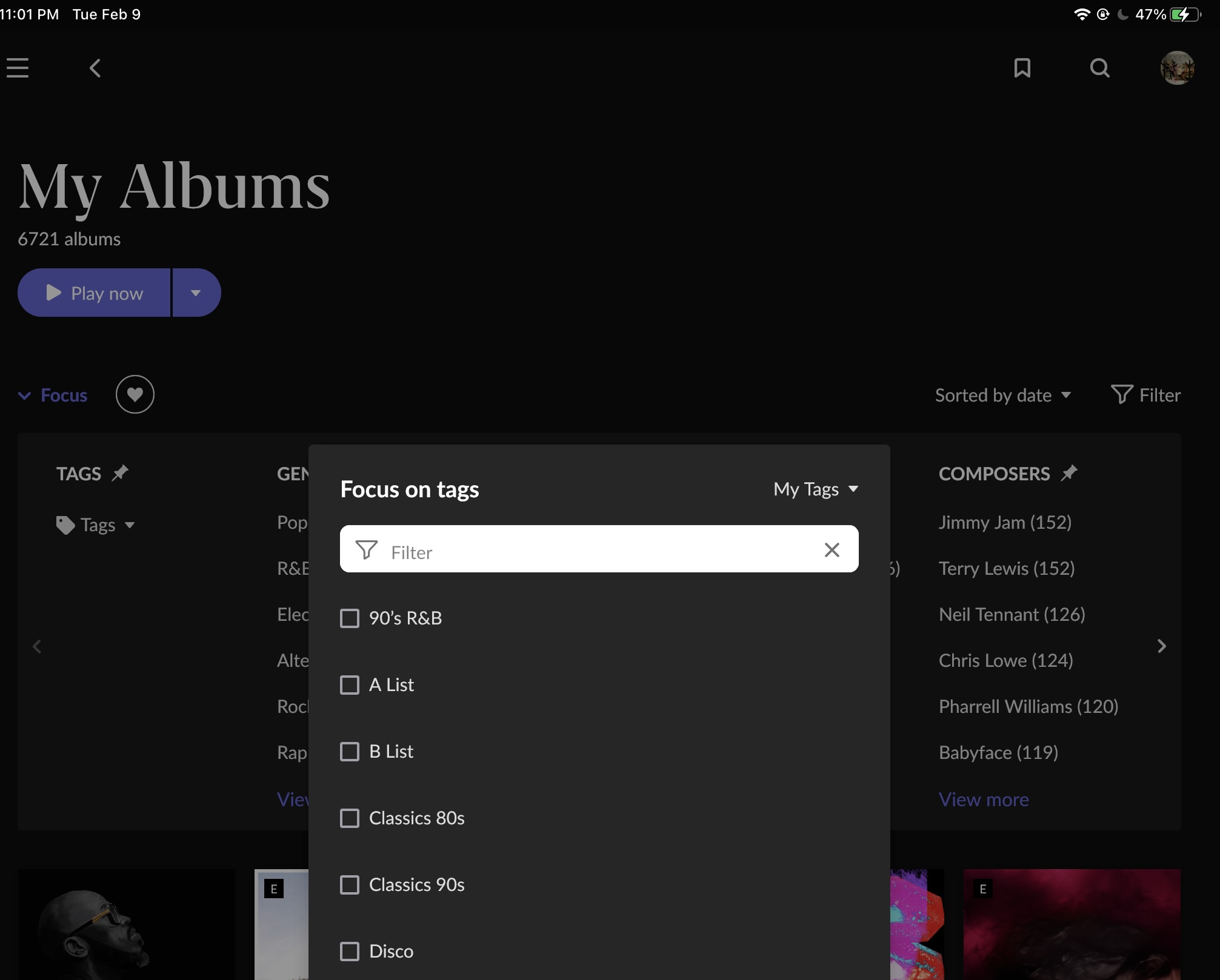
Did you guys forget the little square boxes next to the tag names?
Please bring them back
2 Likes
Installs were almost a non-event… MacOS and iPadOS remotes are great. 1.8 remote on iOS is great for a few seconds until it crashes (sometimes doing NOTHING but staring at the screen). Repeated behavior even after deleting/reinstalling. iPhone 12 Pro, iOS 14.4.
Just when the 1.7 remote on my phone was stable and not making me say bad words.
Lifetime subscriber, BTW.
Thanks for mentioning portrait mode on the ipad. It looks nice and much appreciated.
Would have been nice to see a graphical interface to edit genres and the genre hierarchy but maybe that’s a 2.0 feature
It sounds like I need to not upgrade at this time. I know I’m not going to like a vertical layout on my 4K tv at the core, my iPad remote, or my 38” ultra-wide curved monitor that’s also used as a remote. I too prefer the old waveform. Losing the horizontal flow and use of screen space would be disappointing.
1 Like