Sometimes it is a bit tricky to see, what’s behind a button. The used symbol isn’t always clear enough.
Tooltips would make sense.
Thanks!
Sometimes it is a bit tricky to see, what’s behind a button. The used symbol isn’t always clear enough.
Tooltips would make sense.
Thanks!
This has now been implemented in version 2.65 of Roon.
However, two points I would add:
I am happy to see progress on adding tooltips, and look forward to further developments.
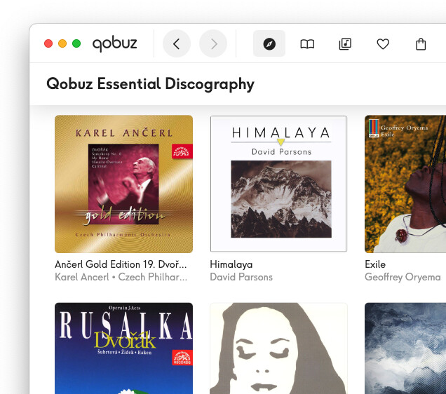
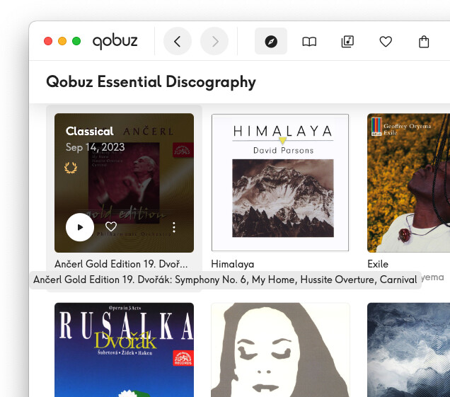
Besides buttons and icons, I hope that tooltips will be added for text (album and track titles, artists, etc) that get cut off whenever there isn’t enough room to display the full text. All of the streaming services (Qobuz, Tidal, Spotify, etc) implement this in their own apps.
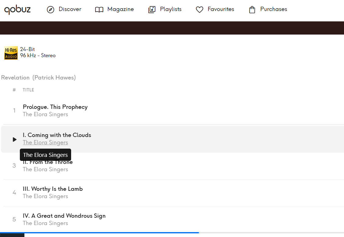
For example, in Qobuz…
with mouse hovering over the title of the first album, tooltip appears…
People kept asking for more tooltips because they found the icons unclear
Who kept asking? EA? I’m used to seeing a feature like that as an onboarding noob feature, most want to switch off at a certain point.
I’m not going to search for it, it kept coming up and not in EA. I’m not opposed to having a switch to turn it off, but isn’t hasn’t annoyed me because they never pop up for me.
This is new in 2.65. I passed this feedback on to the product team and suggested maybe the ability to “toggle” tooltips.
I honestly didn’t know there were tooltips.  . I had to go out of my way to make one show up.
I hope that this is a work in progress - not all the icons have tooltips at the moment.
And an option in Settings to turn them off would be nice to have.
same. I had read that this was added, but so far, have not had them pop up or anything.
Just click play.
It’s not subtle so I am surprised at the comments from various that it has not popped up. Maybe it depends on remote type and/or other configuration switches being active?
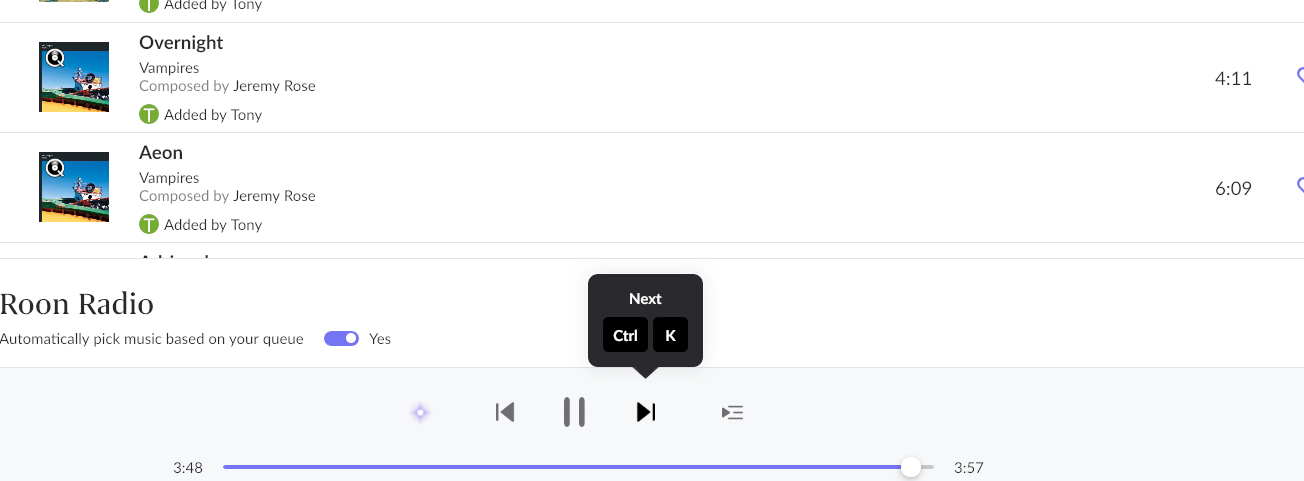
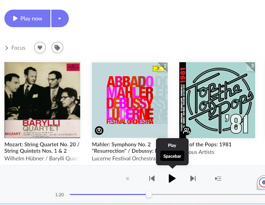
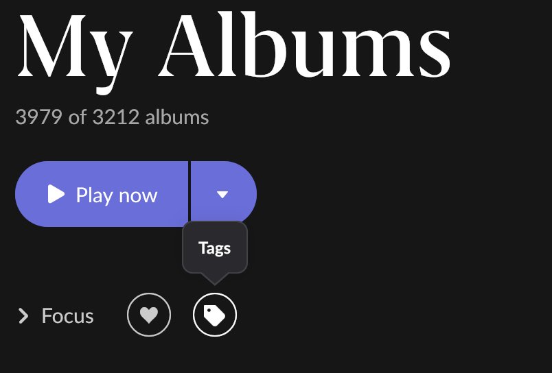
This is a particularly annoying example. There is already a play button with some text “Play now” in the upper left. Is a tooltip on the bottom arrow in a completely unmatching and jarring design language needed for the bottom play button also? This tooltip also clashes and overlaps with the text descriptions below the album art and other messaging about the endpoint in focus starting up, which I wasn’t able to capture in the screenshot. It’s just an incomprehensible mess onscreen TBH, so I don’t know how that is helping anyone, especially roon noobs. If the existing interface is so confusing for a user to figure out how to “play” then there is something more wrong with the interface than this version of tooltips can fix.
 . For some context. There are already a lot of toggles in “Browser Preferences”. Almost all of them are there to control the verbosity and clutter of the screen views. Some like it. Some don’t and a previous generation of roon users were just as vocal about reducing screen clutter as I assume others have been in EA about increasing it.
I know where they are and how to trigger them, but you have to hover the mouse for a few tenths of a second over the button for the tooltip to appear, and I rarely ever do this. Those who see it just hover a little bit longer before clicking and trigger the threshold.
Maybe a solution without yet another switch would be to extend this threshold timeout a bit, so that it’s less easily triggered. On the other hand, it is a fine line to walk between not being discoverable enough for newbies and being annoying for experienced users, so maybe a switch is better.
In fact, for discoverability I think there should be more such tooltips. Currently they only exist for buttons that have an alternative shortcut, which is useful for learning about the shortcuts.
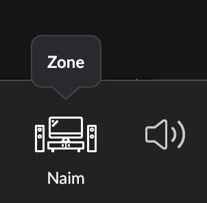
However, regarding comprehensibility, indeed few people will have problems recognizing a Play or Pause button  and the buttons that tend to lead to bigger problems are things like the MUSE or Transfer Zone buttons, which still have no tooltip because they have no shortcuts.
If the future brings more tooltips for the purpose of helping newbies with these buttons, an off switch may be the best option after all.
Some did in EA, but maybe less significant. I think the problem was the discoverability for new users, and this came up consistently (not in huge numbers but again and again) when people were looking for features. And I guess shortcuts.
Making things easier for less experienced users is important for any software project, but of course it should come without annoying others.
Some examples for requests and problems:
There are more that I’m too lazy to search for, usually in the form of „I never knew what the wiggly button is“
Edit: I couldn’t resist, so here’s one example:
Actually this is incorrect. Most tooltips seem to be for buttons with shortcuts, but there are these, for instance:
but the speaker icon next to the Zone doesn’t, nor does it hint that the perhaps most cryptic buttons are behind it
Doesn’t look thought through at all to me.
There is no design language consistency. You cannot just slap it on any old how and retain credibility as a premium product.
Tooltips used sparingly for some of the more cryptic buttons might make sense for noobs but it should be switchable for more experienced users as is defacto practice and surely the plan is not for every single button? That just says to me there is something wrong with the buttons. Its bonkers.
But tooltips for shortcuts? I cannot believe that I am alone in not wanting tips all over the place on how to roll the roon GUI back to a 1970’s vi or emacs lookalike. It’s even more bonkers. Anyone interested in that is perfectly capable of navigating a manual I would have thought.
What would help with roon usability would be if the normal GUI design language people are used to from Windows and/or Macs was retained. Why were scroll bars abandoned on numerous screens several years back for example? It’s a fine balance between familiarity and differentiation that roon has often struggled with over the years.
I’ve merged all the tooltips comments into this Feedback > Feature Suggestions topic - they will give feedback to the Roon Labs team in the relevant place.
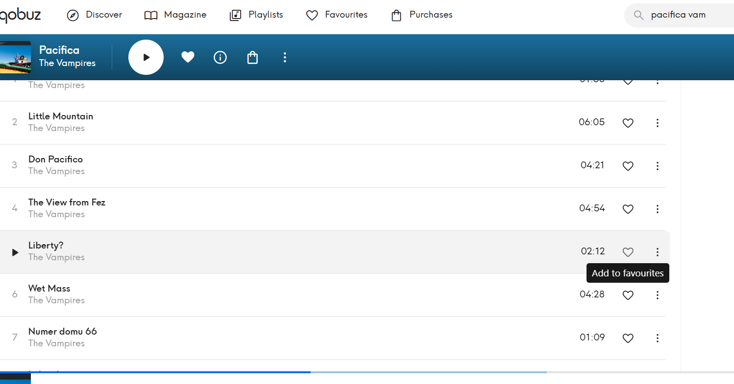
I hope so. For those thinking Qobuz provides a template. Take a closer look. Most of the so called tooltips are literally a duplication of album artists and album and track titles when you hover:
In addition, there are a few blindingly obvious functional tooltips
The first thing you notice is how much more discrete the Qobuz tooltips are to the ugly roon choice. But just as a point of design principle, tooltipping every single text and graphical item like this, if that is the plan, makes absolutely no sense to me.
Particularly, the text tooltiping will likely cause havoc with any edited libraries. Qobuz doesn’t provide a metadata editing option so the issue is not obvious. In Qobuz, all you are going to see is irritating duplicates but in roon depending on genre there is going to be very significant text clashes where users have customised poor or incorrect metadata in roon and the tooltip overrlays the user customised metadata with the original roon-sourced metadata. This is already the case in roon with the unrelated case of play screens but the effect is the same. Roon continues to display the metadata it has sourced and not the user customised versions, and despite numerous complaints, it has never been fixed. There are several major screens with this effect, not just play, so there is history here.
This really needs to be properly thought through with all the navigation consequences and frankly navigation havoc for more experienced users, instead of assuming that it is some kind of obvious, no brainer, and simple navigation enhancement. It is not. This is a complex, high risk, GUI change with deep roots throughout the roon experience and really should be driven by a dedicated and specialist designer to ensure that there is minimal brand damage to the slick roon look and feel. I don’t have the impression that is the approach here.
BTW. I have just noticed there are 8 votes in five years for this. I just don’t see any interest at all warranting this level of disruption.