Thanks (and to @mike as well) for taking the time to clear that up - and sorry for wasting your time on this. It does feel a touch… off, though… So here’s to hoping we’ll see the enhanced radio working on the local libraries in 1.7 
Hi @danny, where does the “composition description” come from? is it a standard file tag? or a custom one? I listened to quite a bit of classical last night (from my local library) but didn’t see anything new in the now playing screen. Wonder if my files don’t have the tag that contains this info…

I would not describe the UI as disastrous. Overall, version 1.6 is a significant improvement in many areas and Danny’s team should be commended.
Danny, with regards to your request for constructive suggestions. I did so, and provided detailed comments, on the two issues of greatest concern to me. I hope that my detailed suggestions are helpful.
I did so in the threads on those two specific issues.
The first issue is how to incorporate album covers in the Now Playing window while retaining the great improvements you have already made in that window. I offered detailed suggestions here:
The second issue is the streaming lyrics, which are a major improvement in the UI and one that I have been looking forward to for many months! However, the new streaming lyrics often fail and only work about half of the time, or even less. You should consider a better algorithm or technology vendor for that function.
More importantly, you need to fix how static lyrics that do not scroll are presented in the Now Playing window. I offered detailed suggestions on lyrics here:
But overall, your team did a great job on version 1.6 and they to be thanked for the significant improvements.
Roon was, to quote from another thread I started, already fabulous and it has been significantly improved in the last version. You just need to modify a few areas IMHO.
1 Like
We took them and others into consideration already, and are working on solutions. Your 2 comments I can address immediately:
it’s coming, and some other changes that should help with your other suggestions.
We purchase 2 types of lyrics data: time-coded lyrics and just the lyrics text. The next bugfix release will address your concern by showing them differently and giving access to the lyrics in the text view if you chose to turn off time-code lyrics option in the “now playing” screen.
1 Like
It will do what you think it should. The other option is purely for those people that never want to see the timecode lyrics. Some people feel music is serious business and should not be sung along to ![]()
4 Likes
Not me. And not the guests in my home theater. They all think the time coded lyrics are fantastic. Some of your biggest fans are teenagers who now sheepishly admit that half the time they don’t understand the lyrics either!
the cropping is a huge issue. often the artist’s face is cropped out entirely.
This is fixed. Your images will slowly update over the next 10 days or so and our facial detection stuff will kick in.
5 Likes
thanks- i’m sure this info is somewhere else in the various threads. i was out of town when 1.6 dropped, so just getting caught up.
- side: Qobuz is wonderful to have in roon.
- side: classical remains a serious work in progress. i have so many things to say, i’m not sure where to start.
if you need alpha/beta testers for whatever is “coming for classical” i’m all in.
1 Like
I like roon and i will continue to like it.
When windows 10 was introduced some design elements were still like in windows 98 or windows 7 at best. But with every update old menus and windows were updated to the new design elements. So i think roon will be updated in a similar way.
My thoughts on new design elements that i have encountered. I am not a native english speaker. So i wish i can explain
First of all The bottom bar gives me the feeling that i am watching pre-1.6 version of roon in a puppet theatre. I think it is because of the solid contrast color.
But now playing screen i think the old one although not as functional looked more beautiful
:
Swipe beteeen lyrics artist bio etc should be implemented. If not please make the little arrows disappear or make them transparent.
Underlining the little icons on now playing screen. Is it really necessary. The selected option is already highlighted. Please can you reduce unnecessary visual objects as much as possible
Configure now playing should also include album cover and the option to turn off artist cover. And maybe instead of the artist photo, is it possible to make dynamic tiles of albums from the same artist on that screen. The way you do in genres.
Lyrics synced or not looks awful. Is it the font? The size of the font? The space between lines?
On the now playing screen; The transition from upper half of the screen to the bottom bar looks disconnected. The last line of text on the upper half is transparent. Maybe it could look better if you turn of transparency effect for texts.
Colour blending album art into bottom bar on now playing screen: sometimes it looks nice but sometimes together with the artist photo it feels disconnected.
The bottom bar on now playing screen has a downward triangle to dismiss. There is lots of empty space on the bottom bar. Is it possible to double click or double tap an empty area to dismiss now playing screen.
I use both my notebook and ipad as remotes. I believe in the new version it is somehow more difficult to navigate on my laptop. However i dont feel that on my ipad.
Dsp screen is nicer. But especially when adjusting the equlizer it is a nightmare. I think we shouldn’t have to scroll up and down to see the graphical results. The fun is gone
I do not think the UI is disastrous. Need album art for Now Playing, then back down from DefCon 1.
2 Likes
LOL. Well said. Restoring album art, and changing the way that album art and the artist/album info is presented, are my main requests. (So that both occupy as much of the screen as possible by eliminating the album thumbnail and moving the icons lower down on the screen). Along with fixing the lyrics function. Danny has already said they are working on that.
I’m not at DefCon 1. I’m at DefCon 5, peace in our time. I changed my subscription to a Lifetime status, as I explained above.
I never even paid attention the difference in themes. I just tried the dark theme, and quickly went back to the light theme for large displays in a home theater room and iPads.
I love the time coded lyrics, too and I’m far from a teenager. From someone taking medication for depression I’ve loved the opportunity to launch into solo karaoke. I know we can’t get our personal preferences all the time but I’d have the karaoke on all the time and large album artwork when that’s not available. If the two can be combined then that would be amazing.
3 Likes
Some good ideas here but still misses the major one: flipping the size of album vs artist image.
1 Like
I think it’s OK that clicking on the “small cover” brings me to the Album Details view.
As for the waveform on the Now Playing Screen. What about a Waveform section?
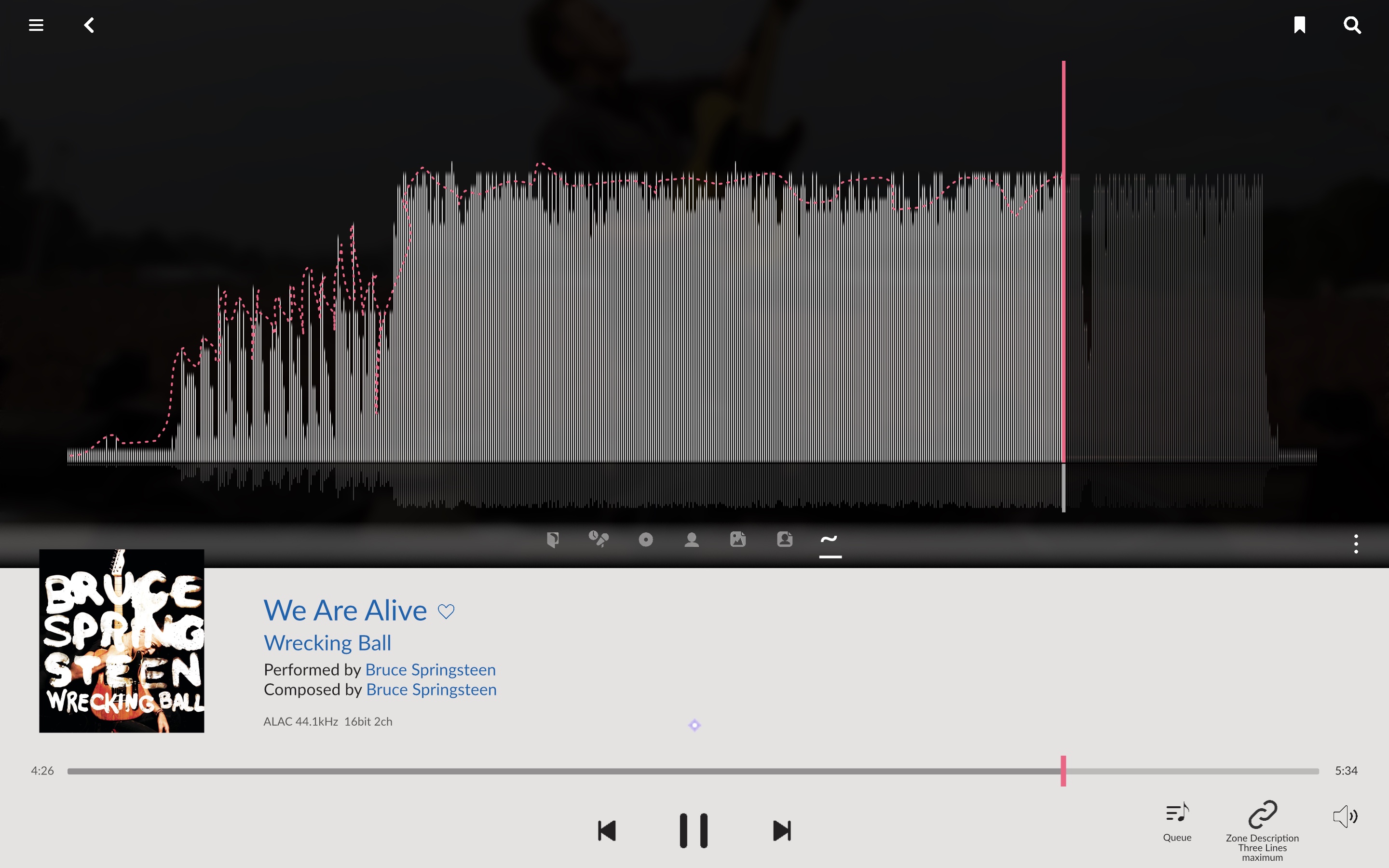
Of course something that renders nicely - not just the upscaled pixels I’ve used in the sketch. 
The Now Playing bar could keep the waveform as is but on the Now Playing screen there’s enough room to paint something really beautiful. And it could look cleaner than it does now.
And if Cover art gets added (back) to the Now Playing Screen there’s probably no need to keep the current cover picture as big as it is now:

This illustrates my problem with regions delineated with lines or color. Much more elegant to have a simple flat area. If the photo (album cover or artist) doesn’t fit the entire page width, just leave the background color from the lower area, light gray here, or white (or black). That’s what elegant publications use. (Align with the grid, without lines, and occasionally violate the grid for some creative tension.)

3 Likes
You mean more like this? (It tends to get boring, in my opinion. Would need some more information - like front and back covers, but the metadata service won’t provide the latter.)

To include both the thumbnail and the large album cover would be beyond dumb. I am hoping that common sense prevails within Roon and the Now Playing screen will include an option for the album cover that will drop the thumbnail. Then information that is shown next to the thumbnail in this example can be spread out horizontally, allowing more room for the larger album cover.
I would eliminate the thumbnail all together as it just takes up extra room. I would rather maximize space for the artist bio, info on the album, lyrics, photo or album cover.
Why do we need the dumb thumbnail anyway? That is what a view of the album cover will accomplish.
1 Like
![]() … it does show nicely how it’s not so easy to get everything what’s wished for into the new Now Playing layout without giving it some proper thought – something I did not apply when drawing the sketches; but then I’m not a designer anyway.
… it does show nicely how it’s not so easy to get everything what’s wished for into the new Now Playing layout without giving it some proper thought – something I did not apply when drawing the sketches; but then I’m not a designer anyway. ![]()
What may not work out too nice: if there’s too much element motion while switching between the various Now Playing view options.