That is simply not correct. Look at the below thread and read the response from the CTO of Roon.
He’s talking about the lyrics in the Display feature. The Lyrics Box is unchanged from - what - version 1.4?
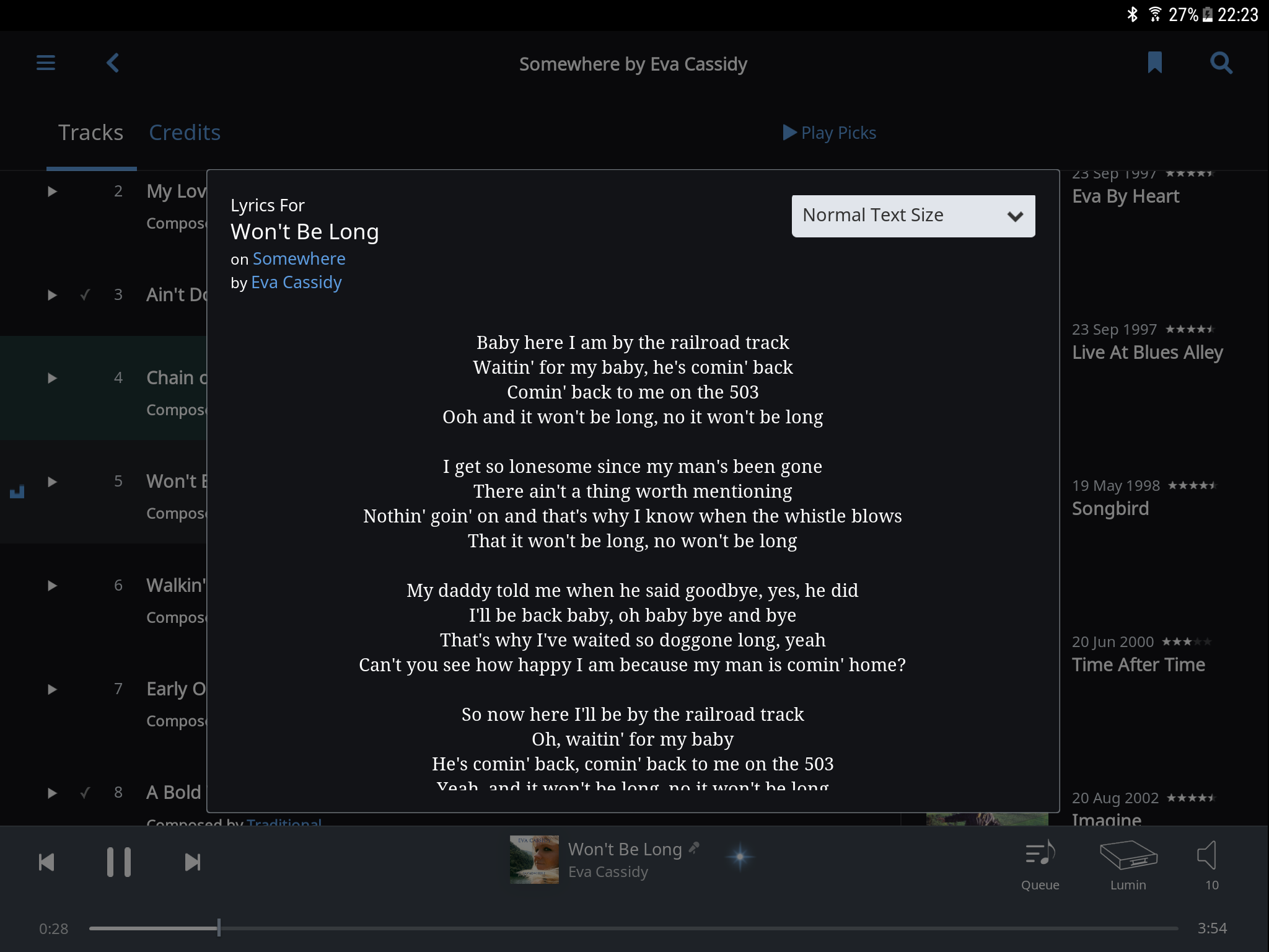
I’m not sure what the confusion is here. We are all talking about the lyrics as the lyrics appear in what we are collectively referring to at the version 1.6 “Now Playing” window. Namely, where the lyrics scroll automatically and with time, when the little clock appears on the microphone. You know what we are all referring to, as you responded on this point yourself. Those lyrics use a huge font.
When the lyrics are NOT linked with time, we are stuck with the same huge ugly font as appears with the lyrics that scroll automatically, only we have to scroll down one laborious line by line.
By contrast, in version 1.5 the lyrics appeared in a smaller font, in a box, and you only had to scroll down in the box once or twice, rather than constantly scrolling down line by bloody line. You could also modify the size of the font, as I recall.
You accuse me of spreading Fake News. Well, what Roon planet are you living on? Your own Chief Technology Officer knows precisely what the problem is, and acknowledged it.
And the same feature is still there in 1.6 - that’s what I’m trying to say…
I still don’t understand what is causing the confusion on your part. It is NOT, emphatically NOT, the same feature – or certainly NOT the same implementation of the feature.
You need to read the prior threads more carefully. I clearly explained the problem, and the Chief Technology Officer of Roon clearly understands --and acknowledges – that there is a problem that needs to be corrected, when you apparently do not.
Your assertion that it is the same feature is like saying that album art is still part of the Now Playing window, because the far smaller thumbnail is still included in the lower left window, rather than the big version of album art.
The prior implementation of static non-scrolling lyrics, and the prior implementation of Album Art worked.
The new implementation of both features does not.
Again, please don’t make false allegations of spreading fake news, when nothing could be further from the truth.
I think @Geoff_Coupe is talking about these…
The 3 dot menu at the end of a track listing.
Not on the now playing screen though.
1 Like
Ok, I understand the source of the confusion.
But I think it is pretty clear that what tboooe and I both are referring to is the simple and most obvious scenario. Namely, what lyrics look like when you click on lyrics in the Now Playing window.
For Geoff to say that the feature still exists means that we would have to do all of the following to get the new implementation of lyrics in version 1.6 to work most of the time (because time aligned scrolling lyrics appear to not be available for the majority of songs) –
(1) Click on lyrics in the Now Playing window.
(2) Observe the ugly huge static lyrics in the Now Playing window designed for people with cataracts.
(Or look carefully at the tiny icon of the microphone and look for the even smaller and tiny clock or the lack of the clock on the microphone.)
(3) Now close the Now Playing Window, or click on the que icon, to get the track list.
(4) Now click on the three dots to get a text box of lyrics for static and non-streaming lyrics.
Talk about a convoluted piece of software. Geoff accuses me of spreading fake news, when he is apparently defending this system.
The point is simple. The ugly huge lines of static text in the Now Playing window don’t work – because they force us to manually and laboriously scroll down, one line at a time.
Thankfully, the Chief Technology Officer of Roon immediately understood the problem, and said he would raise it with this team.
A post was split to a new topic: Blank album covers after 1.6 update
I have a similar perspective on letting the Now Playing run w/o interaction and show track info.
I would like to be able to click on the large cover pic and see other pics I have loaded or even have a slide show option without exiting the now playing screen and re-entering. .
I like various artists with unique pictures per track and for complete album collection boxes I would like to see the cover of the album that matches the track vs. the box set front (similar idea to showing your scan of the single)
Configurable graphs are nice, too. Spectrum and wave form.
1 Like
I happily agree there was confusion. Allan was saying the lyrics box was gone in 1.6, when it quite clearly was still present to me.
What is the case is that in building the new Now Playing screen, Roon Labs have used the lyrics tech from the Display feature in place of the lyrics box tech. And I agree with Allan that this was a bad choice (using tech designed for 10 foot screens on displays that are going to be rendered on PCs/Macs/Tablets). Brian agrees as well, and the Now Playing screen will be changed in this and in other ways.
@Vectra
You said it better than I could have: Your wish-list for the Now Playing screen exactly matches mine!
Geoff, I’d like to provide additional clarification on the problem and how it might be solved,. In addition there are failures with how the automatic lyrics function. But I thought it would be more useful to respond in the thread on lyrics, as I know how you moderators like to have one thread on one issue. ![]()
So I responded to you here:
In a different thread, there is discussion of whether we can roll back to a prior version of Roon. I strongly disagree with that conclusion, as it is clear that the new version brings many benefits.
Those benefits include improvements in the Now Playing window. The new set of icons to quickly call up artist bios and info on the album that is playing are great. That provides great functionality for some of the most important features of Roon. My own criticism of the UI work was not fair or balanced, as it didn’t give credit where credit is due.
I’d suggest that the new improvements in the Now Viewing window should be retained, but modified in how they are presented, as that can also address the concerns expressed in this thread.
It would be a shame if Roon abandoned those improvements and simply reverted back to the older version of the Now Playing window. That would also be the equivalent of throwing the baby out with the bathwater.
The simple way to address the concerns expressed in this thread is -
(1) for Roon to include another icon in the Now Playing window that would call up a large illustration of the album cover. As is already the case, it should include the option of using either the Roon album cover or what we have already saved in the music folder, depending on which is higher resolution.
(2) On the bottom of the Now Viewing window, start with larger fonts showing the artist, album and track that can be easily and quickly read in a home theater at a distance, or when quickly glancing down at an iPad. Eliminate the thumbnail of the album cover as it just takes up room and is unnecessary.
The row of icons should be directly above the album and artist info. (Not in middle of the window as is currently the case.)
The icon for the album cover should be the first icon, and the Now Playing view should default to that first.
Then 2/3 of the page, if not more, is reserved for what is shown by clicking on the icons.
Then the majority of the page is devoted to a large presentation of the album cover OR the artist bio OR the info on the album OR the scolling lyrics OR a box of static lyrics in a smaller font size OR the photo – depending on which icon is clicked on.
(3) That would build upon the great improvements in the Now Playing window in version 1.6 – but make it even better. Using more of the window for the artist bio and info on the album would mean that in some cases, all of the info can be read without even scrolling. (Depending on how detailed the info is.) And we would have to scroll less.
And it would bring back a large album display which is what everyone posting here wants. And it would default to that as the first choice.
2 Likes
it’s coming, and some other changes that should help with your #2 and #3 suggestions.
3 Likes
Danny, just so there is no misunderstanding. The long bios and long album info are not a problem. Quite the opposite, they are the strength of Roon. When I’m demonstrating how Roon works to my guests, I routinely call up the artist bio of Duke Ellington to illustrate the long, detailed and in-depth information you present.
But some of the bios and album info are shorter, so to the extent the most of the Now Playing window can be reserved to show the album cover or the bio/album info, it would mean less scrolling, and in some cases, no scrolling at all.
Scrolling through detailed bios is not a problem though. I recall that Tidal abandoned the detailed bios and shifted to short condensed info they bought off of Tivo. That was a major step backwards for Tidal.
So don’t ever abandon, and don’t condense the great artist and album info that you now utilize! It is your strength!
Roon 1.6 was playing while I had other apps open on my PC. This was the view when Roon was in the background behind other apps. Why not keep it simple as a default view? If I want to see the other stuff, that’s fine but the default view does not need to bombard me scrolling lyrics or press pics of the artists.
I fully agree, as well. PLEASE BRING BACK LARGE ALBUM ARTWORK DISPLAY!
2 Likes
FWIW I would like to add my +1 for a configurable Now Playing screen where we can choose what to see, e.g. Album Artwork.
Want is have not seen mentioned in most comments about the Now Playing screen is the excellent composition descriptions. For me it adds more value that a larger album picture, perhaps specially true for classical music
Highly appreciated!
3 Likes